😊 Last Updated: 2022-01-20 15:18 PST 😊
Pokémon GO Concept UI Designs by MESH


I want to start off by saying that I am a huge fan of the application, and I play it almost every day as I have been playing Pokémon GO ever since it came out – as it is very addictive and fun to play, and the more I play, the more I fall in love with it.
Thus, I decided a year or so ago, that I wanted to do something creative with Pokémon GO using my passion and my talents for UI and design.
This application has done a lot for me to relive my childhood memories. Therefore, I decided why not be part of something that you truly enjoy? Therefore, it is my honour to design these new-refurbished User Interfaces, and present them to Niantic Inc.
Below each UI Design, I will spend a sentence explaining why I decided to make those changes, and my main focus has always been to make the User Interfaces simpler and more accessible for anyone and everyone.
I want to hopefully be part of something that I truly love: not only as a consumer & a gamer, but also as a creator and a designer.
Also, I am in love with the new feature(s) that were introduced to this application in the past few weeks, I am especially loving the new AR-Mode; and with all the new/exciting things being added to the game, the newly refurbished UI design(s) – that I have done – would fit perfectly, and I am certain that a lot of people are going to love it!
Thank you for taking the time to read this. Showcased below are the designs I have done using my passion for art.
– Nimesh Devkota (MESH)
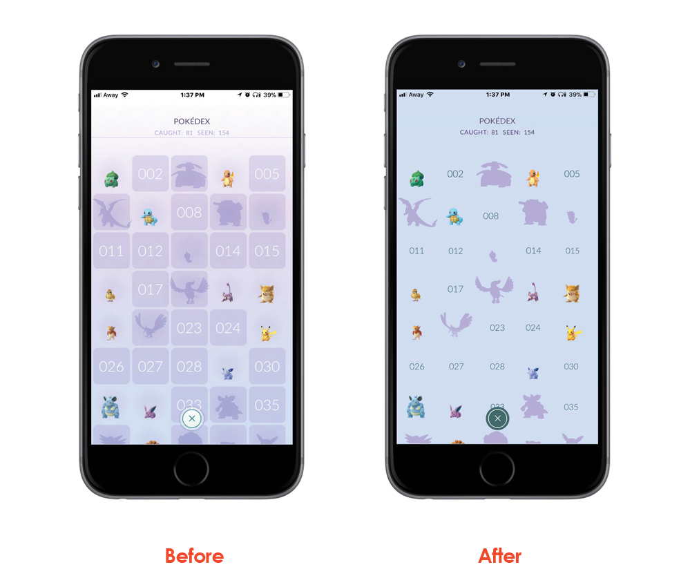
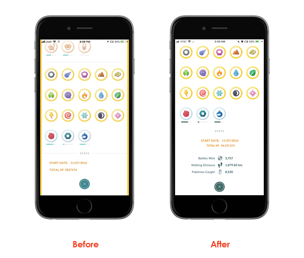
The designs [above right] were changed to make the Pokédex Page UI more accessible for those with visual impairments because it will be harder for them to see something with that low contrast between the texts and the background, as well as making the background have less clutter by removing the lines by instead going for a gradient look/feel.
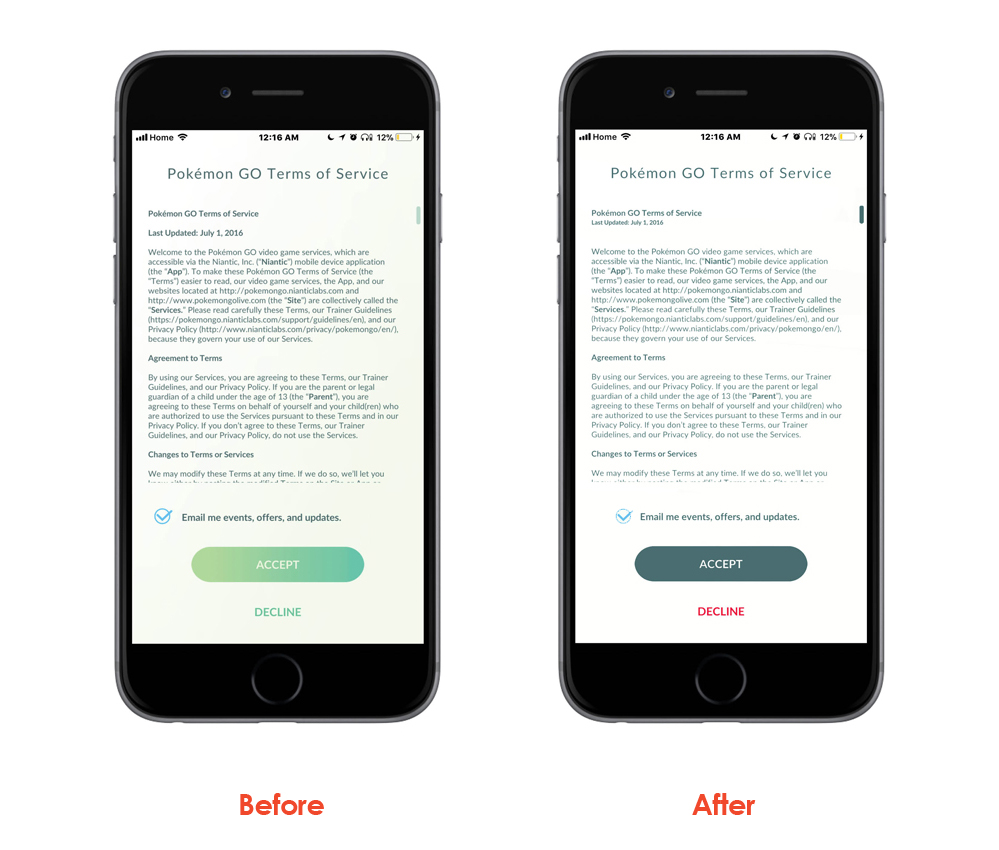
The design [above right] was changed to make the “call-to-action” UI button more accessible for those with visual impairments because it will be harder for them to see something with that low contrast. The “DECLINE” should be coloured “red”, not “green” as “DECLINE” denotes “no” and the “no” button should be red, not green.
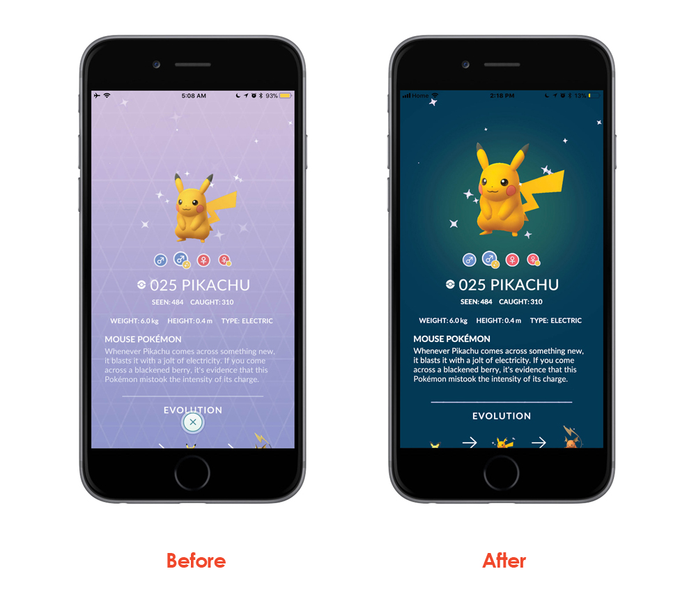
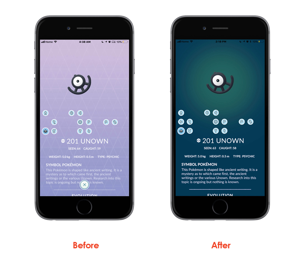
The design [above right] was made more accessible by making the Text UI elements have a higher contrast between the foreground vs the background and also cleaned up the box surrounding the Pokémons so that it is also cleaner and less visual clutter.
The design [above right] has been redesigned to give it a more balanced flow through the entire page, plus removing the yellow bars on the left/right side of the page is also makes the page have a simpler and cleaner feel/look.
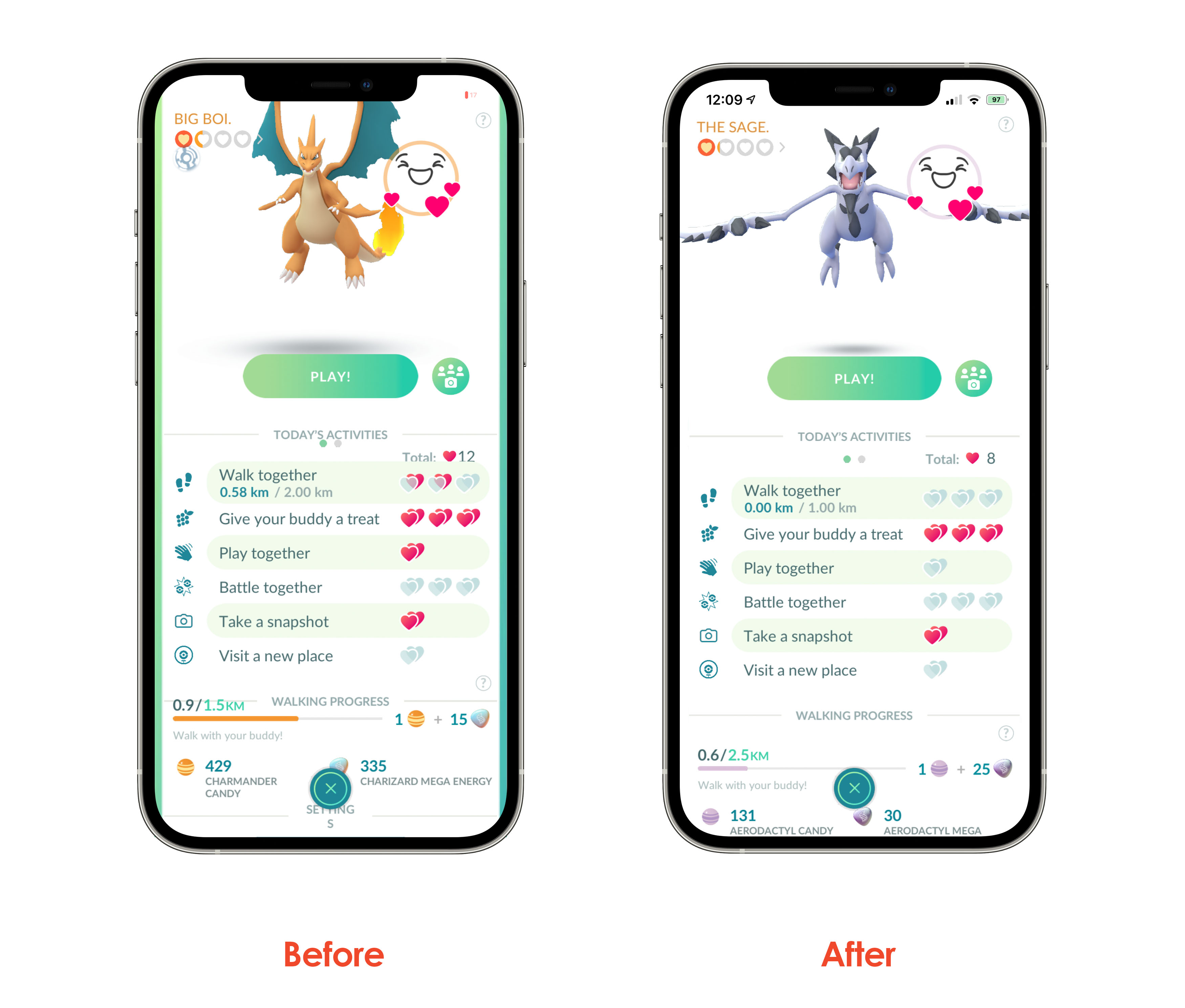 The design [above right] was changed to make the Buddy Pokémon’s page have less clutter and more breathing space. Right now, all the UI elements are way too cramped up and this page having more white-spacing gives it a much better look, plus removing the green bars on the left/right side of the page is also making the UI have a simpler and cleaner feel.
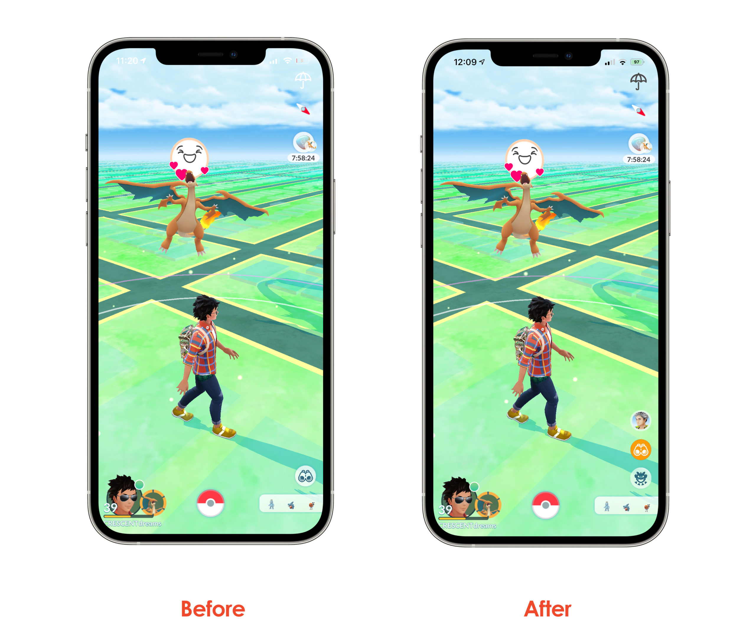 The design [above right] was changed to make the buttons on the bottom left of the screen less confusing. So very often while trying to check the “Today” / “Field” / “Special” Tasks page has been always confusing. Having each Task have its own button will provide a much easier User Experience for the gamers. So very often while trying to access “Raid” page we always click the “Binoculars” icon and always have to exit it and tap the icon below and is not a good UX, and it can be made more intuitive.
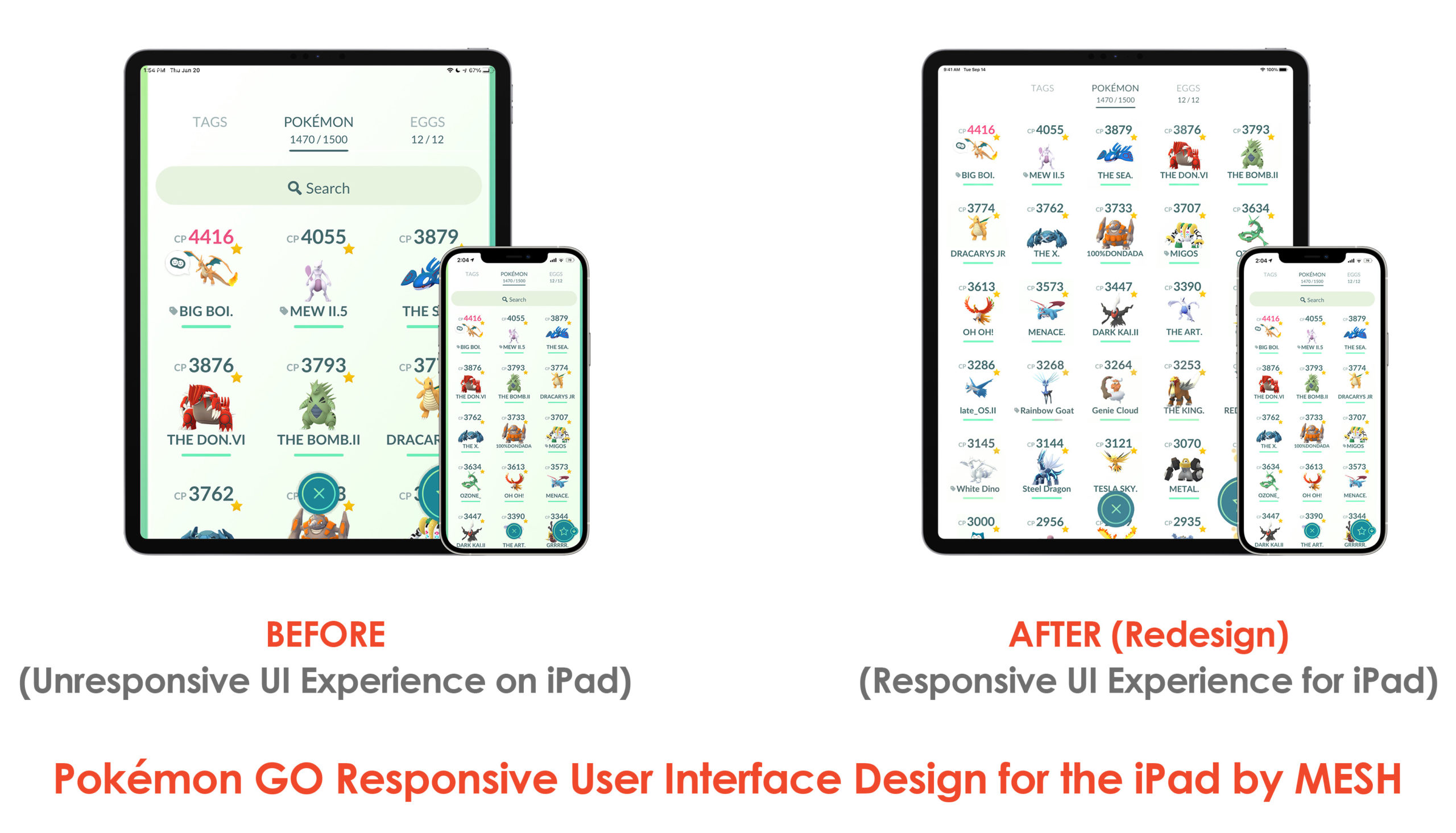
The designs [above on the right-hand side] were changed to make the iPad’s Gaming User Interface (UI) to be more responsive. As of right now, the iPad shares the same UI as that of the iPhone and it is NOT optimized for the iPad’s screen. The UI [on the left-hand side of the iPad] feels like it could use some Responsive thinking, and that is exactly what I have done. I have showcased the before-and-after of the Redesign and compared it side-by-side with that of the iPhone’s for better visualization.
By utilizing the bigger screen Real-Estate of the iPads, I have made it so that more Pokémons are visible at any given time and it creates a wonderful viewing / Gaming Experience for the Users by thinking bigger [literally]. The white-space is being thought of, the UI of the iPad was completely redesigned from the ground-up, not just borrowed from that of the iPhone and thus it becomes much better User Experience.
The designs [above on the right-hand side] are something that I have forever wished that Niantic would bring about to Pokémon GO’s User Gaming Experience.
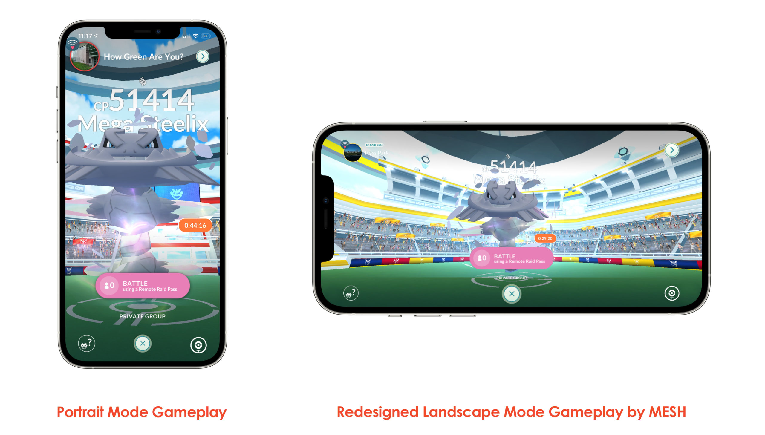
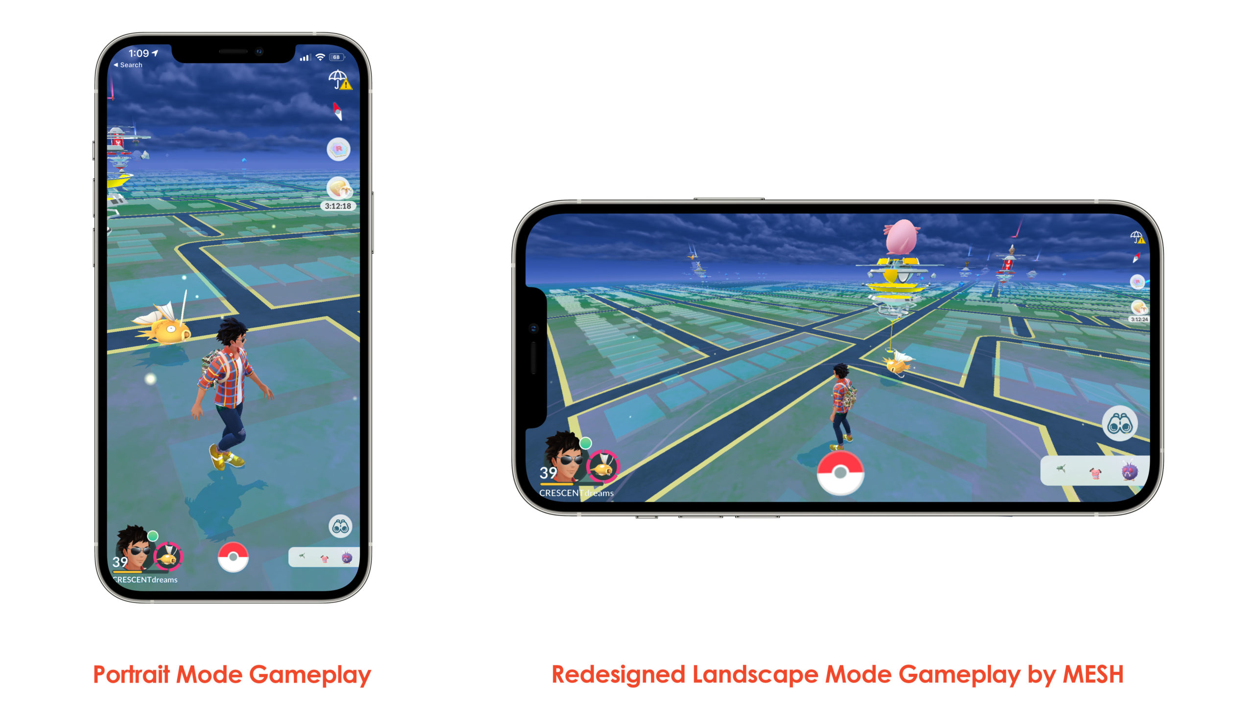
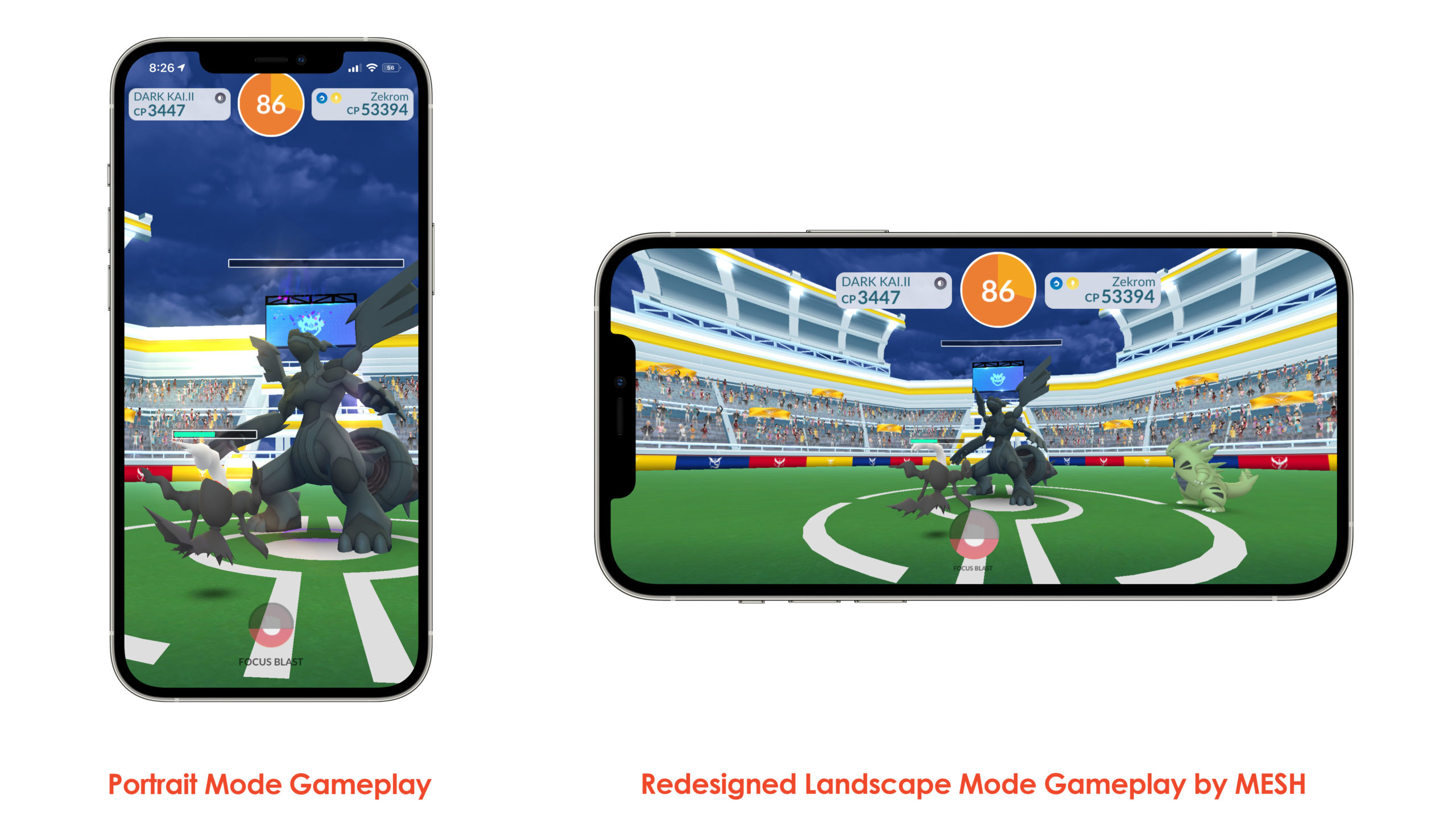
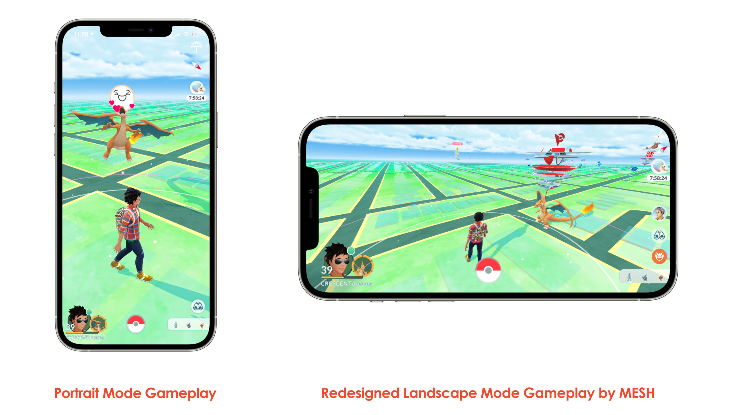
This Redesigned Landscape UI feels so intuitive and gives off a very nostalgic vibe as if we are catching those Pocket Monsters in our Nintendo DS.
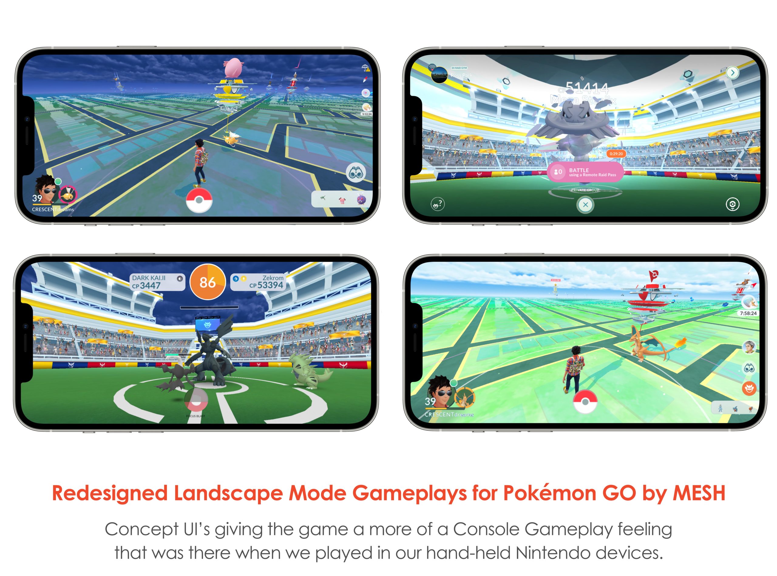
This is exactly what I had in mind while trying to recreate the Pokémon GO User Experience in Landscape Mode. This mode makes the game that much more alive!! Fighting other Pokémons feels very amazing, and it would actually be easier for Users too because this is already something that the Users have been used to since the PlayStation Portable (PSP) and Nintendo Eras. This is what led me towards creating Landscape User Interfaces and it gave me great satisfaction in creating them! I have also placed the Landscape Mode beside the Portrait so that you can compare and contrast and this gives the user also an option to play it however they want to.
This Best of Both Worlds gives gamers a much better User Experience and in return more fun. It almost feels like a whole another game whilst having the very essence and a feel of Pokémon GO that we have grown to love over the years.
____________________
Thank you for viewing my Concept UI Designs.
Stay for as long as you like.
– MESH
🙂