![]()


Last updated: 2022-03-02 at 17:13 PST
._.
![]()
-._.-

When you first get an iPad, you expect everything to appear similar to that of an iPhone iOS. But, it is not the case.
You eventually realize that there are some apps available on the iPhone, but contrarily they are NOT available on the iPad, which makes you wonder WHY!? This makes you feel like, there are some things missing… And, I bet I am not the only one who has felt this way!
First, I am going to tackle the iPad Weather app, and fully give the users an amazing experience, and then, I shall move on towards the Calculator App, the Health app, and the Wallet app — in the upcoming months.
Therefore, this project is very special to me.🔏
Because, when I devoted my time building this, I KNEW that IT WILL NOT ONLY benefit me, but this would also benefit millions of other users. And, as I go on building more apps, the start of this project has the potential to become something ground-breaking for everyone using the iPad as their daily driver. Because, switching in between devices — while you are working on the iPad — can become quite tedious, and is actually very counter-productive, and this project removes that time-consuming workflow/experience between the need of switching between multiple devices for something as simple as checking the weather.
As I got started with this project, my goal with this project was to make these UI designs look like they were included with the native iPadOS. I wanted to bring the same experience — already present in the iPhone — into the iPad so that the user feels like it was meant to be there the whole time. I yearned for these designs to be fluent within the Apple Ecosystem.
Meaning, the visual interface along with the user experience has to be seamless within multiple devices/platforms. Because this is how you build brand recognition and give users familiarity within multiple Apple devices. Thus, this all leads to the users having an Amazing Experience with the product/services.
._.
____________________________

The most important thing to consider while doing UX design(s) is to ask yourself the following question:
“How does the Product / Service FEEL?”
The question: how does it make the user feel? Perhaps nothing is more important to the UX designer than the forever process of enhancing the user’s satisfaction by continuously improving the usability, accessibility, and pleasure provided during the interaction process between the user and the product/service. Therefore, this is EXACTLY what I have — and will continue — doing with this project of mine!
._.
“The UX Design encompasses all the human-to-computer interaction and extends further by addressing all aspects of product/service used by the user.”
Like, any other UX Case Studies, I have begun my work in a systematic fashion and I have devoted all of my energy towards showcasing the users — who might use this product in the future — that I CARE. I care about the feeling you will get once the Weather Application is in your hands. I take care of the smallest details when it comes to the designs I make, and this is exactly what I have done with this design process.
._.
You may ask yourself, who am I targeting with the designs of these applications? Who would be the perfect candidates for the Weather application on the iPad? Well, truth be told, anyone and everyone who will purchase the iPad would be a perfect candidate [see below picture]:
During the initial stages of the Research, I went online — like how we all do — and I Googled how many other people see the lack of native Weather / Calculator / Health (and many more) apps as an issue and a barrier, and I was surprised as to how many people felt the same way as I did. This ended up adding more fuel to the fire as to why I wanted to go ahead with this project. Since we all live on Earth, and “weather” we like it or not — pun intended — our lives are governed by the various climates on the macro-scale. We all look at the weather to get a sense of what is happening now, or what will happen either in an hour, tonight, or the next Sunday where your family is throwing a barbeque!
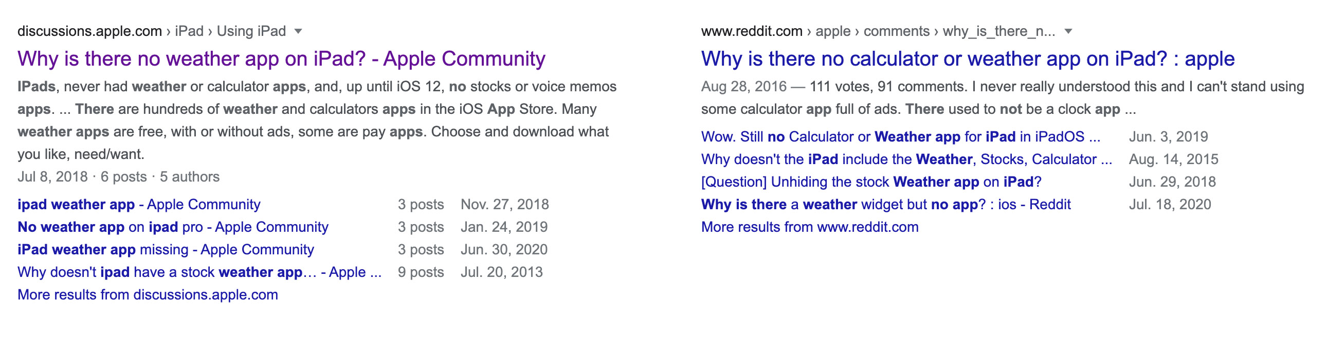
I have just decided to showcase these two examples, but there were just way too many online forums in which people were enraged with the lack of the Weather / Calculator / Health app on the iPadOS.
On one of the Forums, one person had asked: “Why is there no Stocks app on the iPad?” But, guess what? Now, we do have the Stocks app naively built on the iPad, so why did they not do the same for the other applications? Still makes me wonder… Also, you might think that if we wanted to check the weather then we can just download an app from the App Store, or if we want to calculate something, we can again just download the app, but the thing with the apps from the App Store’s are that they are filled with bloatware, and they have lots and lots of ads, it is not a good user experience! Moreover, someone like an elderly person using the iPad may not be able to do that! Therefore, it is essential to have those apps on our devices — they will make our lives easier.
“Apple NEEDS to build a native Weather app for anyone and everyone who owns an iPad.”
____________________________

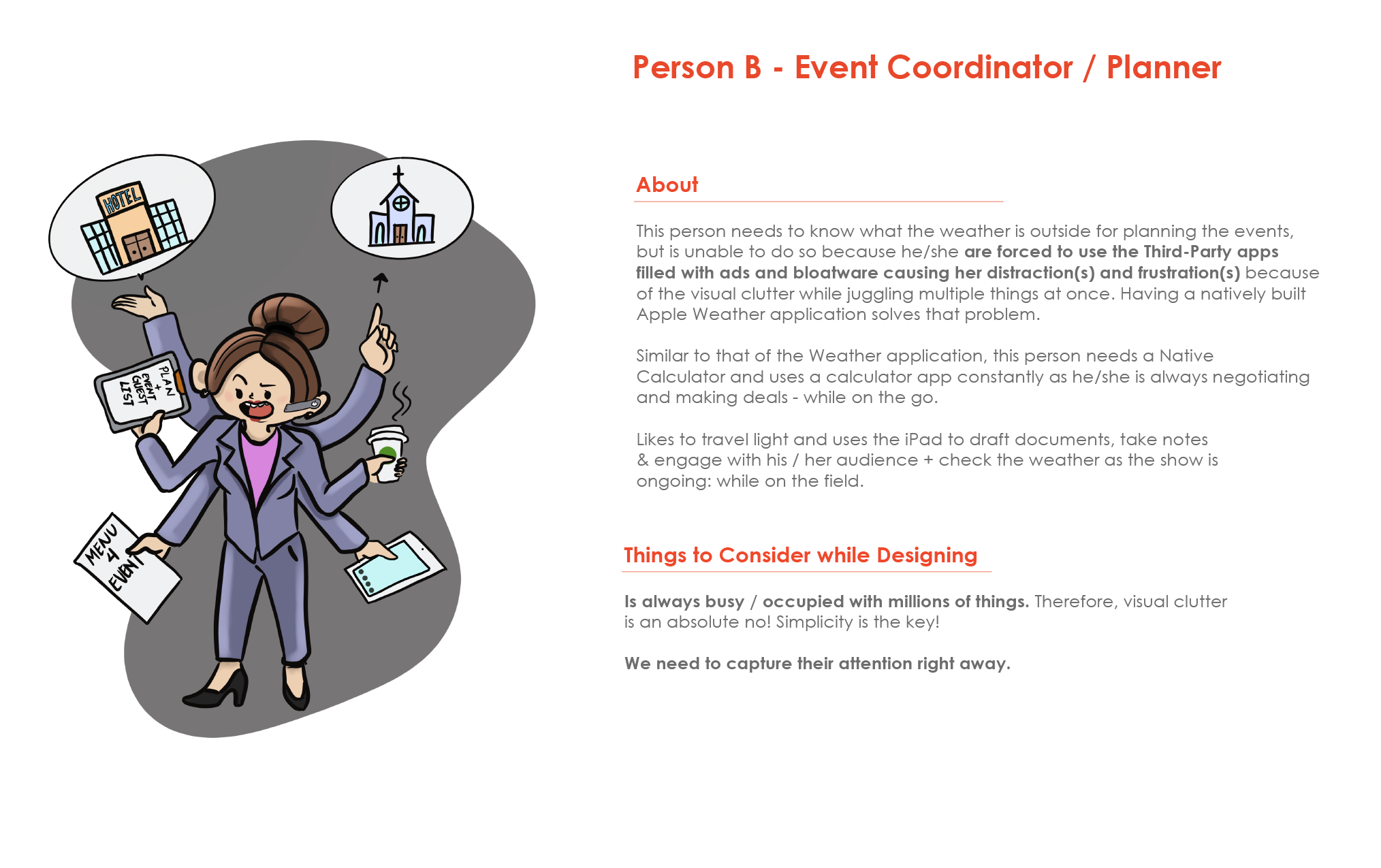
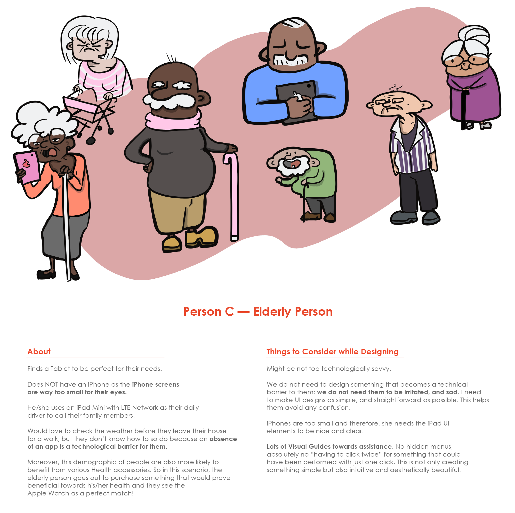
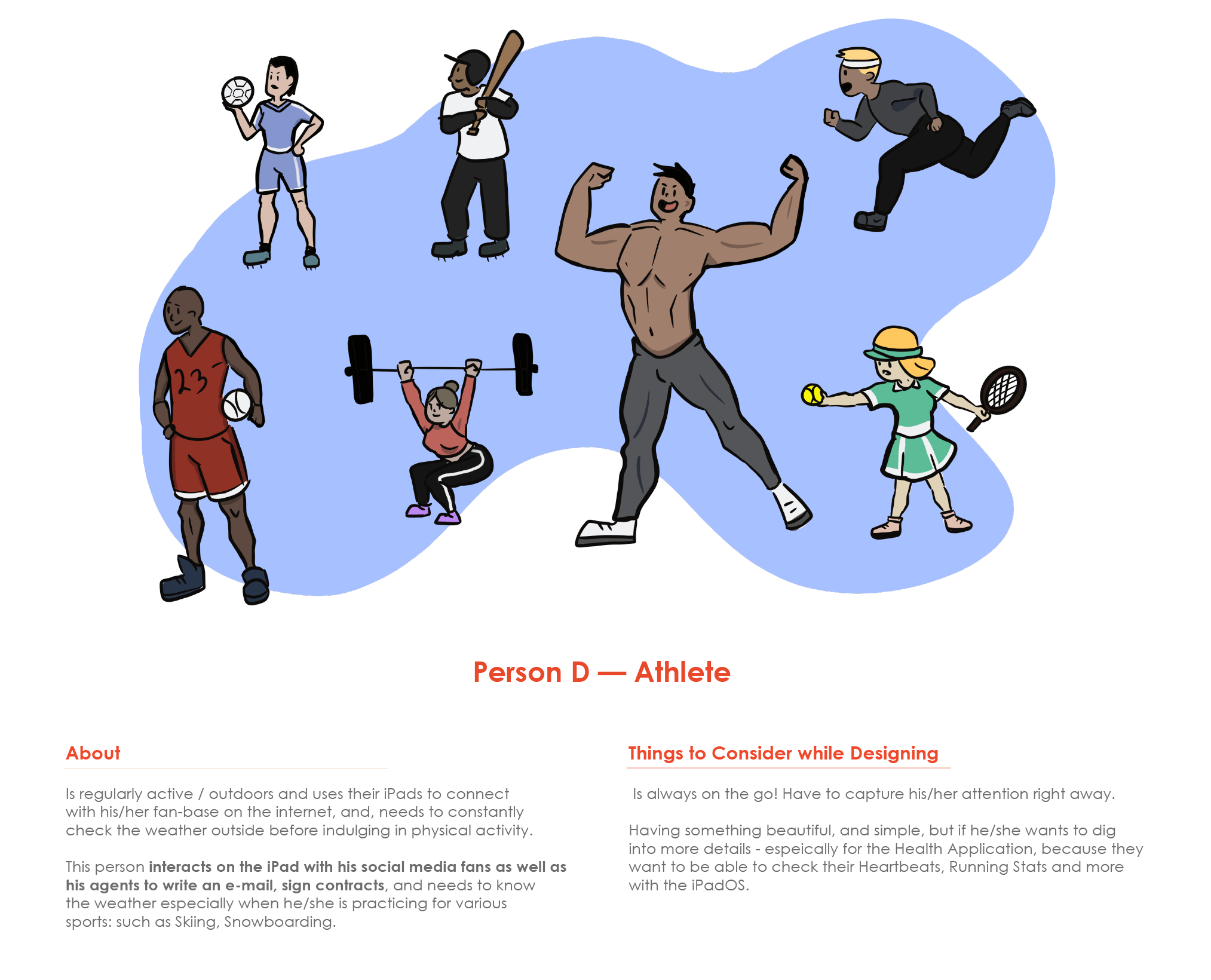
So yes! People need to view what the weather is like, and it is handy for everyone to know what the weather is like outside! Apple NEEDS to build it for anyone and everyone who owns the iPad, BUT for the sake of the argument – and in this case – we have 4 perfect candidates as the Target Audience. For this study, I will refer to them as “Person A”, “Person B”, “Person C”, and “Person D”.
And, why am I selecting these 4 User Personas? Well, I am targeting these groups of people who might mainly benefit from the weather application on the iPad because of the following reasons:
____________
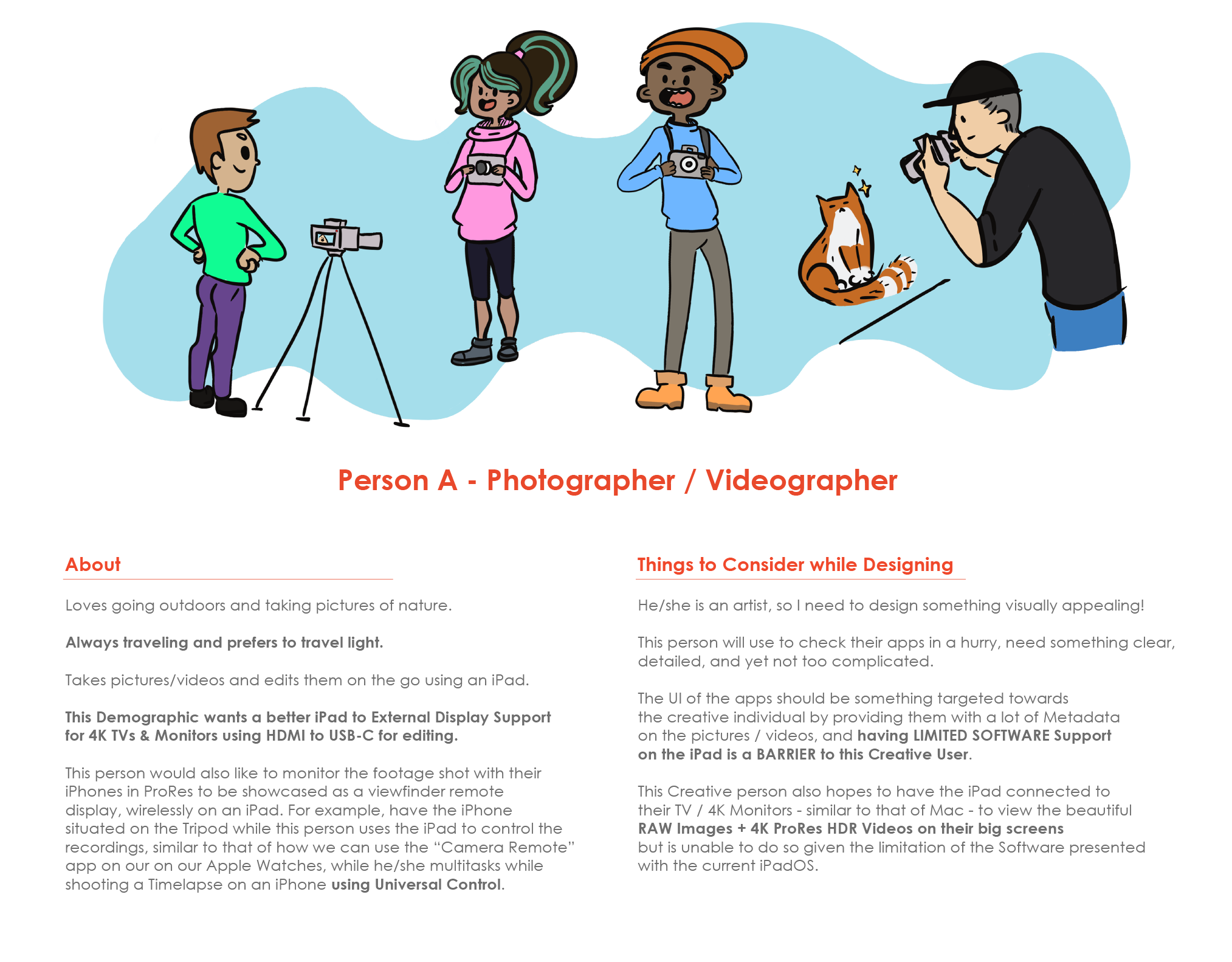
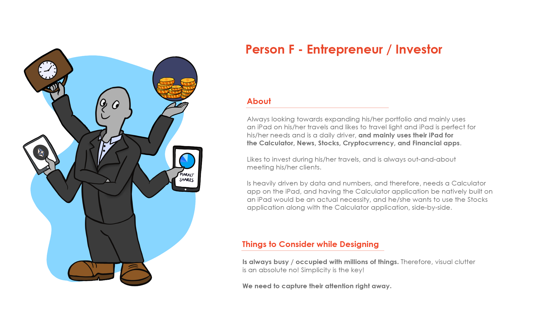
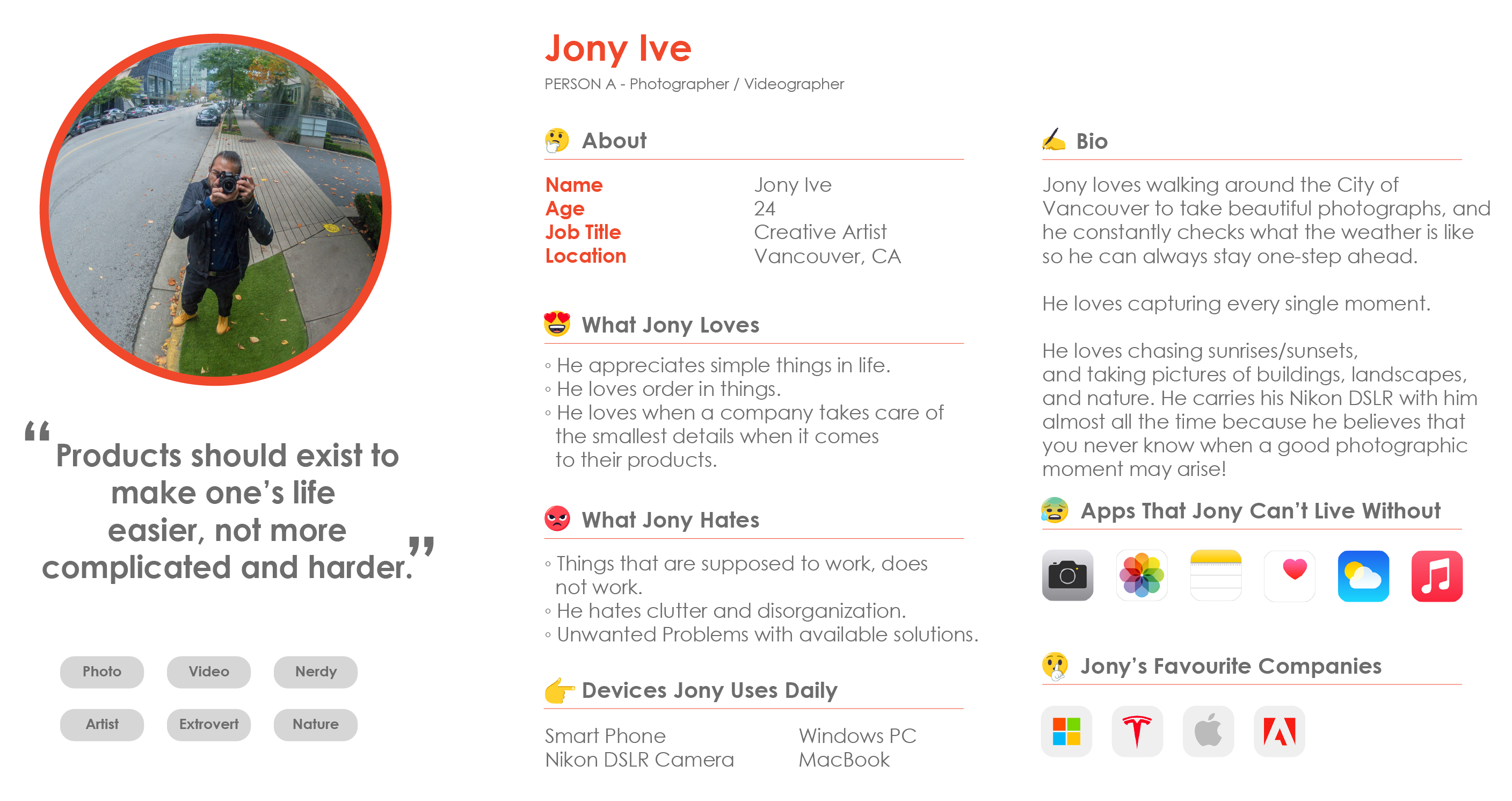
Detailed & Narrowed Down User Persona Profile for the Person A: Photographer / Videographer.
HOW am I going to make my designs not only appealing but also user-friendly towards these individuals?
I will use these User Personas as the main driving force behind the creation of the Weather Application. 🌞
“We do not just make designs pleasing, because designs are so much more than that.”
Also, we make designs user-friendly as UI/UX Designers. We have empathy for our users, and we are always advocating for them. Because essentially THEY are the ones who are the driving force behind any success. We solve problems for the users to ensure that there is a high rate of success in the product we make. Therefore, the same idea is what I am taking into account while undergoing this project. From the point of the text size to the visual appeal to the user-friendly UI’s: I have to consider everything.
What I have gathered from studying/researching all of my above personas is that SIMPLICITY IS THE KEY! I need to make designs that are simple, and yet very effective.
I have to make something not too complicated, and graphics and texts have to be fairly large so that elderly people can see stuff clearly.
When I am dealing with people who will use this weather app on the go, the most important thing to consider is simplicity. I want users to see what they want to see without a whole lot of visual clutter. Something very simple that just looks right, and is in itself self-explanatory. This will not only help creative people on the go, but this will also help elderly people — with not many technological skillsets. I especially do not want to confuse them! 😵
“Simplicity is the Key.”
____________________________
: )
 Okay, so now that I have gathered the Users who might be a perfect fit for this application, the next step was to do a Competitive Analysis. WHY? Well, how else was I going to learn what is already out there, by studying and learning my competitions(s), and by creating something that isn’t already there, right? 🤔
This is where I learn from my competitions & out-perform them!
Due to the time-restrains, I was not able to do these in much detail as I had hoped to, and had to resort to simplifying my findings to a minimum.
Anyways, these are the four-most downloaded Weather Applications on the iPad’s App Store:
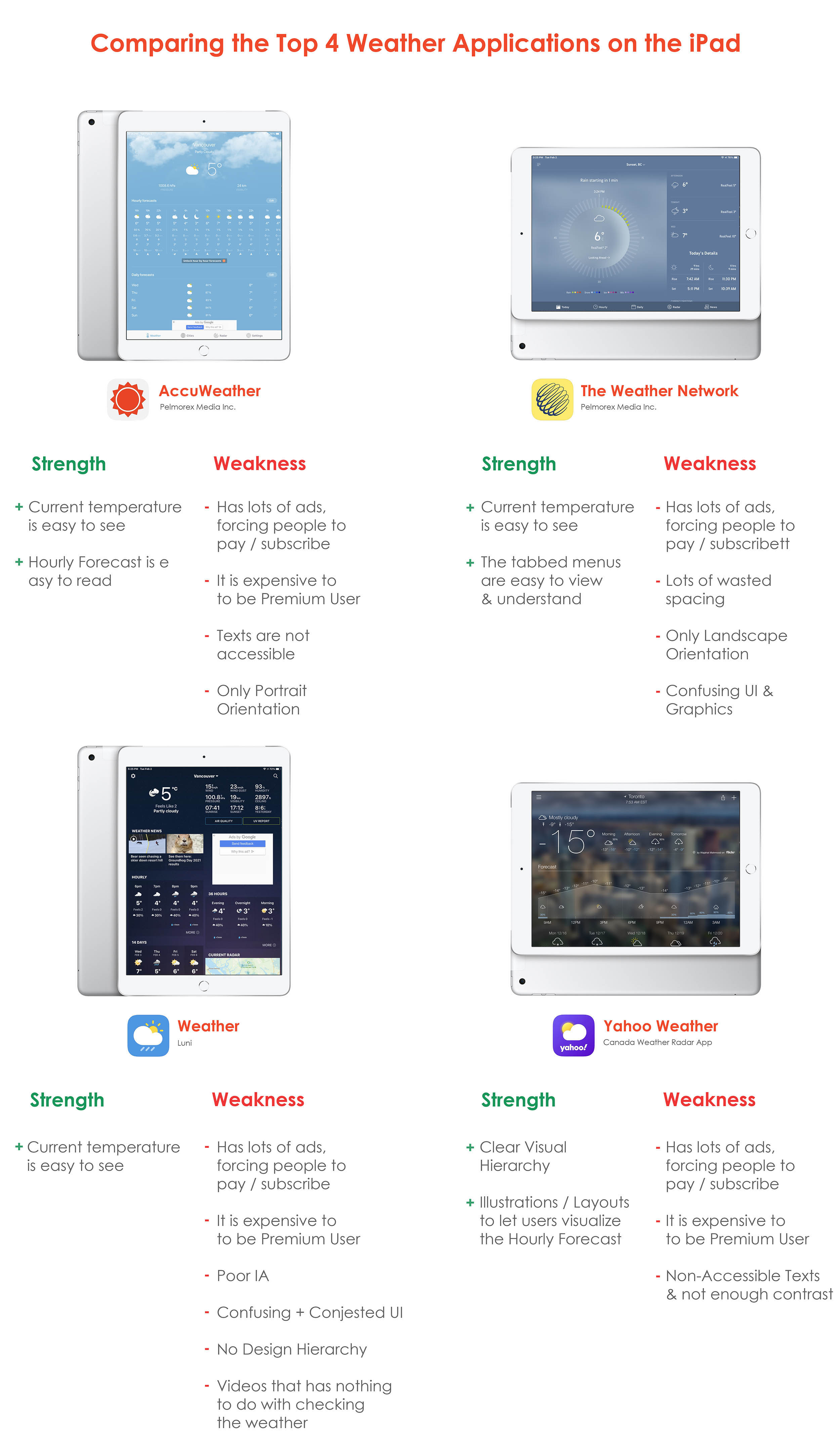
Anyways, these are the four-most downloaded Weather Applications on the iPad’s App Store: The experience that I PERSONALLY FEEL — as a user, myself — while I use them are all YUCKY!! There are lots of bloatware, and they are filled with boxes upon boxes of advertisements, and they are not in any way accessible and it is all very complicated to understand. 🤦♂️
Now going back to the User Personas: think about the Target Audiences. Imagine how a Grandmother would feel when she stumbles upon one of these filled with advertisements and a squirrel? SERIOUSLY? A SQUIRREL ON A WEATHER APPLICATION? Now, let us talk about those ginormous advertisements: again, going back to the grandma who is our elderly target audience. She is already having a hard time with technology now there are boxes of shoes, glasses, tissue papers, and new cellphones where there are supposed to be weather instead!! Imagine how busy our lives are. Products / Services are meant to be there to simplify our lives, not complicate them further. All these four products are doing the EXACT opposite of what is meant to make the user feel.
Most Importantly: THEY ARE ALL MONEY DRIVEN APPS! All these apps have EXPLOITED the USER’S DESPERATION. The user has NO weather application natively built-in, therefore, they ARE FORCED to download one app or another, and yet ALL OF THEM are there as a way to squeeze every bit of penny from the user. 🤑
Now, what does that leave us with? An unhappy customer because of a terrible User Experience. Why? Every aspect of the app was designed to bombard the users with ads so that he/she is forced to buy that premium version of the application, and EVEN THEN, the application is still OUTWEIGHING their Weaknesses and their STRENGTHS, in almost all examples. That is not a good sign.
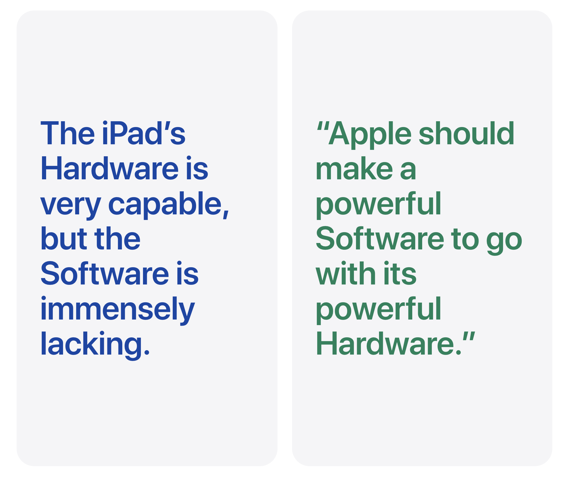
Apple decided to build its whole brand based on this one motto: “simplicity”. However, this notion of not having a native weather app built on to the iPadOS, and forcing the user to go online to download more complicated applications which are bombarded with advertisements and bloatware is the EXACT OPPOSITE of Apple’s company motto…
-.-
Apple is going AGAINST their own notion of “SIMPLICITY” when they FORCE their users to go online by making their lives more complicated. This is NOT a good User_Xperience…
There is a clear solution to this: create a beautiful weather application to be natively built into the iPadOS Experience by making the User’s Experience more pleasant…
A good UX is what makes the user feel like they want to continue using the product/service. A good UX is what gives users the value n using a product repetitively, and not wanting them to choose a different competitor.
These are all the things I have considered well before I jot my ideas down on a piece of paper. All these research and ideas are like added fuel to my already burning fire as I begin the UI Sketches. 📝
____________________________

Privacy is an important human right, that should NOT be taken lightly: especially by these big corporations and institutions. 🔏
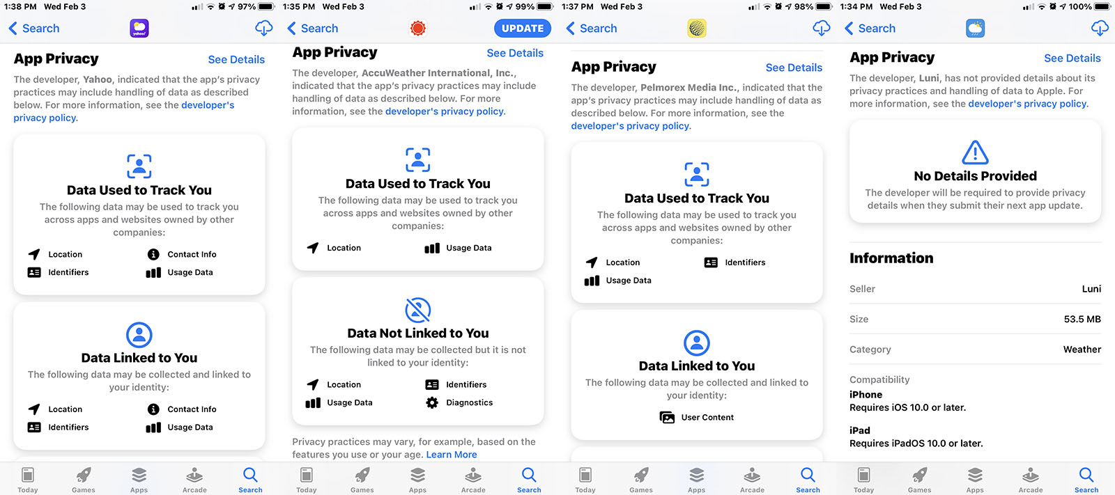
Apple did the RIGHT THING by taking a strong stance on Privacy. They have even announced the “Apple Privacy Nutrition Labels” that is applicable on all third-party applications as well as their OWN native applications. All of the Apple applications are heavily privacy-driven.
Apple has set a new standard for data control/privacy minimization + machine-learning by using on-device calculations for everything from location data, to your contacts, as well as your photos, so that it does not leave the device and go into the cloud. But the same cannot be said about third-party applications. Their stance on privacy may be viewed at https://www.apple.com/privacy.
“We do not know what they are doing with our data, or who they might sell the data to…” 🔐
…
…
Apple CEO Tim Cook talks about Privacy on January 28, 2021.
Now taking that point into consideration, by not having the Apple Weather app on their iPad natively, the App Store is saturated with third-party apps that are littered with ads — which is not what Apple wants. There is a clear solution towards fixing this: build a native app that does NOT share the user’s location to the highest bidder and is not money-driven.
Amongst all the other privacy stands, that Apple has taken, they have not thought about this particular issue, and I am using this opportunity to tackle that privacy issue — that a lot of iPad users are facing — when they are forced to use third-party applications that are saturated with bloatware, as well as advertisements.
![]()
One more thing: when you ask Siri: “How’s the weather outside?” using the iPad then you get the response back, but notice one thing? On the top-left, that IS the Weather app icon. WOW. So clearly, there is the Weather took-kits / icons / resources built into the iPadOS Experience, and yet there is NO weather app itself, and it got me thinking that it has to be some kind of inside-joke at this point as to why there is no iPad app on the iPad. Also, the same thing applies to the Calculator app. Although there is no Calculator app, there is still the Calculator Icons built for the Siri Response…
._.
____________________________
._.
 Now, that I had formulated what I wanted the product to FEEL like, and I have gathered the people that might be a perfect candidate for the Weather app on the iPad + seen what the other companies/apps were doing thru the competitive analysis, I have formulated the do’s and the don’ts, the next step was to start getting creative, and this is where I got started:
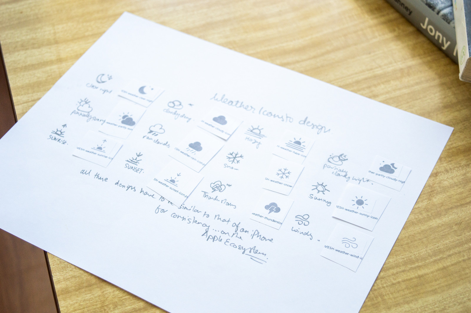
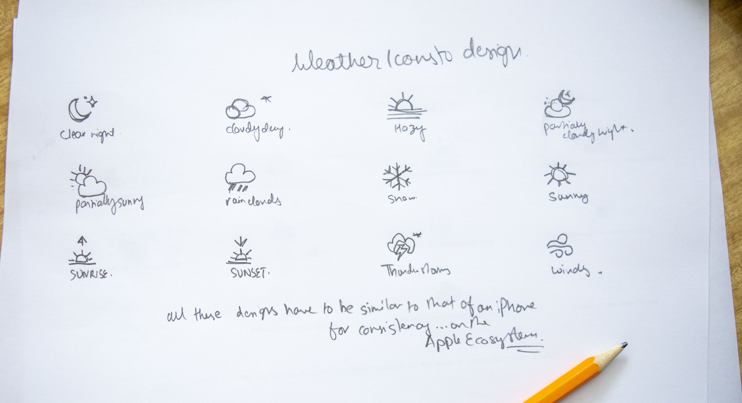
Early Sketches of Weather Icons that I did for the iPad Weather App.
In the very beginning, I began my sketches by formulating all the small icons of the Weather Application. Each weather icons indicate different weather conditions. For example, the rain, snow, sunny, and more conditions. 🌞❄️
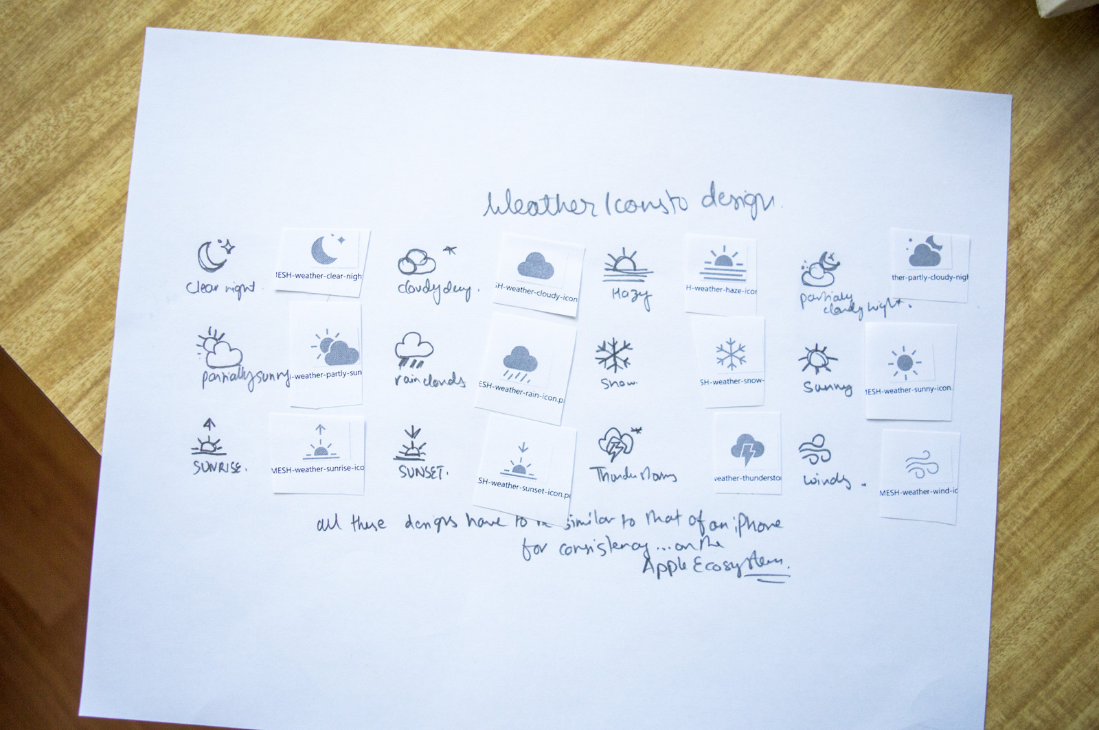
Collection of Sketches of Weather Icons that I did, and comparing them to the finalized Icons that I illustrated afterwards, for the iPad Weather App.
Once the small icons — indicating different weather scenarios were created — I printed them to a letter size paper, why? Because I wanted the icons to be accessible.
I did NOT want icons that are TOO SMALL, nor do I want the icons to be GIGANTIC. Again, going back to my personas, I did want the icons to be large enough for Person C — an elderly person — and I did not want them to squint to see basic weather icons but, I did not want them to appear too big for the rest of the user audiences so that it looked too hideous. The perfect balance was what I was seeking with my designs.
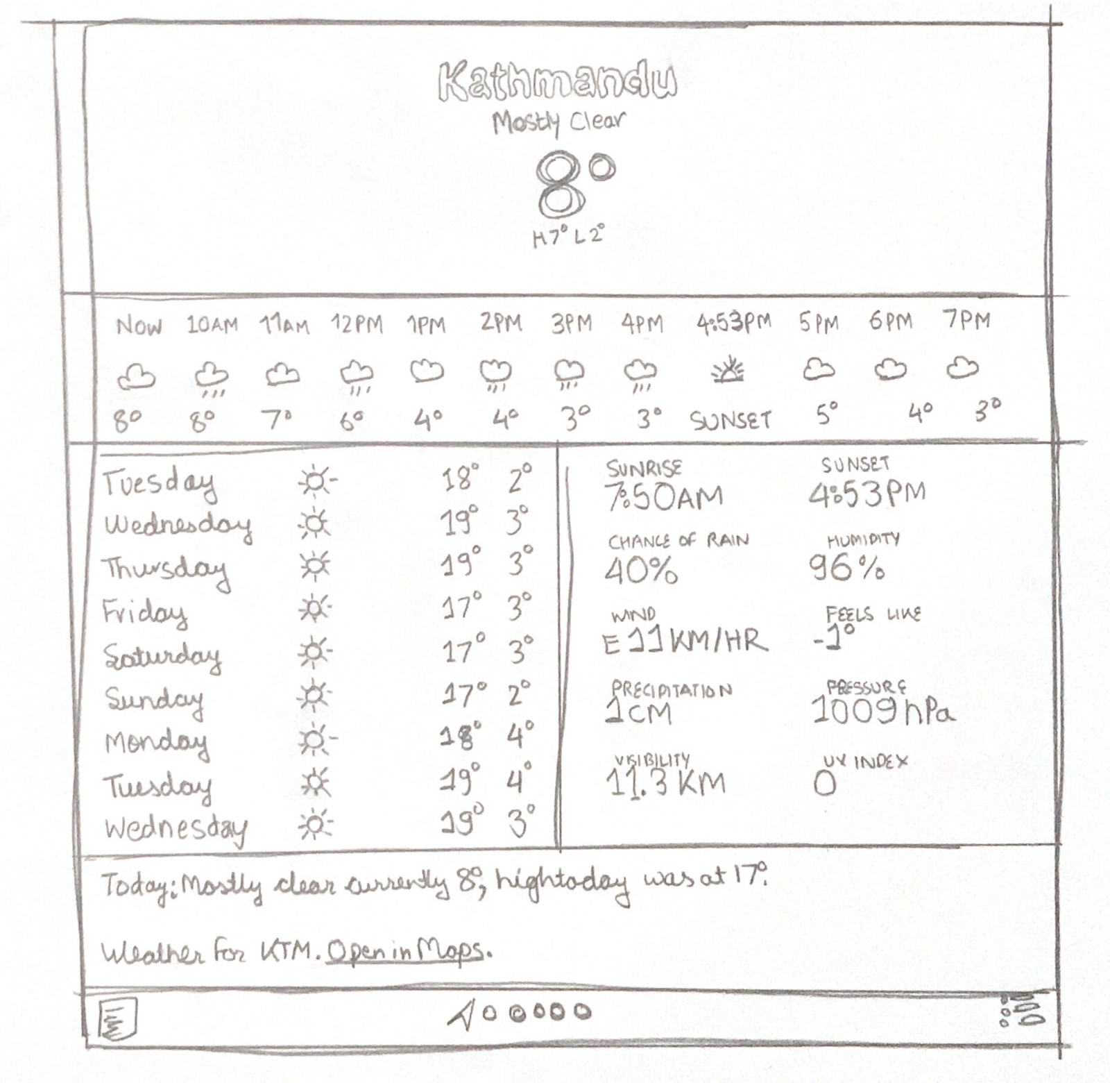
Version 3 of the Wireframe Sketch I did for the iPad Weather App.
[This is my favourite mock-up design concept BTW. 🙊 ]
During my next step, I utilized finalized the icons, and then, I moved on to see what the weather would look like with a rough wireframe sketch. Upon my third trial, I was successful in capturing the initial steps of what would soon become a final project UI for the weather app showcasing the weather for the City of Vancouver.
As I go on, I will break down each component into its own sections, and explain.
Photographs of — what would later become — Version 3 of the Wireframe Sketch I did for the iPad Weather App.
Hi.
Another Wireframe Sketch that I did for the iPad Weather App would — later on — become the Version 1 of the UI.
Hi.
Using various Wireframe Sketches, I was able to get a rough idea of what I wanted the Weather app on the iPad to feel like. I used the paper as a template to help me drive my decision further towards the mock-ups shown below.
More Mockup UI’s are coming soon. :)make sure to add — add snowflakes for snow, and stuff…in the sky
____________________________

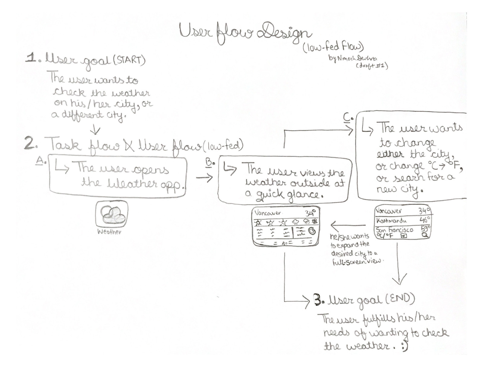
Due to heavy time constraints: I was only able to do a low-fidelity wireframe sketch of the User Flow in which I have showcased the User’s Goal from the Start to the End (how I want the application’s flow to behave).
Here, I will briefly explain the processes (User’s Flow):
1. The user first has an objective. In this case, the user’s goal is to check the weather outside — or for a different city (perhaps the user wants to travel to a different location later on in the near future).
2. The user then opens the Weather app. He/she will quickly glance at the weather that is provided. He/she will quickly assess the situation, and one of the two things will happen. Number one: his/her goals are met, and the user will exit the application. Number two: he/she wants to check the weather for another city. In that case, either the user will scroll right to see the city’s name that is already saved on his application, or he and she will tap on the menu icon — bottom right — to click on the search icon, and search for the city, and then tap “Open”. Check the weather, and then the user is satisfied with the results displayed.
3. The user now has completed his/her goals, by fulfilling the need to check the weather, and then he/she will exit the application.
____________________________
: )

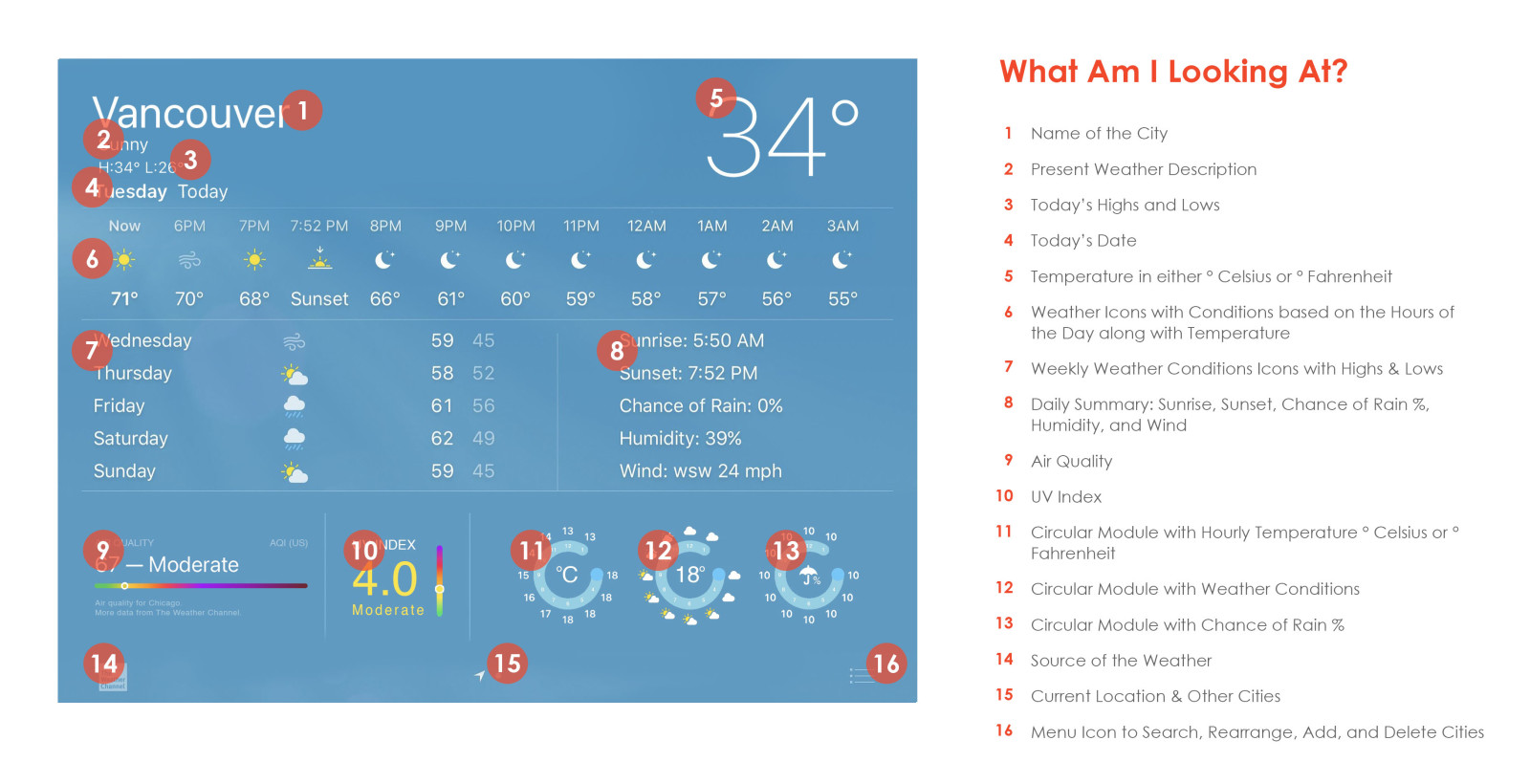
Before looking at the User Interface Designs below, I would like to take this opportunity for you to view the breakdown of each section(s) thru multiple labels. This serves as a guide — towards the development process + end results for the users — for me to showcase its purpose on the screen.
._.
“We build the Component Library to make the dev’s life easier — during the initial development process…”
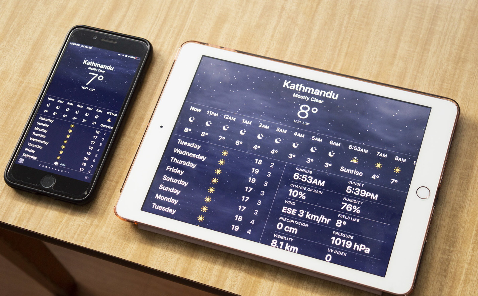
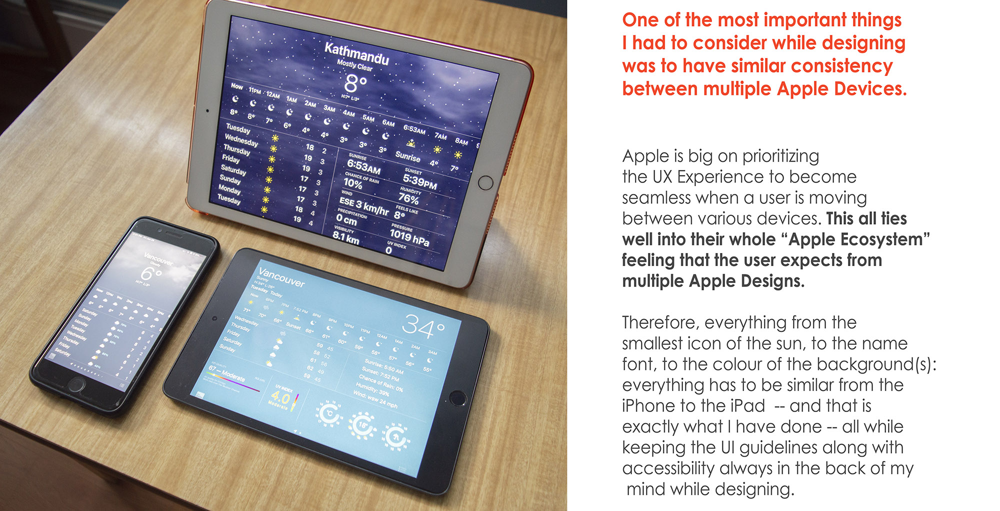
I have to match the consistency between multiple Apple Devices. 🍏
Getting the weather Icons to look similar to that of Apple’s iPhone + Apple Watch + MacOS was VERY important. WHY!? Because I wanted these designs to be fluent within the Apple Ecosystem. Meaning, the visual interface along with the user experience has to be seamless within multiple devices / platform.
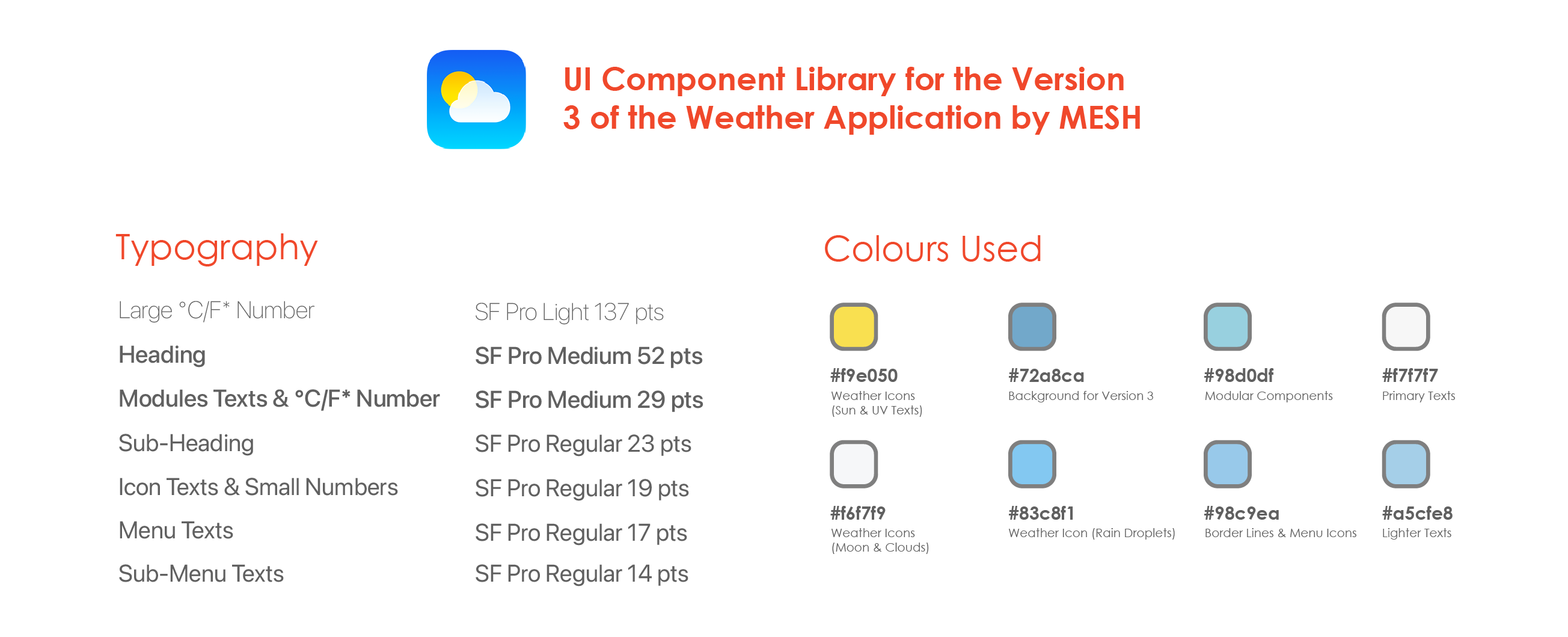
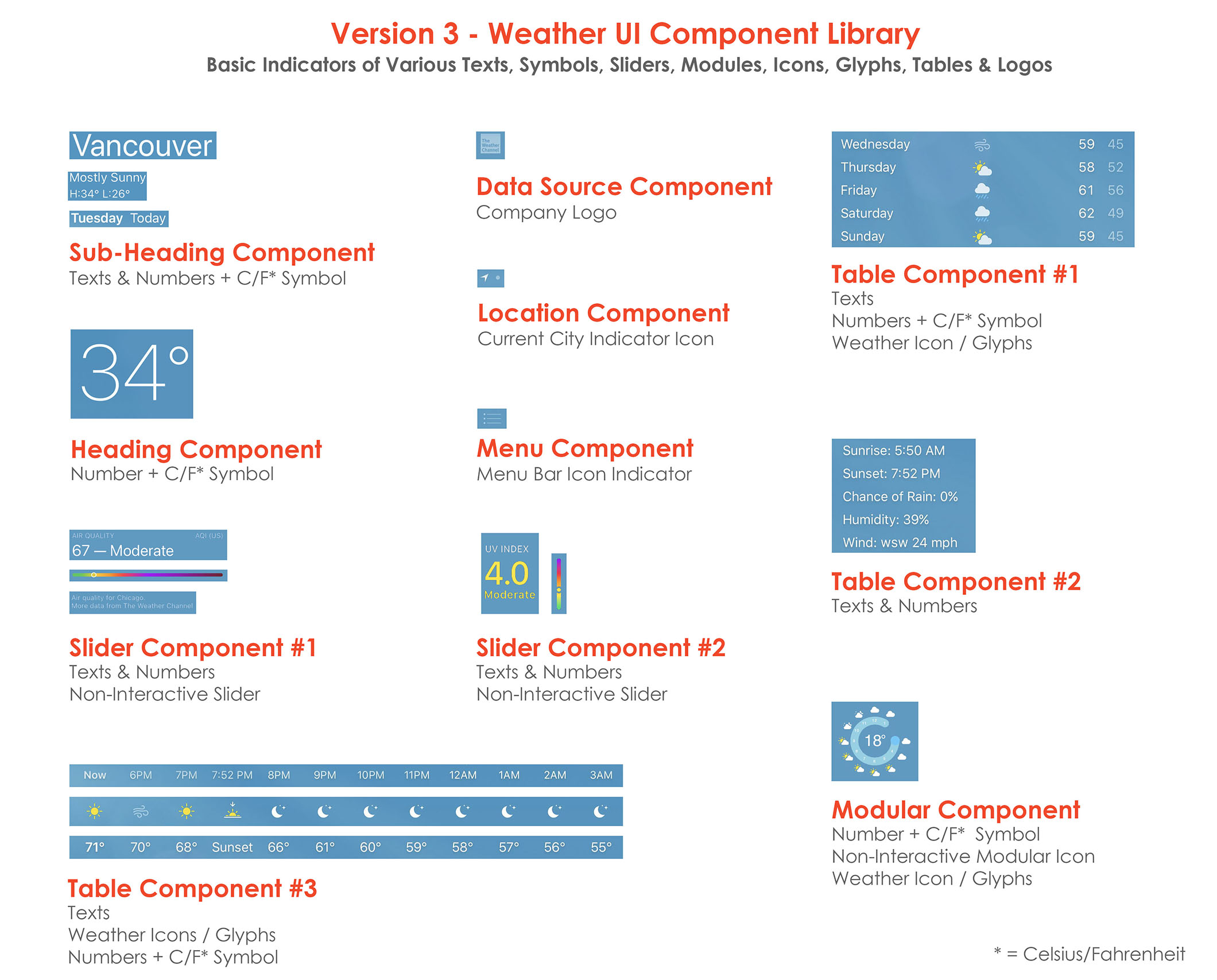
Various Components of the UI Design — by breaking down various sections into a Library of User Interface Materials including the Typography, Colour Hexacodes, Tables, Sliders, Modular Components and more (as shown above) for the development process.
Why did I end up doing this? Because in doing so — as a UX Designer — we make the dev’s life easier — during the initial development process — so that they can start building the UI: one component at a time. For example: starting the development with building the “Heading Component”, or the “Subheading Component”, and ending the final stage of development with the “Table Component #3”, or vice-versa.:
…
____________________________
: )

: )
: )
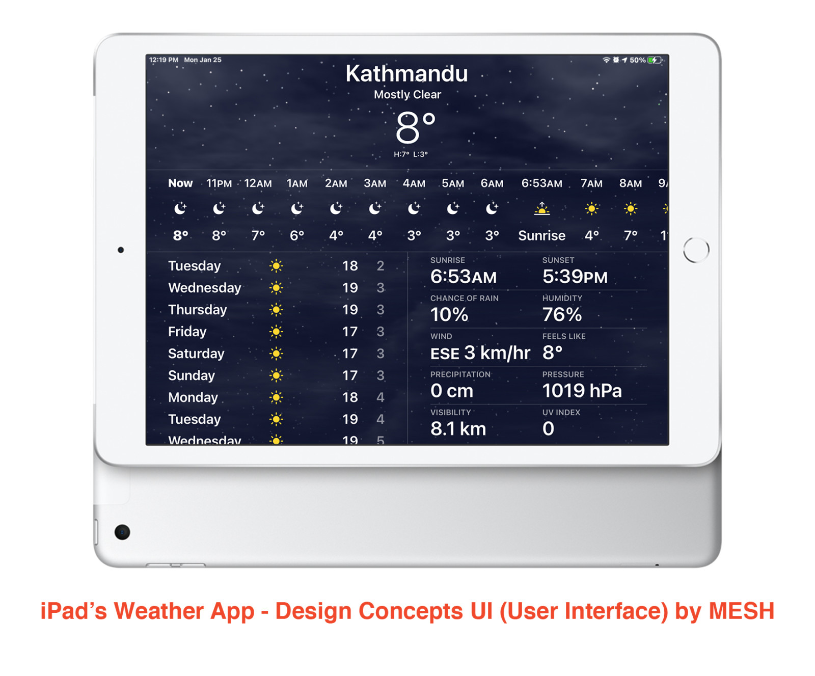
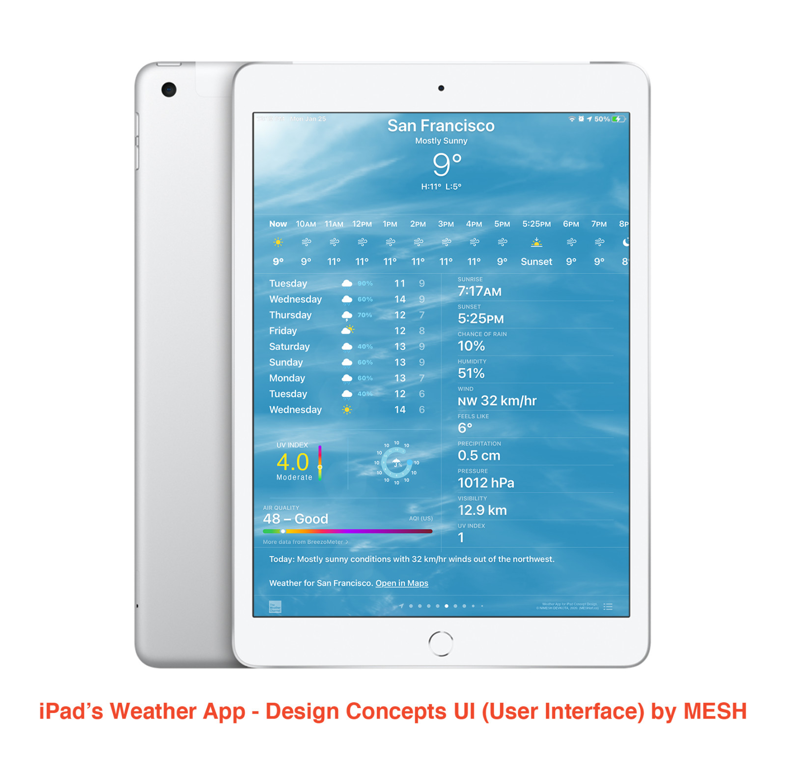
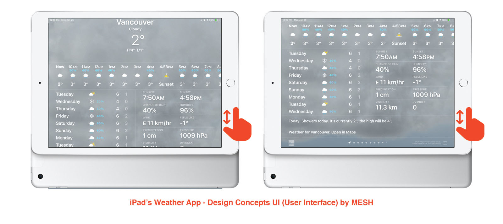
Here are some of the UI mock-ups that I did by placing the designs inside the iPad to give you the feel of what the app would look like if it was actually a real product.
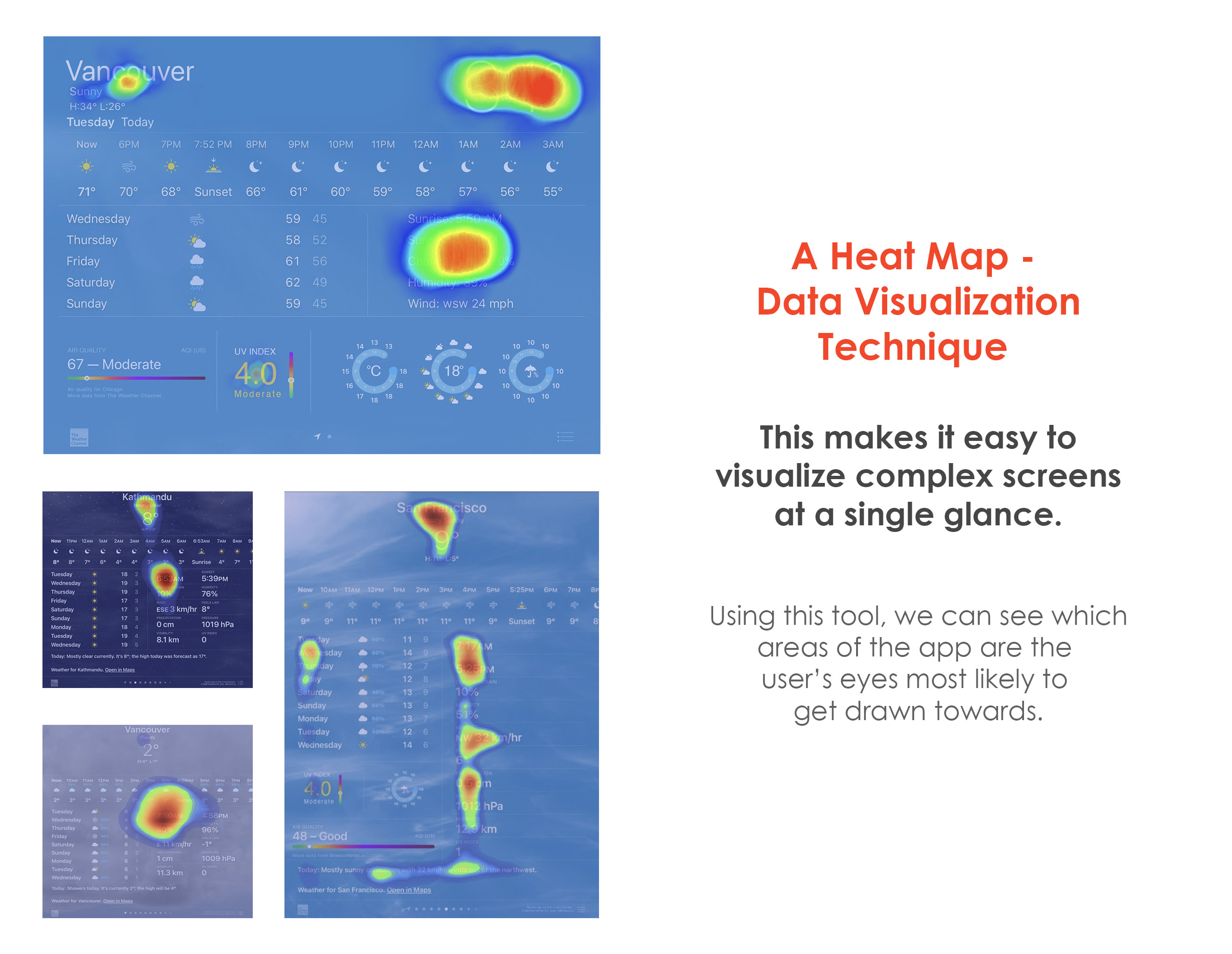
These Heat Maps show variations in colours + hues demonstrating where the user’s eyes will get directed to once they land into the Weather Application.
I used this technique to better understand my very UI design concepts for the weather app. Because ultimately my goal has always been to make the designs as intuitive/friendly, and simple + clutter-free as possible.
So, this heat-map technique has been amazing in helping me guide myself. Because, as a designer you get so attached to the product that you are designing, sometimes you forget the smallest details as to how this might look from a third-person point of view. Or, how does the design appear to someone seeing this for the first time?
You know every nooks and cranny of this UI, but the users won’t have that at a first glance. So, this technique is good to have, and I have used it to further solidify my design choices.
The way you perceive the designs — as the creator — versus “Person C”: an Elderly Person will be different! Moreover, the way in which the Elderly Person will perceive the designs will be different than the “Person A”: Jony.
It was important for me to use the Heat Map to visualize complex screen(s) at a single glance.
____________________________
: )

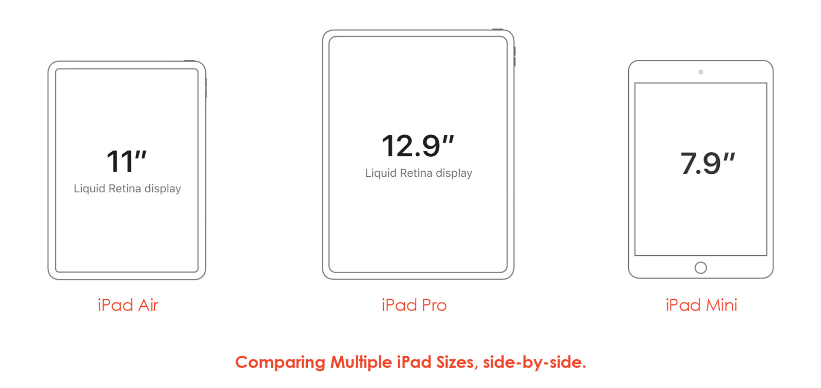
Another thing to also consider is the various sizes, not all iPad are of the same size. The sizes do vary between different models: as shown above.
Doing all the design is one thing, mocking it up on an iPad is also one thing, but HOW IT LOOKS / FEELS in the REAL-WORLD is a whole another thing that a designer must ALWAYS consider and quite frankly see for themselves by taking lots and lots of photographs of it. This is exactly what I have done below: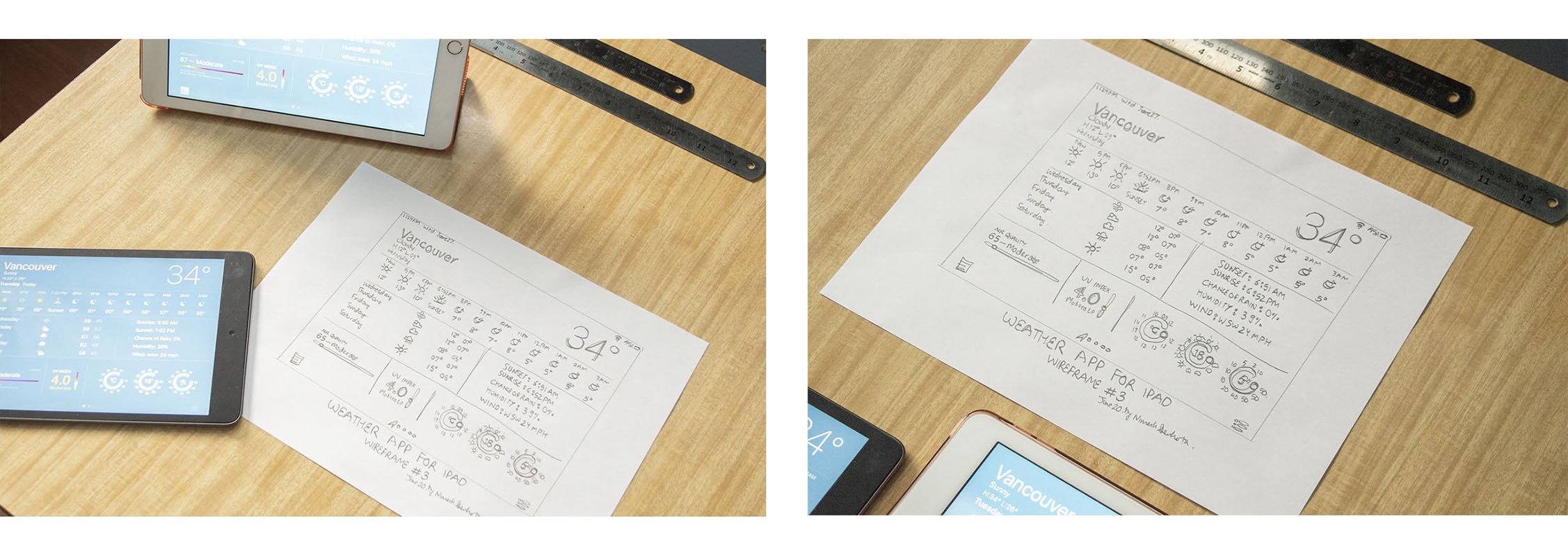
Showcasing the Version 3 of the iPad Weather app’s final design UI with that of the draft of the initial wireframe sketch on both the Regular Sized-iPad as well as the iPad Mini.
Making real-life mock-ups, and then photographing them are extremely useful in the processes. It becomes quite handy to visualize the end result(s).
I get to see how the icons/texts look while being placed on the actual iPads. I get to see the difference in the icon/text sizes when comparing it with the iPad Mini vs. the Regular Sized-iPads. One of the main issues facing the design is process is the same things might feel different while switching between different sized devices. And, this is a no-no!
I needed to make the UI look JUST RIGHT. Therefore, having consistently between multiple sizes of the iPad family was a MUST. Therefore, I tested the final UI (User Interface) on multiple sizes of the iPad for the looks and the feels. I have to say, I was quite happy with the result.
: )
This is me holding the Version 1 of the UI Design on my iPad Mini.
: )
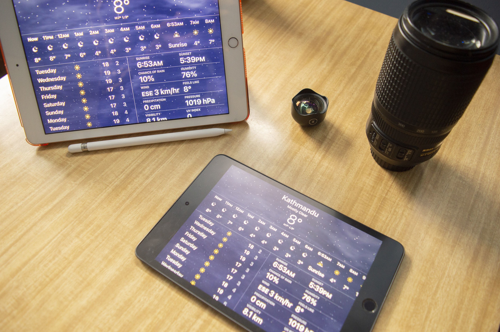
Various angles of the Version 1 of the Weather application on the Regular Sized iPad [left], and the iPad Mini [right].
: )
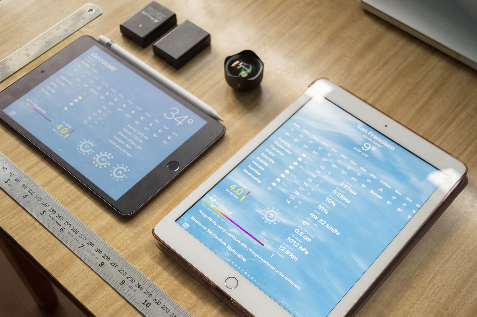 Comparing the iPad Mini’s Version 3 of the UI Design [left] on the iPad Mini with the Version 2 of the UI Design on the Regular Sized-iPad [right].
: )
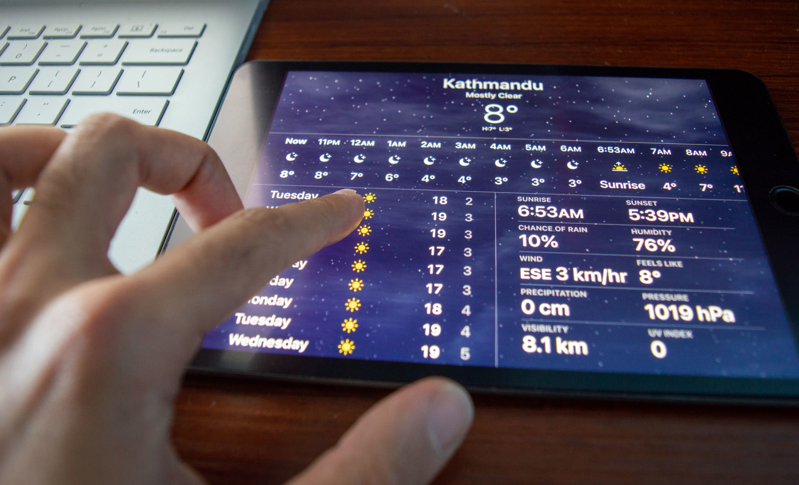
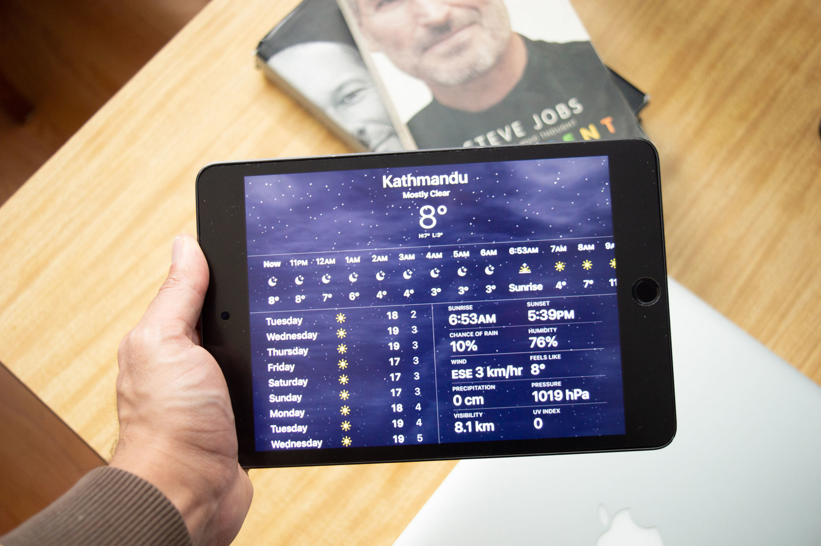
Scrolling thru the Version 1 of the Weather application on my iPad Mini.
: )
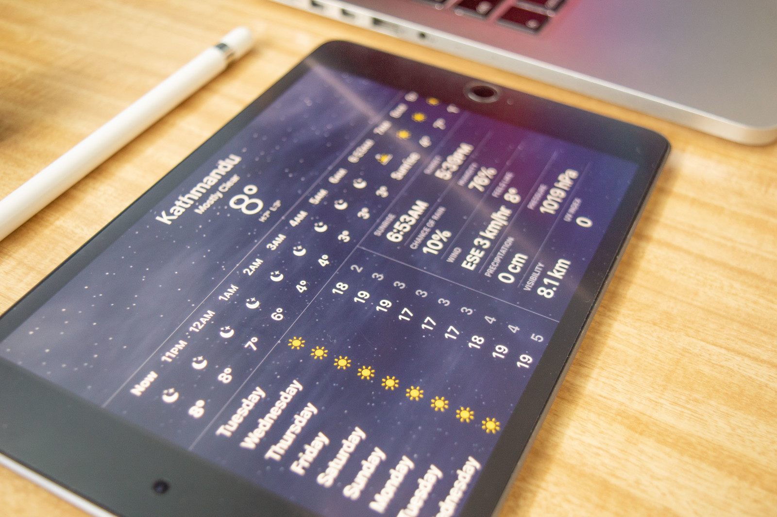 Viewing the Version 1 of the Weather app on my iPad Mini that on my desk.
: )
Here are a few of the real-life mock-ups that I have photographed, showcasing how the Weather App would look like when it is beside you in real-life. The looks and the feel have to be just right, and not only that the functionality of it has to be also on-par with the looks.
____________________________
: )

Showcased above is comparing the iPhone 7 Plus’s Weather App [left] with that of the Version 1 of the Weather app that I designed & placed on my iPad Mini [right].
Showcased above are comparing the iPhone 7 Plus’s Weather App [bottom-left] with that of the Version 2 [above], and Version 3 [bottom-right] UI of the Weather app that I had designed on my Regular Sized-iPad [above], and the iPad Mini [bottom-right].
: )
____________________________
: )
 : )
: )
The word “Experience” means to consciously perceive the world around us. And, now the phrase: “User Experience” means how does the user experience the products/services and how does it make them feel.
THIS IS THE MOST IMPORTANT QUESTION that kept lingering on my mind throughout the whole process. This went on from the research to the design. Especially during the early stages of my wireframe sketches, when I got started with putting the pencil on the piece of paper to let my creative part of the brain take over. And, with this Case Study, I have explained the thought process that had crossed my mind while doing these UX Designs — by putting myself in the shoes of the user, I was able to formulate various questions and concerns and use my designs to answer them, accordingly.
Since this was a personal project for myself, and I have been wanting to undergo this project for quite some time: I am glad that I did it.
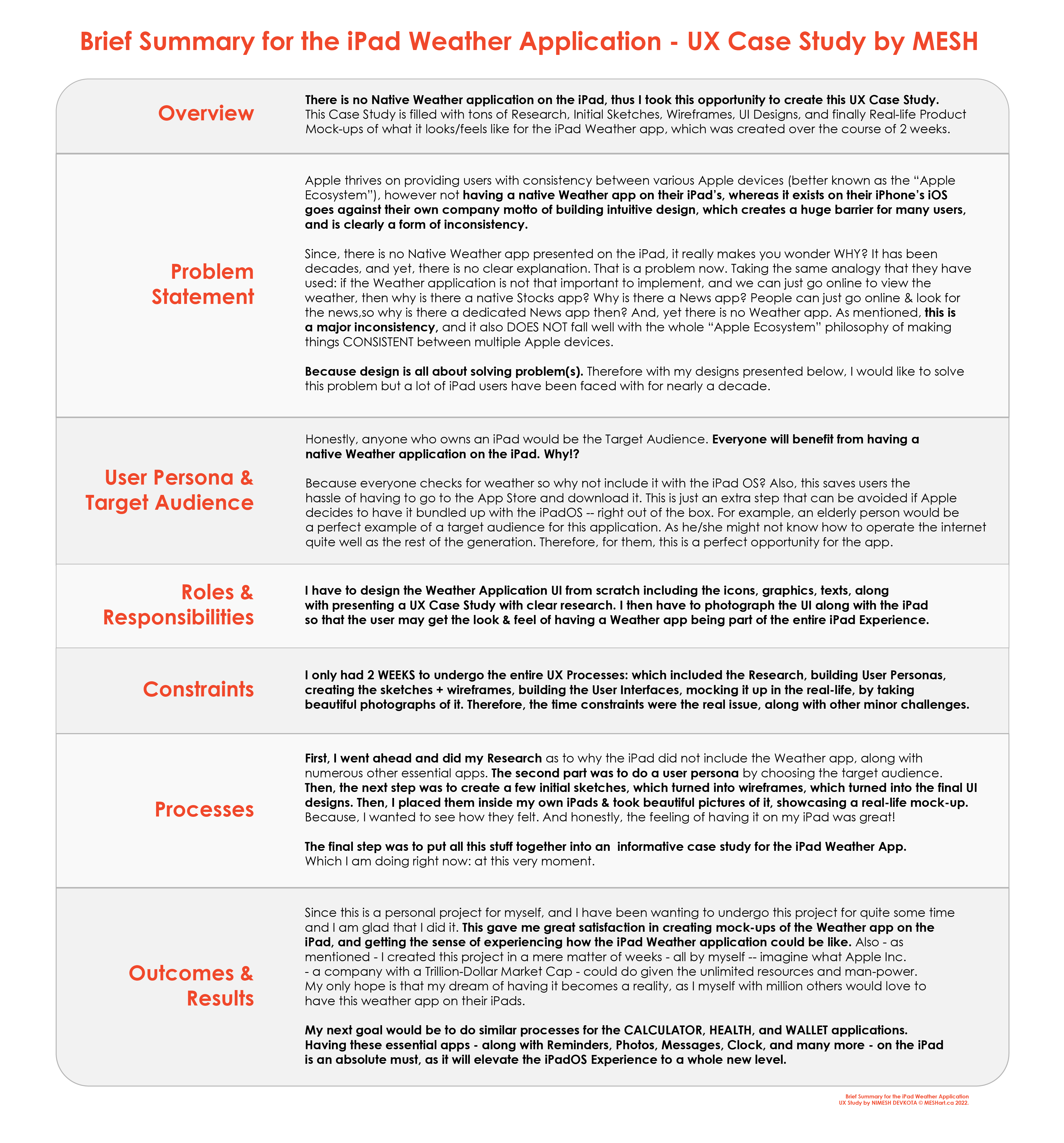
Apple thrives on providing users with consistency between various Apple devices, however not having the Weather app being natively built goes against their own company motto. The same thing that is available on the iPhone, and the Apple Watch — is clearly absent on the iPad without a clear goal, is an unwanted problem with a clear/obvious solution: building a native weather application on the iPad. Because there is no basic weather present on the iPad, it really makes you wonder WHY!?? It has been decades, and yet, there is no clear explanation. That is a problem now. Taking the same analogy that they have used: if the Weather application is not that important to implement, and we can just go online to view the weather, then why is there a native Stocks app? Why is there a News app? People can just go online & look for the news, so why is there a dedicated News app then? And, yet there is no Weather app. As mentioned, this is a major inconsistency, and it also DOES NOT fall well with the whole “Apple Ecosystem” philosophy of making things consistent between various APPLE DEVICES … Because design is all about solving problems. Therefore with my designs presented below, I would like to solve this problem but a lot of iPad users have been faced with it for nearly a decade…
This project gave me great satisfaction in creating mock-ups of the Weather app on the iPad and getting the sense of experiencing what the iPad Weather application could be like.
Also — as mentioned — I created this project in a mere matter of weeks — all by myself — imagine what Apple Inc. — a company with a Trillion-Dollar Market Cap — could do this given the unlimited resources and manpower.
My only hope is that my DREAMS of having the Weather app on the iPad becomes a REALITY, as millions of other users — including myself — would love to have this Amazing User_Xperience!
…
…
…
Craig Federighi talking about the lack of Weather, Calculator & Health Applications on the iPadOS.
I wanted to leave you with this one video that I have found online. In this video, you get to see Craig Federighi — who is the current Senior Vice President of Software Engineering at Apple, and he is in charge of overseeing the development of the iOS, iPadOS, and the Mac OS — answer the question as to why there is NO WEATHER, CALCULATOR & the HEALTH app on the iPad. In the video, he had mentioned the reasons why Apple’s Engineering team has not gotten around to building the Weather Application — amongst — others were they wanted to first build an amazing Weather application, but was unsuccessful in doing so, therefore has not put out the application yet!
Craig has been A HUGE INSPIRATION TO ME. I sometimes follow a few of his philosophies, while doing designs. However — in this particular matter — I would have to DISAGREE with him.
The important in this case would be to just get started on the project — like how did — and not worry about PERFECTION. Perfection will be achieved as you go on. During my initial stages of designing. I had many, many, many errors and mistakes. And, I know that I will make many more. However, when that fear of wanting to get perfection gets in the way of real work, there is a problem. 😖😨😱
On this page, I took the initiative of creating a Weather app for the iPad. I plan on doing the same for the Calculator / Health / Wallet apps. Which I hope will one day become a reality!
My next goal would be to do similar processes for the CALCULATOR, the HEALTH, and the WALLET applications.
Having these essential apps — along with Reminders, Photos, Messages, Clock, and many more — on the iPad is an absolute must, as it will elevate the iPadOS Experience to a whole new level.
——-
So what’s next? Here’s a sneak peak… 😉
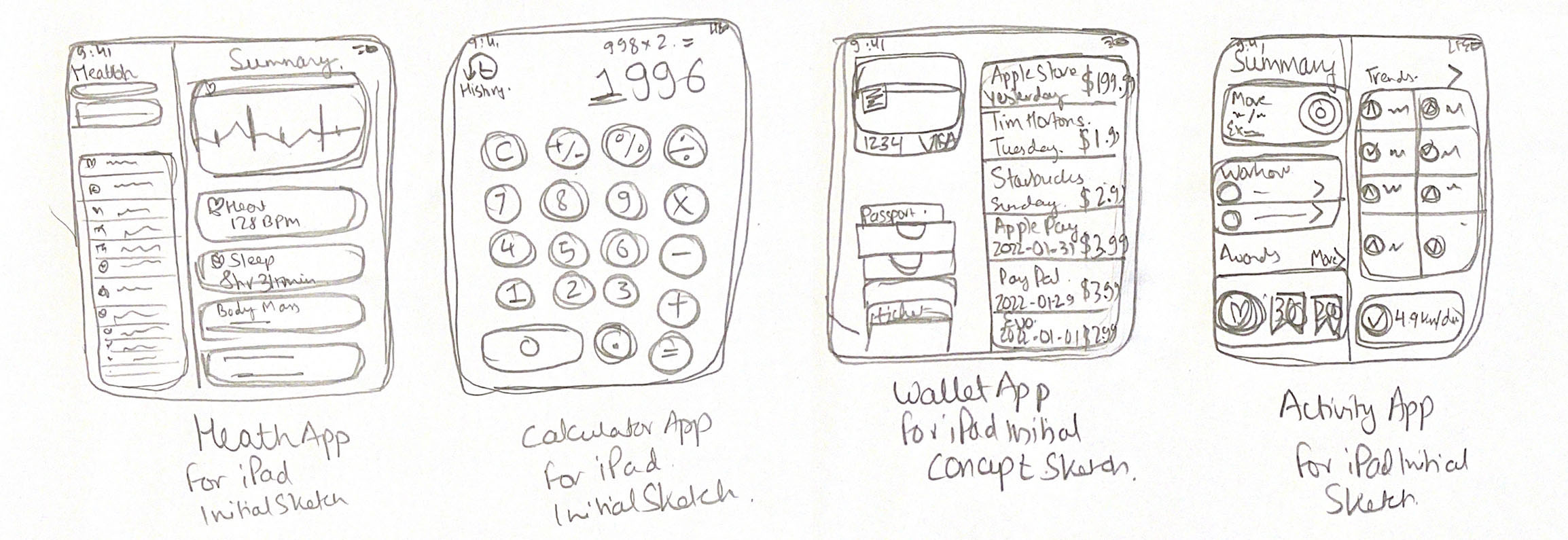
Initial Sketches I did during the Brainstorming processes in which I thought about elevating the iPadOS Experience by including these 4 apps into the iPad. In order from the Left to Right are the Health + Calculator + Wallet + Activity Application(s) for the iPadOS Experience.
Want to see more? You may do so at my other Case Study for the iPadOS 16 which is viewable here. In this page, I take everything that I have done with the iPadOS’s Native application and expand that to other applications such as the Health + Calculator + Wallet + Activity apps for the iPadOS Experience.
Link for the iPadOS 16 UX Case Study where I discuss the build of the Weather app, Health app, Calculator app, Wallet app and the Activity application for the iPadOS Experience.
: )
Thank you for visiting.
So, what did you think? If you have any questions, and/or suggestions — or if you just want to say hi — please do contact me personally by sending me an e-mail. 🤔
Feel free to come back any time.
Cheers,
MESH
____________________________
Last updated: 2022-03-02 at 17:13 PST
© MESHart.ca 2022. No Copying Without Explicit Permission.
🙂
: )
![]()