


![]()
__________________________
I want to Share My Story as to why I think the iPad Pro should get more of a “Pro-like” Software.
__________________________

This is something that Sir Jony Ive has taught me.
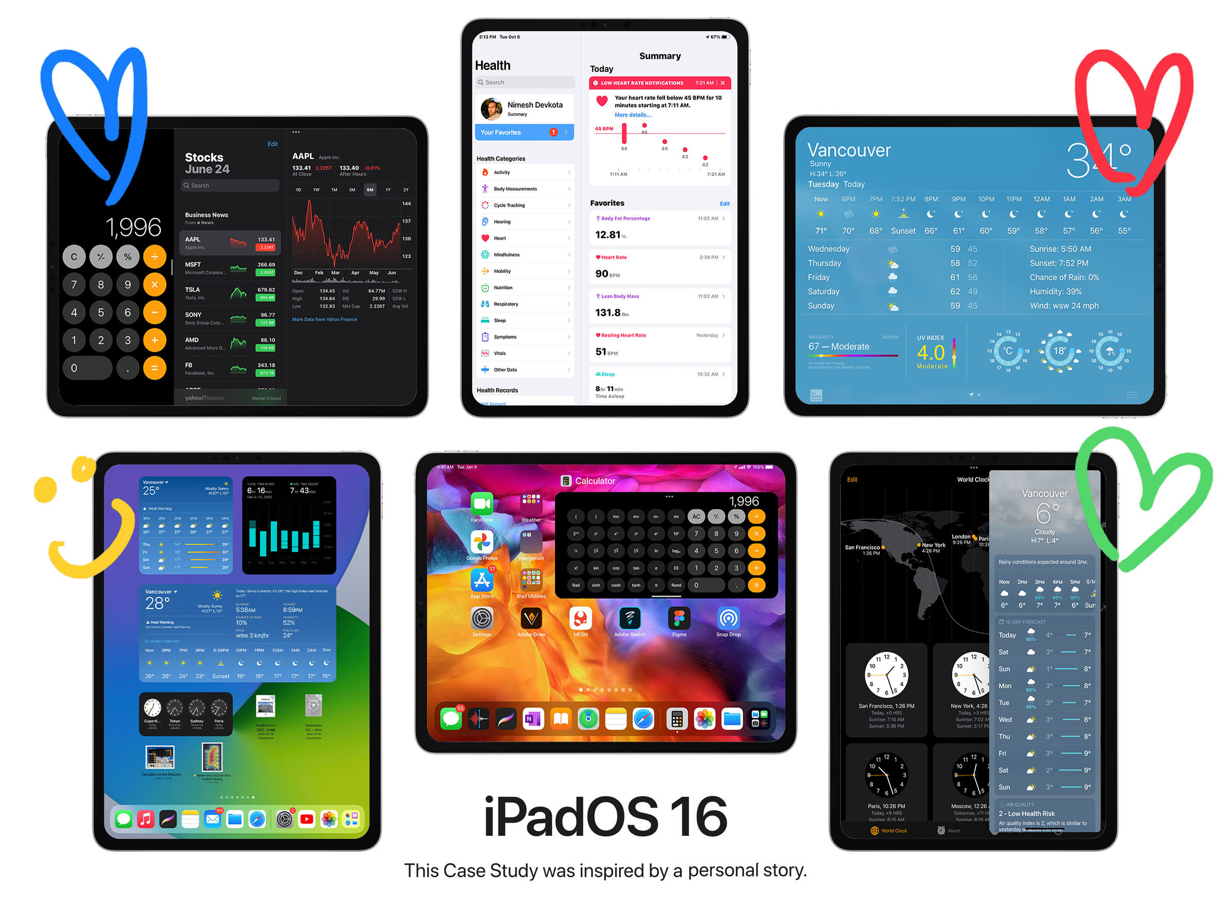
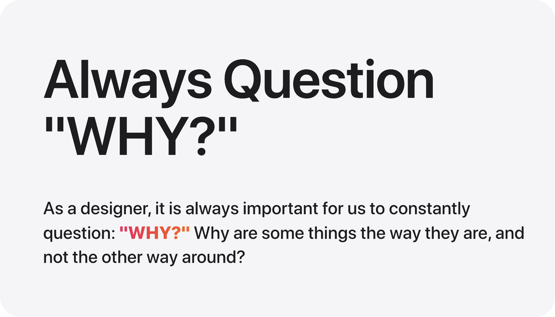
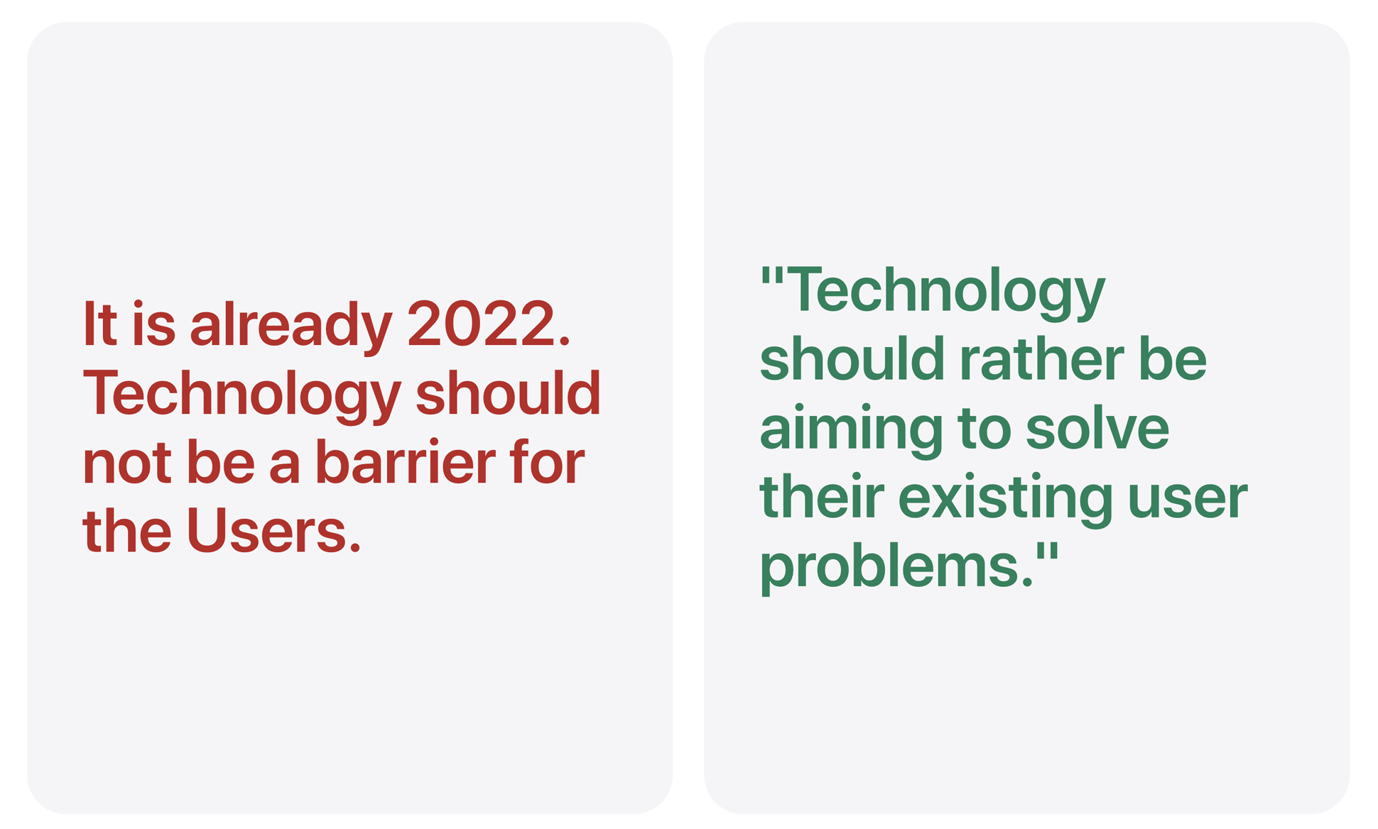
Why are there no Weather + Calculator + Health application(s) natively being included on the iPadOS Experience?
![]()
Hence, one of the greatest examples of how I have applied this very question — as a designer — in my personal life is by asking myself: “Why are there no Weather + Calculator + Health application(s) natively being included on the iPadOS Experience?” It was the absence of the Weather, Calculator, and Health applications for the iPadOS that originally motivated me towards creating this Case Study: that gave me the initial boost. Hence, I decided that I would, myself go about and create prototypes of these applications on the iPad as if they were natively created by Apple themselves. When you first get an iPad, you expect everything to appear similar to that of an iPhone iOS. But, it is not the case. You eventually realize that there are some apps available on the iPhone, but contrarily they are NOT available on the iPad, which makes you wonder WHY!? This makes you feel like, there are some things missing… And, I bet I am not the only one who has felt this way!
Therefore, this UX Project is very special to me. 🔏
Because I connect with the Designs in my personal life, and I devoted my time building this, I knew that these designs will NOT ONLY benefit me, but this will also benefit millions of iPad users around the world. The start of this iPadOS UX Research has the potential to become something ground-breaking for everyone using the iPad as their daily driver. Because switching in between devices — while you are working on the iPad — can become quite tedious, and is actually very counter-productive, and provides users with a horrible user experience, and this project removes that headache and frustrations related to the need of switching between multiple devices for something as simple as checking the weather, or calculating some numbers or checking your heartbeat using the Apple Watch while being paired with the iPad.
__________________________

During the initial stages of the research, I went online, and I Googled how many other people see the lack of Native Weather + Calculator + Health apps as an issue and a barrier, and I was surprised as to how many people felt the same way as I did. Seeing all these results made me want to build these designs and do these designs even more. Seeing hundreds upon hundreds of pages of people wanting these simple apps on their iPads made me want to create some beautiful User Interfaces even more. Since we all live on Earth, and “weather” we like it or not — pun intended — our lives are governed by the various climates on the macro-scale. We all look at the weather to get a sense of what is happening now, or what will happen either in an hour, tonight, or the next Sunday where your family is throwing a barbeque!
I have just decided to showcase these two examples, but there were just way too many online forums in which people were enraged with the lack of the Weather + Calculator + Health app(s) on the iPad.
“Apple NEEDS to build a Native Weather + Calculator + Health apps for anyone and everyone who owns an iPad.”
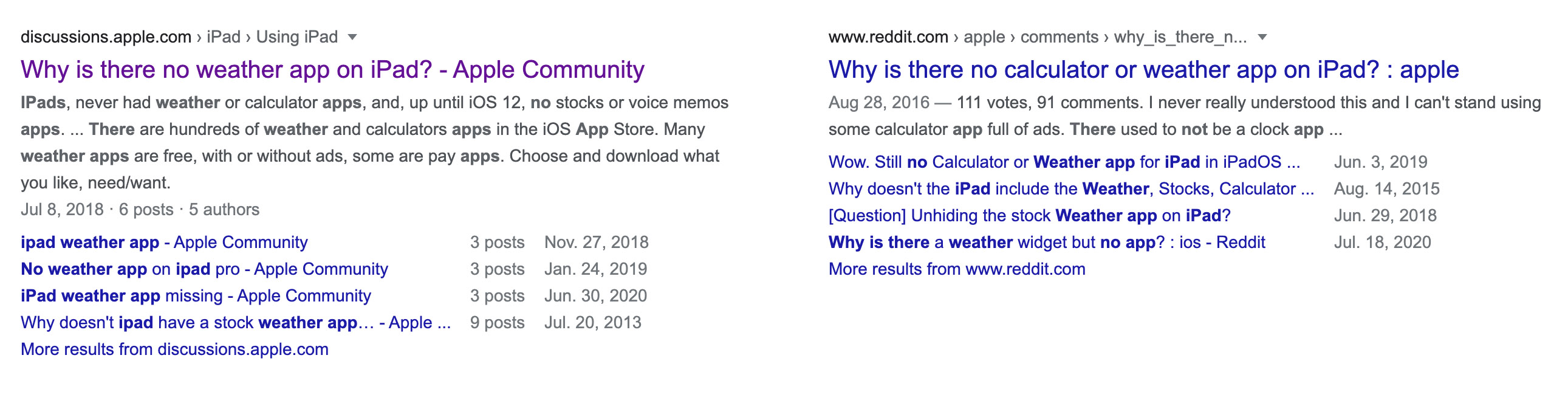
Some of these questions date back all the way back to 2013…
So why is it that Apple has not done anything for the last 9 years? I do not know the answer to that, but it does seem suspicious and it almost seems like a funny inside joke that Apple has had amongst themselves. Because, after 9 years of something still not happening, it has to be an inside joke now right? But the thing is that this inside joke is hurting their Core Users Base. Not having a feature/functionality just because of some inside joke makes the user frustrated and thus leads to a Poor User Experience. Hence the very reason behind my User Experience Case Study is to make for a Better User Experience for all users that use iPad as their daily driver.
__________________________

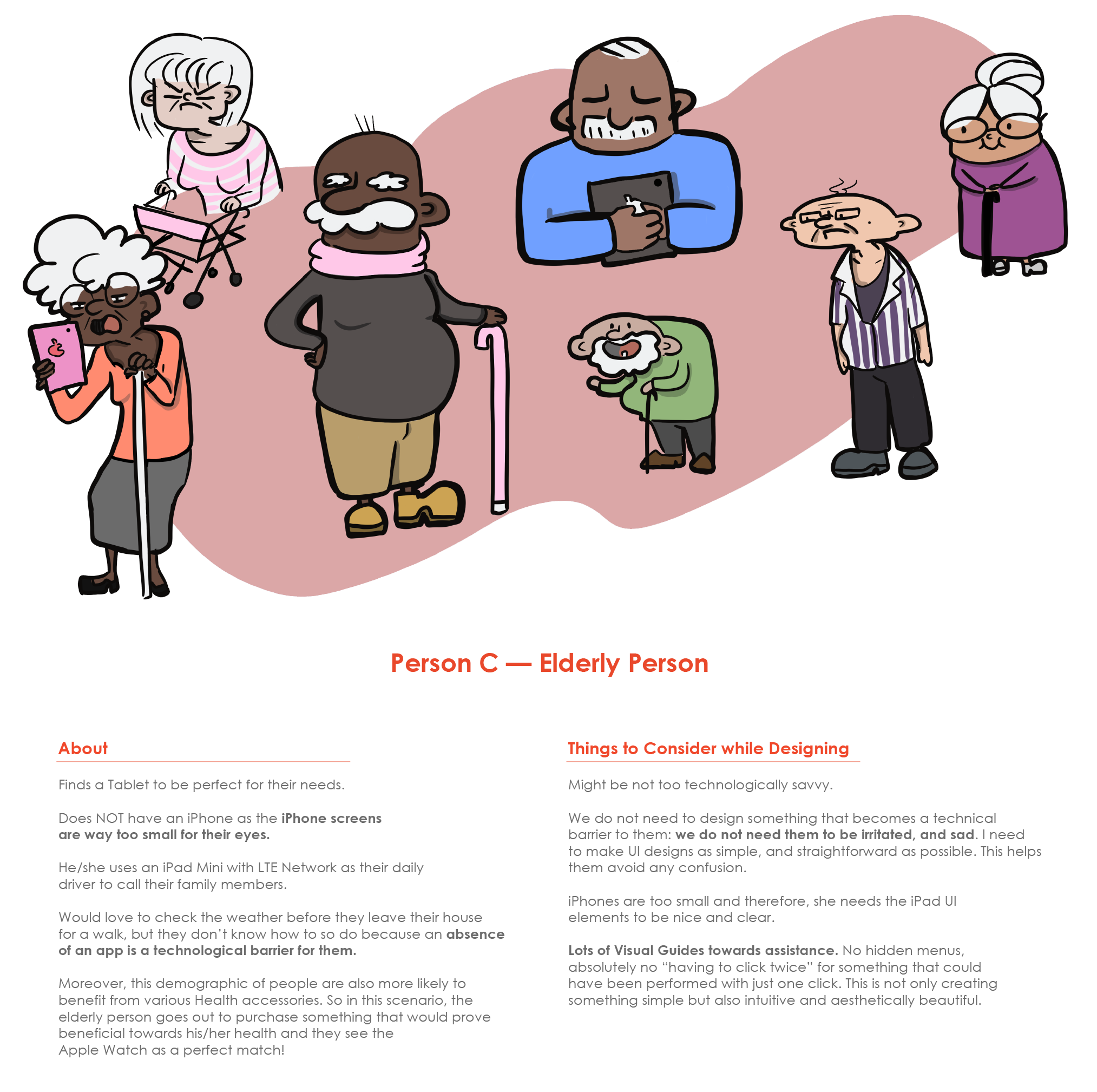
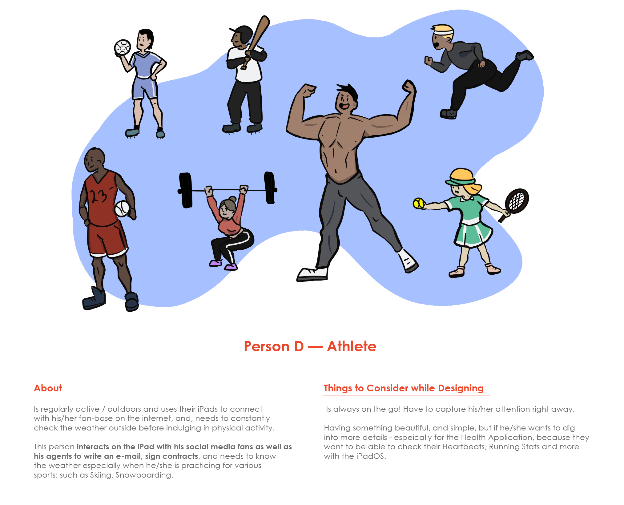
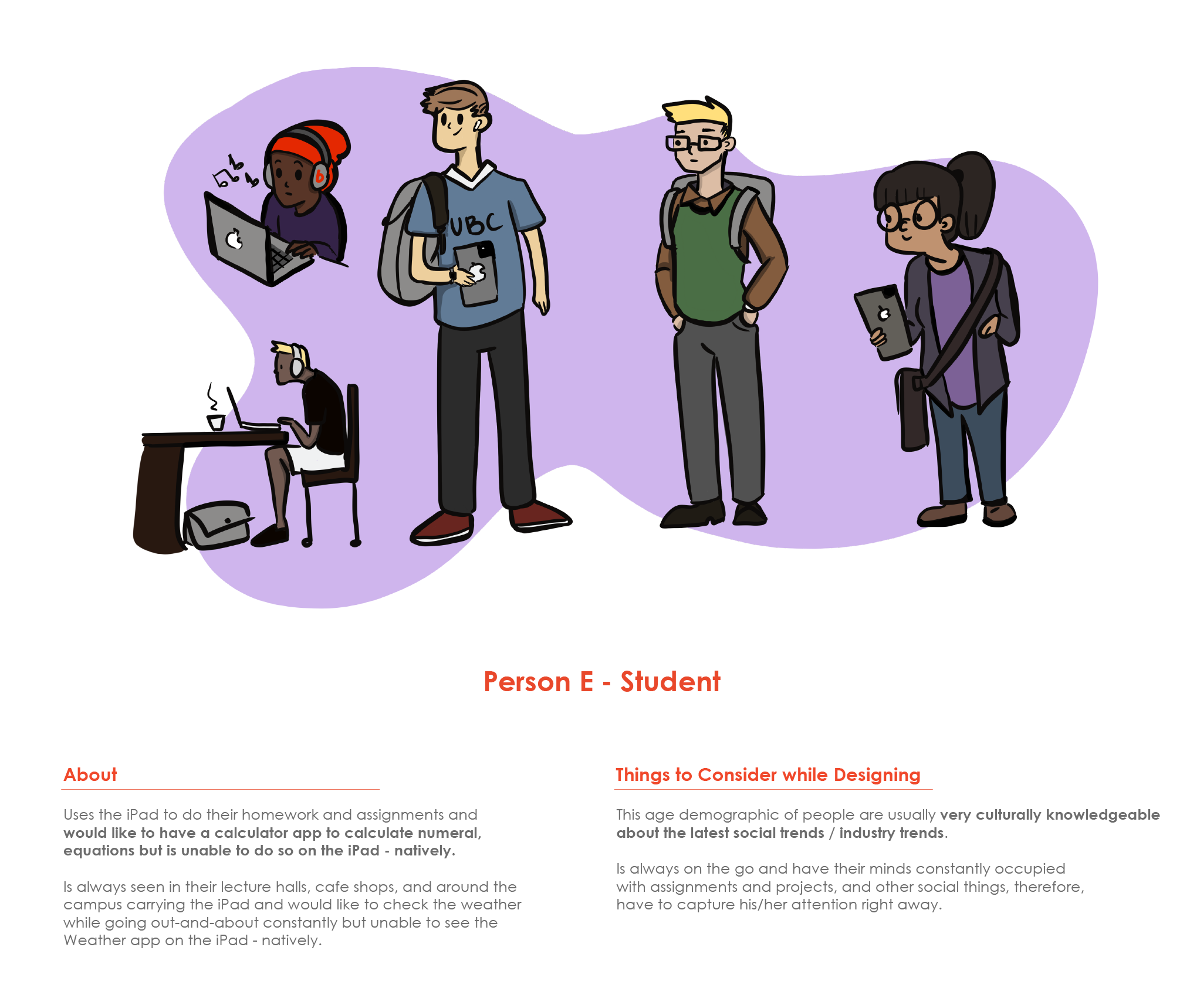
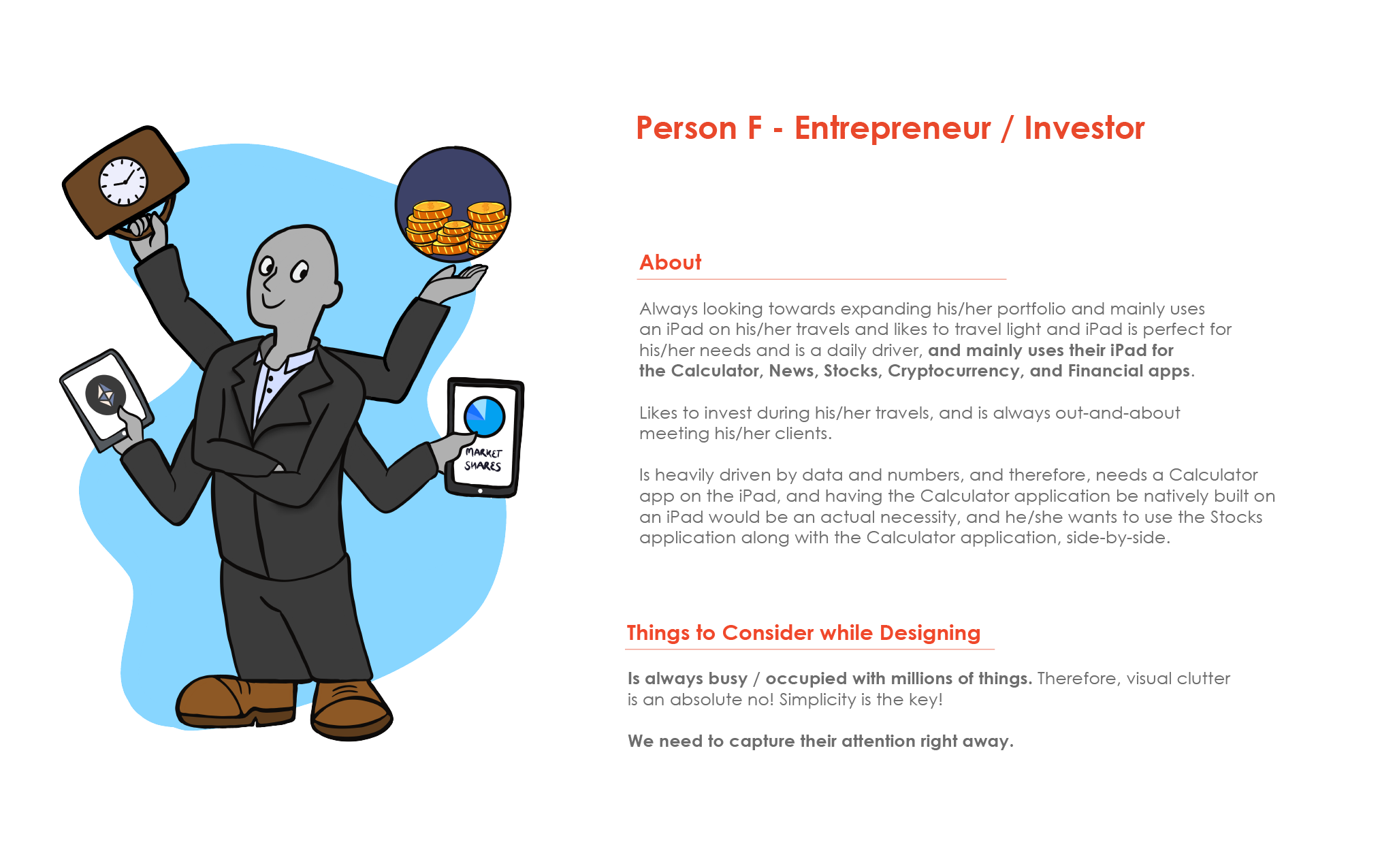
“Who am I targeting with the designs of these apps?”
Who would be the perfect candidates for the Weather application, Calculator application, or even a Health application on the iPad? Well, truth be told, anyone and everyone who will purchase the iPad would be a perfect candidate.
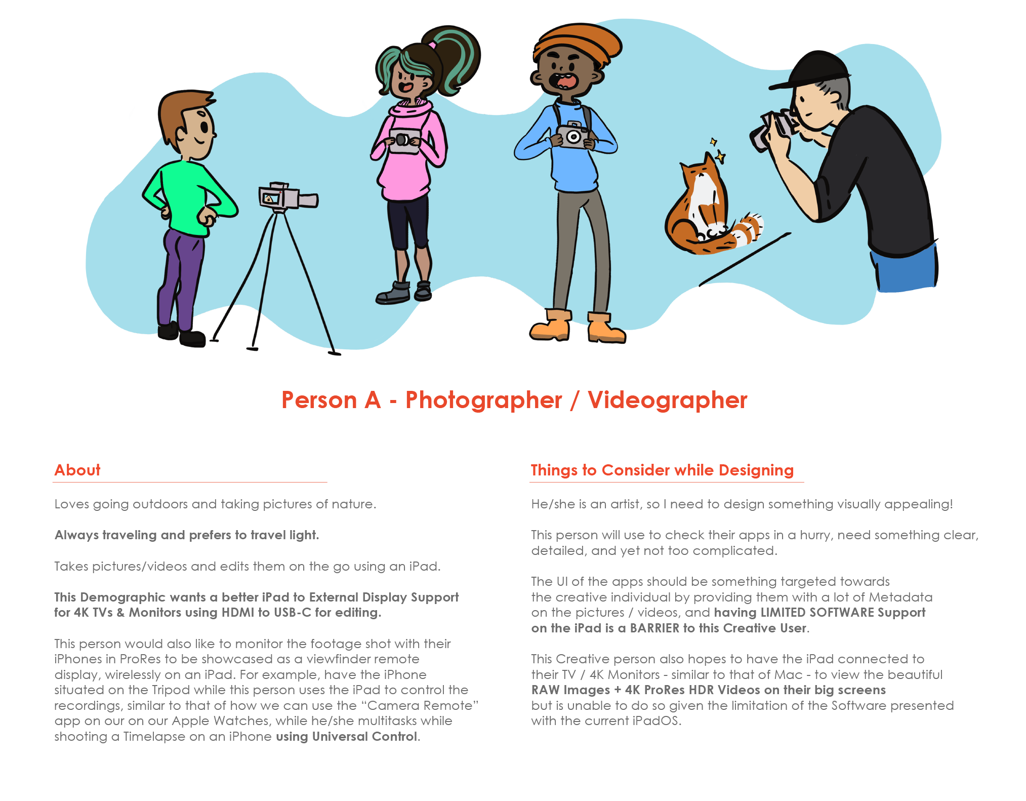
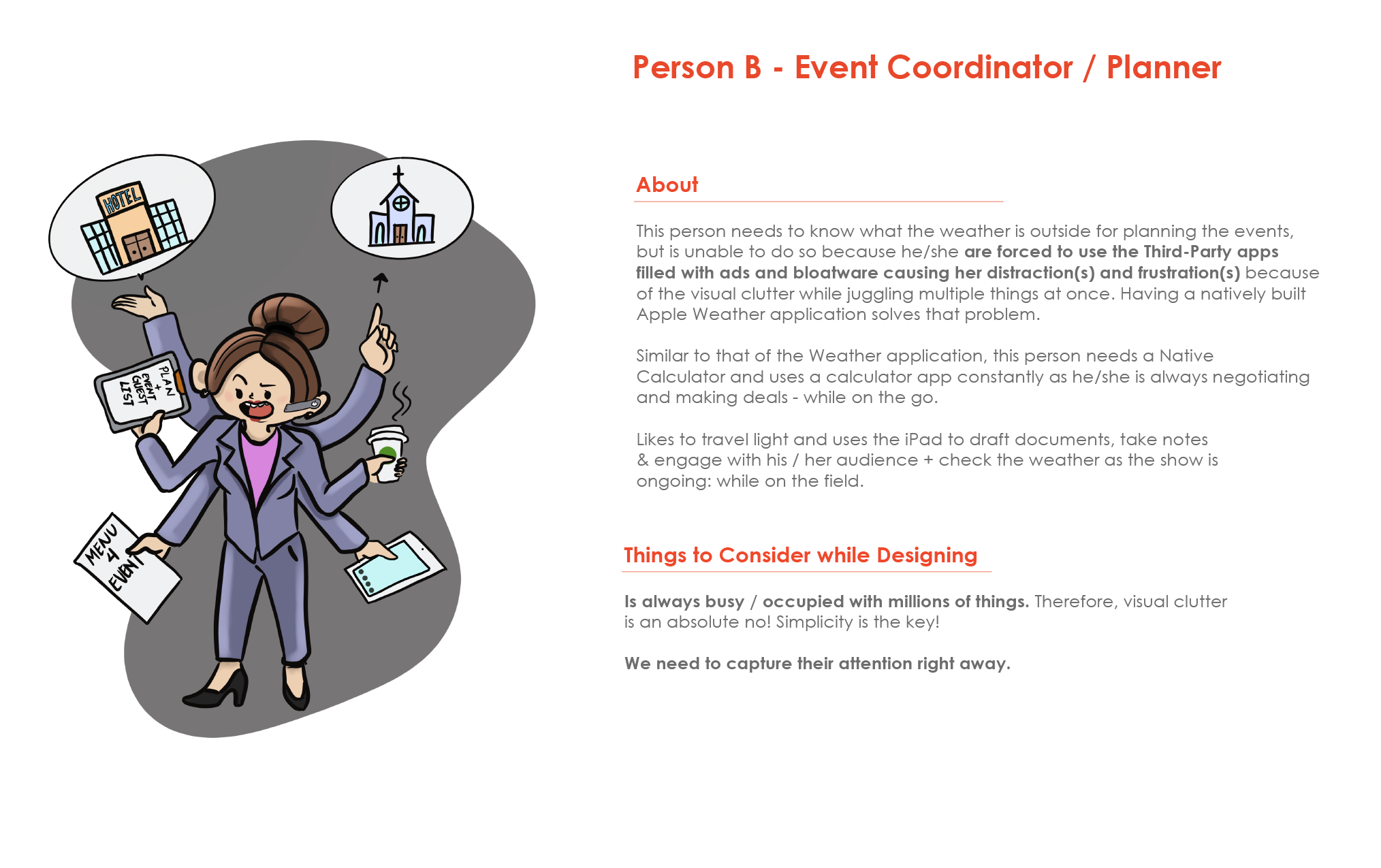
However, I will narrow my User Personas / Target Audiences to the following 5 groups, mentioned below. I am targeting these groups of people who might mainly benefit from these changes laid out in this UX Case Study because of the following reason(s):
__________________________

Let us start by comparing two of the biggest dominators in the Tablet Scene: Apple iPad vs. Microsoft Surface:

Comparing Apple’s iPad Pro 2021 [Left] with Microsoft’s Surface Pro X 2019 [Right].
Why is the iPad Pro called a “PRO” if it has the SAME Software as that of the iPad “MINI”?
At this point, Apple should really be having two versions of their software. The immensely powerful iPad Pro still runs the same Software as that of the iPad Mini even though they have totally different hardware, inside each one of them.
Read More…
Now, what you see above is just the very reasoning as to why they need to beef up the iPadOS to something even more powerful!
On the left hand, we have the iPad Pro 2021 with 8GB RAM + M1 Chipset that runs iPadOS.
And, on the right-hand side, we have the Surface Pro X with the same 8GB RAM + SQ1 Chipset that runs WINDOWS 11. WOW!! Just wow! SQ1, by comparison, runs at 1.80GHz, and then there is the iPad that has the M1 with 3.20GHz! See?
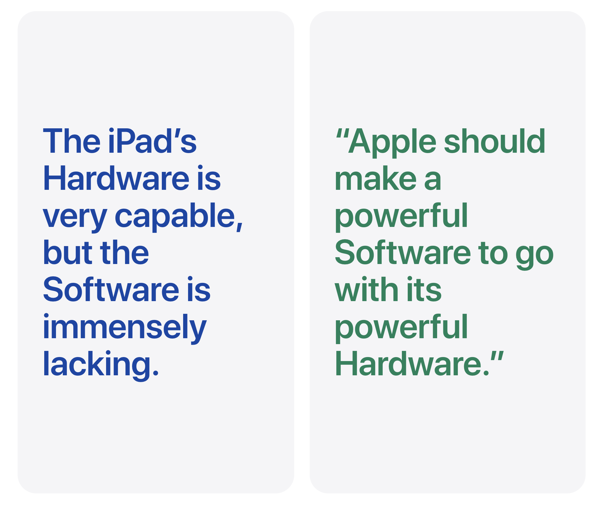
This ties so very well with the original sentences in this entire case study: Apple’s hardware is so very capable, but their Software is immensely lacking!! Apple really needs to make more powerful Software to go with their even more so capable Hardware.
The SQ1 on the Surface X is literally LESS powerful than the iPad Pro’s M1 chipset, and YET the Surface Pro X runs a full-fledged Windows 11 Operating System, and here we have iPad that runs like a giant mobile.
And, thru comparison, the M1 iPad could very well run an ENTIRE MACOS: if Apple ever allowed it to reach its full potential! People won’t be needing to jailbreak their iPad any longer! They could be running more powerful Logic Pros and Final Cut Pros on the iPad…There could be a world filled with beautiful and more powerful Software and Programs for the Pro Versions of the M1 iPads. But, nope.
The operating system has not changed ever since they differentiated the iPad OS with iOS. The iPad OS is literally like the iOS even if the name has been changed the functionality is one but the same. On one hand, you have a Microsoft running a full-fledged desktop-class operating system on their Surface tablets, and on the other hand, we have Apple with beautiful Hardware inside the iPad Pros, but their Software and the Operating System is like that of a mobile device… How does that even make sense?
We just got the SAME software that we got on the iPad mini, on the iPad Pro… How does that even make sense? The iPad mini clearly has less powerful hardware, so why is the iPad mini getting the same software as that of its predecessor: the iPad Pro 2021 with the M1 chipset.
It appears that the M1 chip still isn’t powerful enough to support a Weather + Calculator + Health app(s) for the iPad…
It is also the fact that I am a designer, right? I have a tendency to design beautiful things. I want to design things that change lives. I want to see things designed so that it would make people’s lives easier so it really hurts me deeply when I see something designed when there are things that are lacking. It hurts me deeply. That is one of the things that led me to write this Case Study.
The designs on this page are meant for the Users to feel like how the iPad should have been from the get-go. An iPad Pro has much more powerful hardware than the iPad Mini and yet when you place the same Software in both devices, it isn’t reaching its full potential and it feels like the iPad Mini is PERFECT but the iPad PRO isn’t. iPad Mini does what it needs to sign documents, take notes, browse social media, browse the internet, set reminders, you know the usual stuff. But then, you have this iPad Pro which is a beast of a machine and yet it can be doing things like editing 4K HDR videos thru Final Cut Pro, Mixing Sounds thru the Logic Pro, designing apps for the iPhone and iPad using Xcode and much more of the “PRO” stuff and here we are.
Seamless design throughout the iPad Family. From the Minis to the Pros.
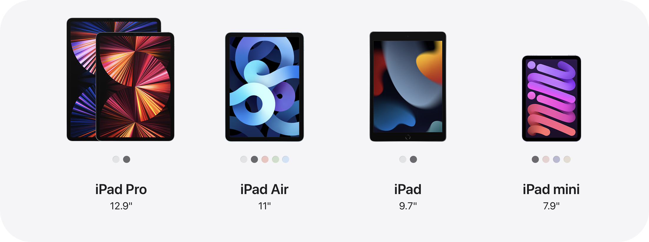
The Task is to design seamless interfaces for all of the iPad Sizes from the 7.9″ to the 12.9″ that are currently in the Market.
Before starting any of my Sketches and Wireframes, it is extremely important for me to understand various iPad sizes. iPads don’t just come in 1 size as there are multiple iPad sizes and that is what makes designing for the iPadOS that much more difficult & exciting.
Read More…
People buy iPads for very specific needs. For example, a creative people might get the iPad Pro 12.9″ to fulfill his/her needs when it comes to doing either Photography / Videography / 2D Animations / 3D Animations, because they want that extra screen real-estate plus an extra RAM from that unified M1 Chipset present with the newest iPad, whereas an elderly person might not need something that gigantic for their hands and bags, but would want something a little bigger screen than that of an iPhone, therefore, the iPad Mini 7.9″ is a perfect size for them to use as it provides them with something for them to view User Interfaces with ease without causing too many eye-strains and visual barriers.
Now, these are just some of the things that I had to consider while building my Wireframes. Buttons have to be just the right size for all iPads. Something that might be just a perfect fit for the iPad Pro 12.9″ might be too big for the iPad Mini 7.9″, and something just right for the 7.9″ might be too small for the 12.9″, so, therefore, it is crucial to get the graphic elements to be just the right size as to provide everyone with a beautiful User Experience: from Students to Creative People to an Average Joe who just happens to have an iPad.
__________________________

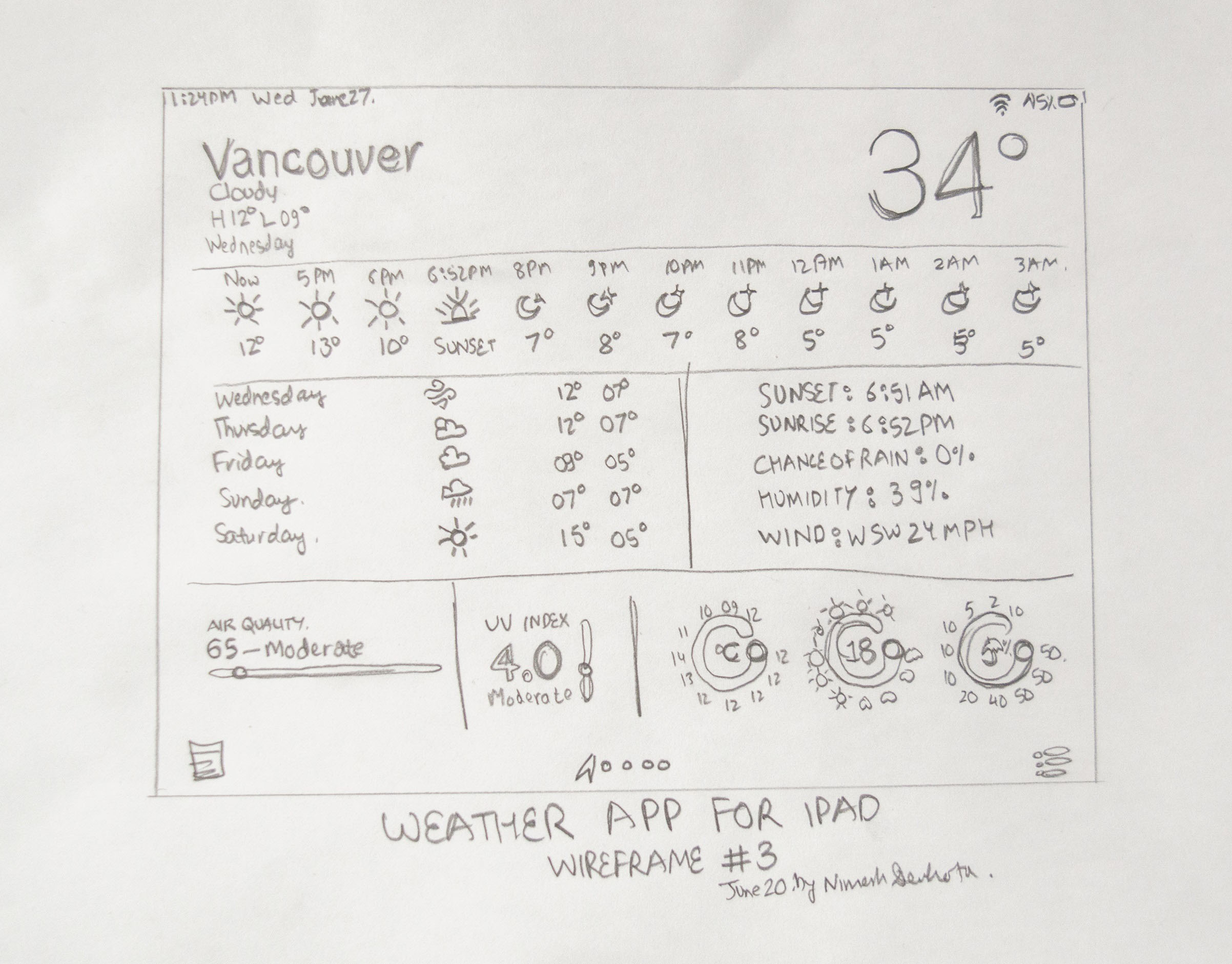
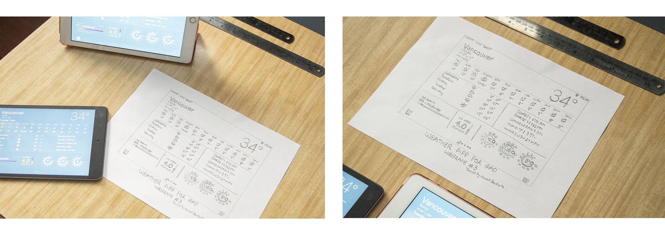
Low-Fidelity Wireframe Sketches for Version 3 of the Weather Application for iPadOS Experience.
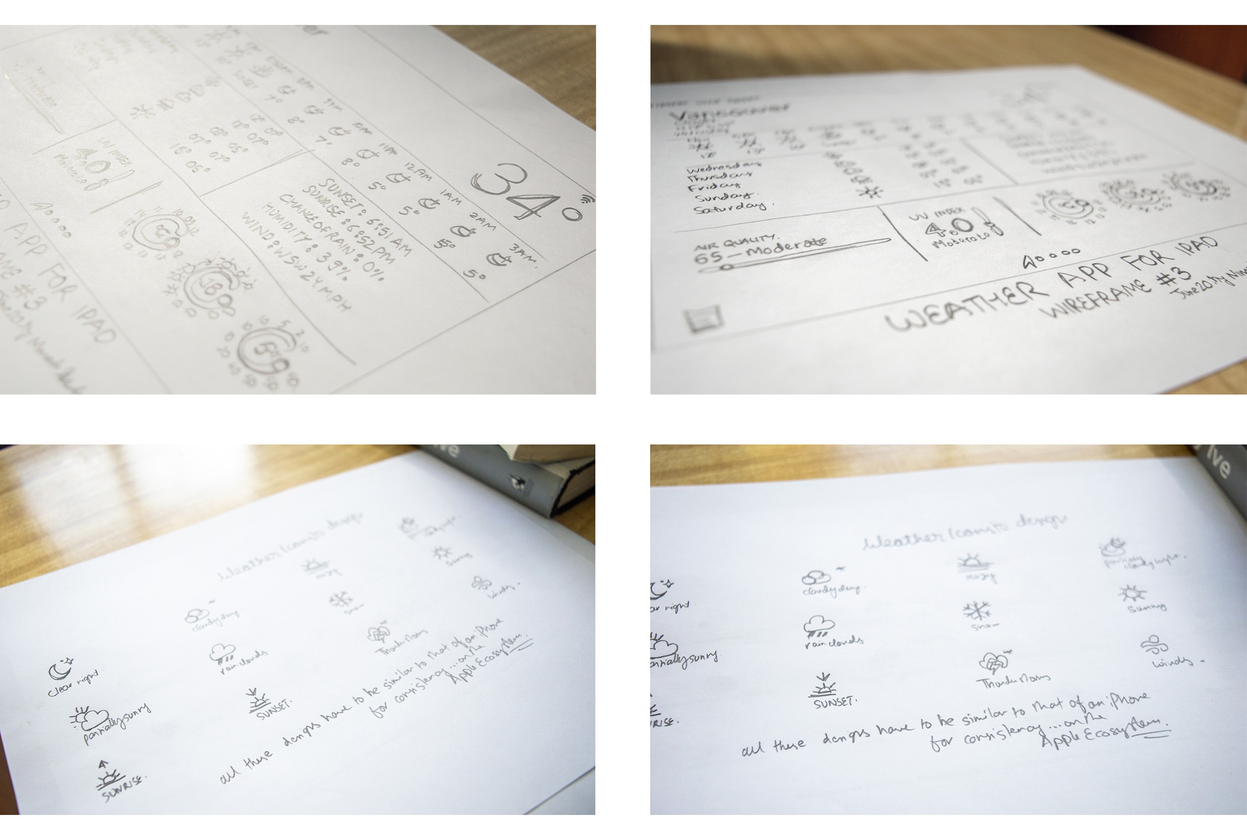
Low-Fidelity Wireframe Sketch Close-ups for Version 3 of the Weather Application [Top], as well as the Sketches [Bottom] of the Weather App Iconsets — for iPadOS Experience.
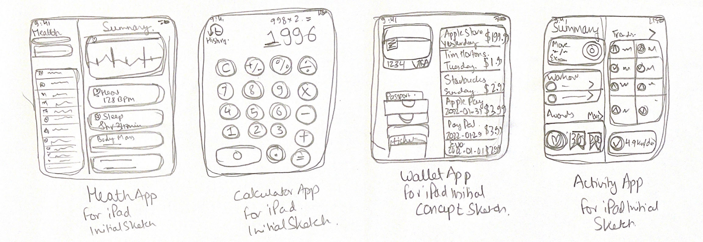
Initial Sketches I did during the Brainstorming processes in which I thought about elevating the iPadOS Experience by including these 4 apps into the iPad. In order from the Left to Right are the Health + Calculator + Wallet + Activity Application(s) for the iPadOS Experience.
These 4 sketches above changed everything!
These four Sketches are the reason why this Case Study even exists. I thought a lot about these designs. Ultimately, I ended up adding the Wallet application to the mix as well, and in due time, I will get around to creating the User Interface for both the Wallet application on the iPad as well as the Activity application on the iPad.
Read More…
I only have showcased a few important sketches on this page. Why is that? I’ve decided to only showcase the Sketches that were the most important/impactful to me while moving forward with both my User Interface (UI) Designs, as well as my Case Study.
I have added the first two designs for the Health as well as the Calculator application on this Case Study, but you might notice that I have yet not added the UI for the Wallet application [showcased above] on this Case Study. You might ask yourself why? It’s because of priority. I have faced an enormous amount of time constraints while indulging myself in this Case Study therefore, I had to prioritize my time and therefore, I haven’t gotten around to designing the User Interfaces for the Wallet Application for the iPad! But, it won’t be the case for too long as I am definitely doing so during the third week of February and will be updated on this very page once it is done.
Also, along with the Activity application, another thing they could have fully added into the iPadOS Experience was the inclusion of a Native Wallet application. So why not? No idea! There is already a way in which we can use Apple Pay on our iPads, but wouldn’t it be something if we could also keep a track of all our purchases using the iPad’s built-in Wallet application? Sigh. Let’s say I purchase something, there is right now, no way of going back on that purchase on the iPad…And, instead, I have to login into my Bank using the web to see the purchases! This is a huge blow to people that are using Apple Pay on their iPads. What infuriates me, even more, is the inconsistency. Why? Because I can do the exact same thing on the iPhone but not on the iPad? What? I have to again question: Why?
Also, throughout the entire Brainstorming, Sketching, & Designing process, I kept the following in mind:
: )
Why is that? Because consistency is everything…
We have so grown to love the iPad for more than a decade, and the design language showcased in my UX case Study should fall well into the Guidelines laid out by Apple in their “Apple Design Resources” for the Users to feel as if it was Natively built by Apple themselves. Now, let’s get into the User Interface Designs.
__________________________

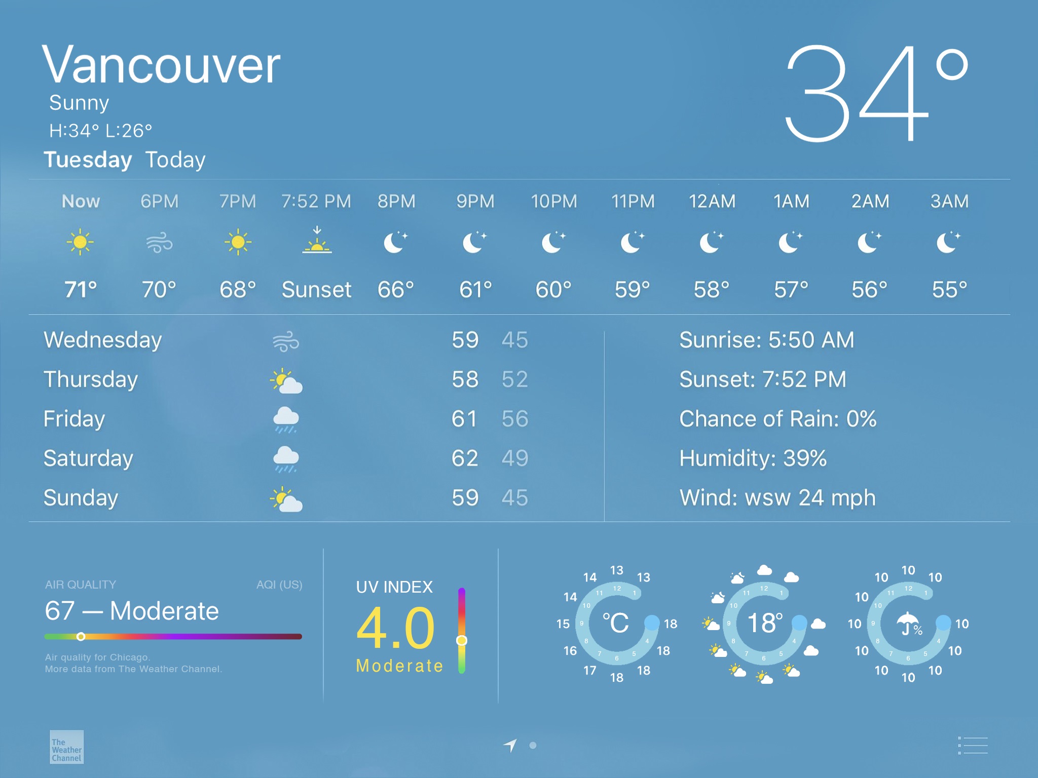
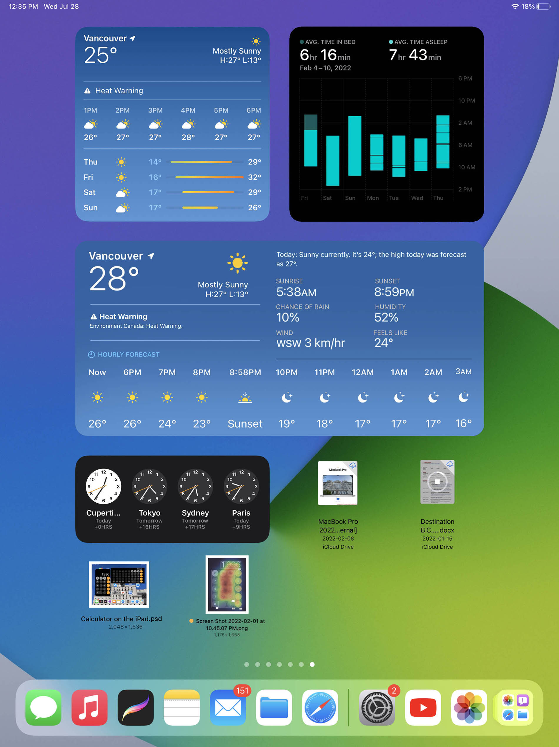
Weather Application User Interfaces for the iPadOS 16.
A New Landscape Mode User Interface featuring the Air Quality, UV Index, Apple Watch styled graphics, and overall weather conditions are both listed by the hour and the day all in one beautiful single page with lots of visual hierarchy.
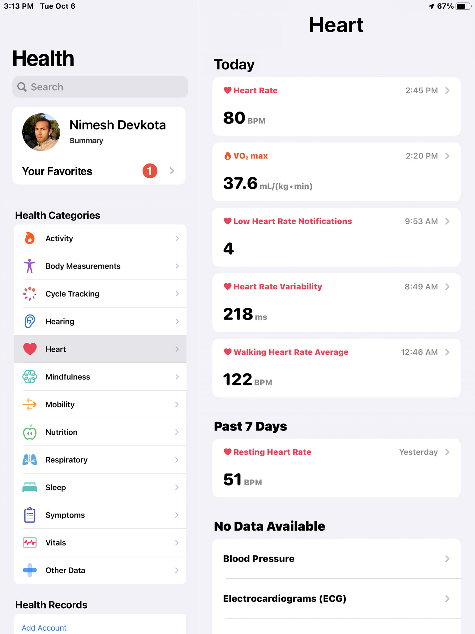
Health Application User Interfaces for the iPadOS 16.
Concepts UI Design(s) & Renders showcasing the Health application for the iPadOS 16 with Heart-Rate, Body Fat %, Sleep Data, and many more for the Apple iPadOS.
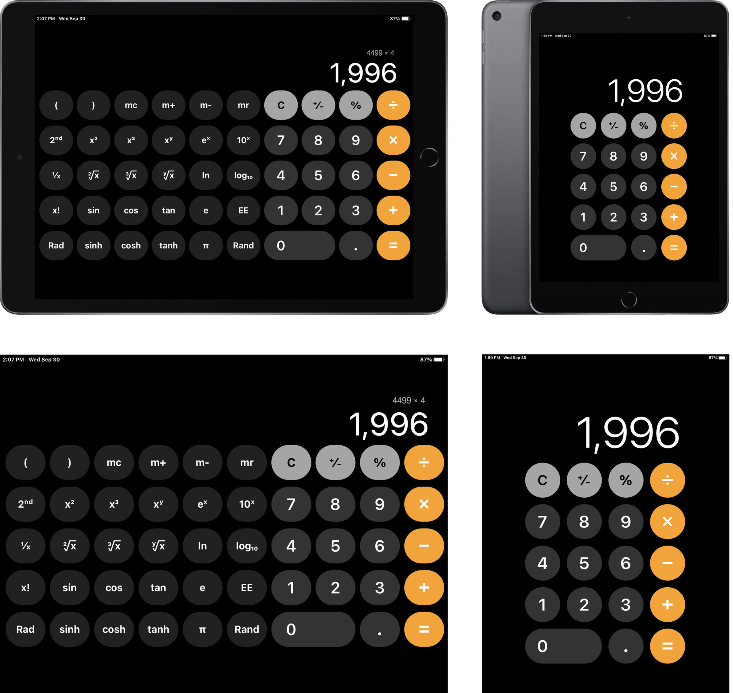
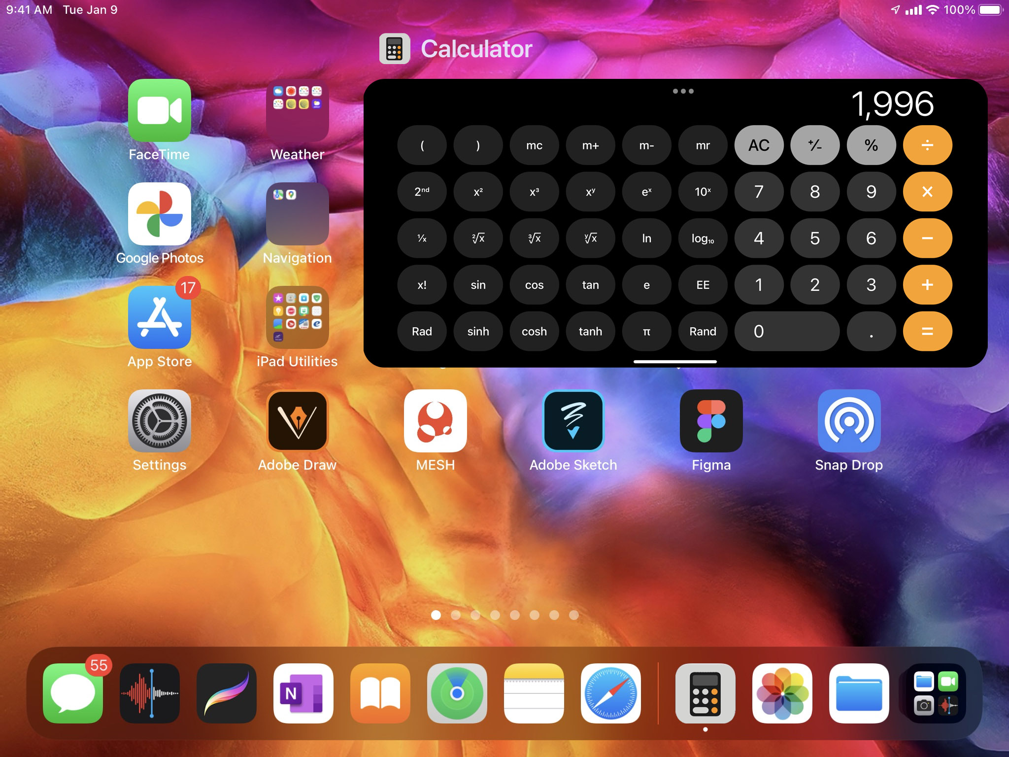
Calculator Application User Interfaces for the iPadOS 16.
User Interface Designs + Renderings of the UI inside the iPad Mini showcasing the Calculator application on the iPadOS 16 with basic arithmetic calculations with the standard / scientific calculator.
And, showcased above are more of the other UI mock-ups that I have done for the Calculator app to come into the iPad negatively. Let’s say for example I am working on a document or something that requires me to quickly calculate some time or calculate some numbers, having to switch to my iPhone just so that I can calculate simple things are just a hassle why can’t it natively be built in the iPad so I do not have to leave the device.
We keep saying that the NeXT version of the iPadOS should set the iPad free. But, time and again — year, after year —we are continuously disappointed as to why it is not achievable…and Apple does not listen to us.
__________________________

__________________________
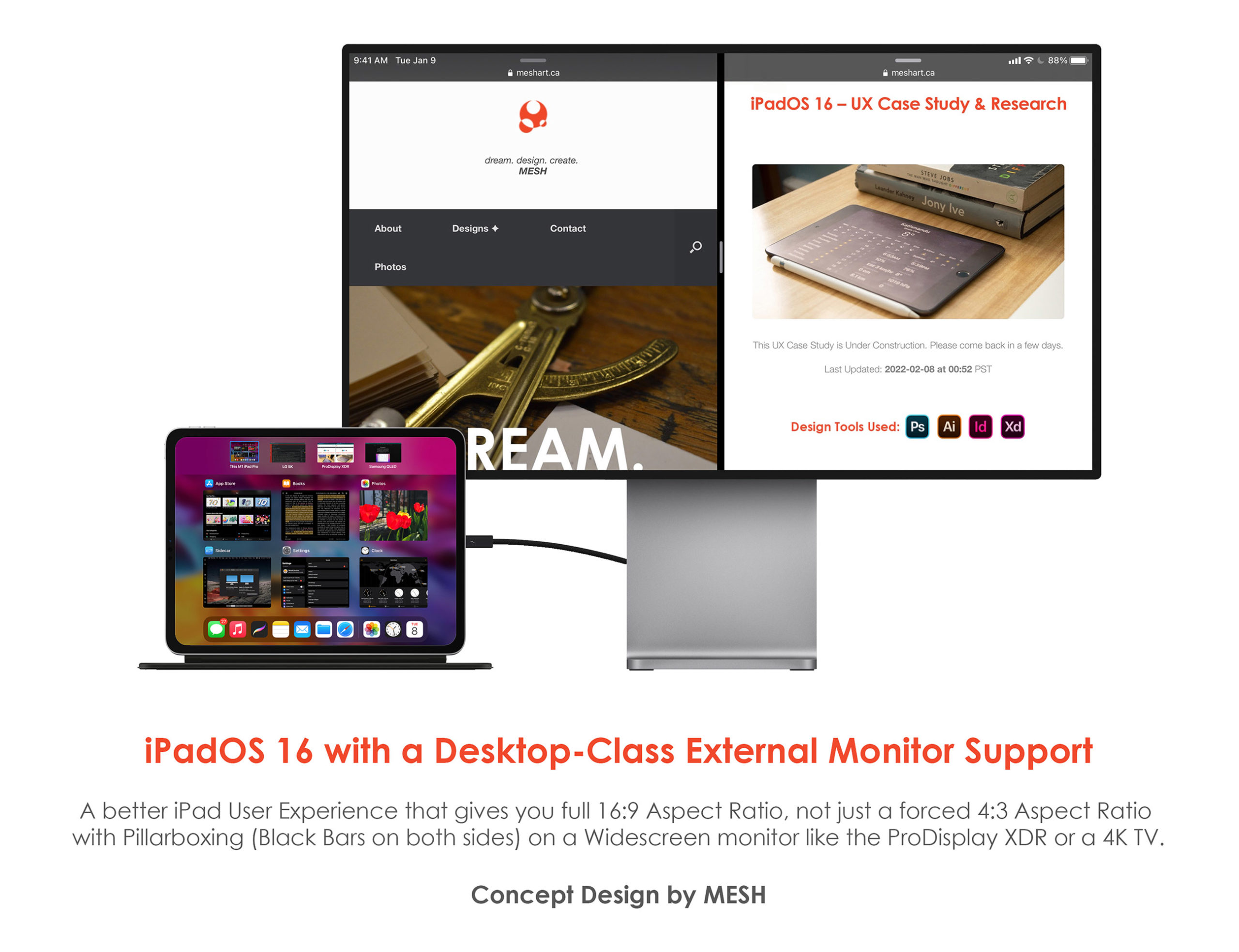
A Desktop-Class External Monitor Support on an iPad?
Yes, Please!!
iPadOS 15 has a very bad External Monitor Support, DOES NOT allow you to Extend your iPad’s Display and you have to view the same thing you see on the iPad on the Monitor, and thus this is counter-productive, and it also forces your iPad to output in 4:3 Aspect Ratio by placing giant Black Bars (called “Pillar Boxes” on both left + right sides), and this cuts your content on your External Monitor’s Screen.
Amongst many, many things discussed over this entire UX Case Study, one of the main things that are clearly lacking is better External Monitor Support. When I connect my iPad to the 4K Monitor/TV, I get what is called a Pillar Box and that’s not a good “PRO” feature that someone expects from buying a “PRO” labeled device. As stated above, a less expensive Surface does a better job than the iPad Pro.
Now, let me take this paragraph to explain what I have done above: I have made the iPad Pro behave more like the iPad Pro! How? I have showcased on the Concept UI above that the iPad is now not only bound to mirror its displays but now, it is also capable of Extending the DIsplay by covering an entirety of the External Monitor/TV. Now a creative user like myself does not need to suffer when trying to multi-task between multiple devices and utilize the device’s full potential. I am showcasing how the iPad is viewing a picture while checking the time, reading a book, going thru the Settings, and using a Sidecar feature (by making my iPad’s display as the Extended Display for the iMac or the MacBook Pro all while extending its display to the ProDisplay XDR to view my Websites on the left as well as the right. NOW, THIS IS A PRO DEVICE !!! When the Software and the Hardware all work seamlessly to provide an amazing User Experience!
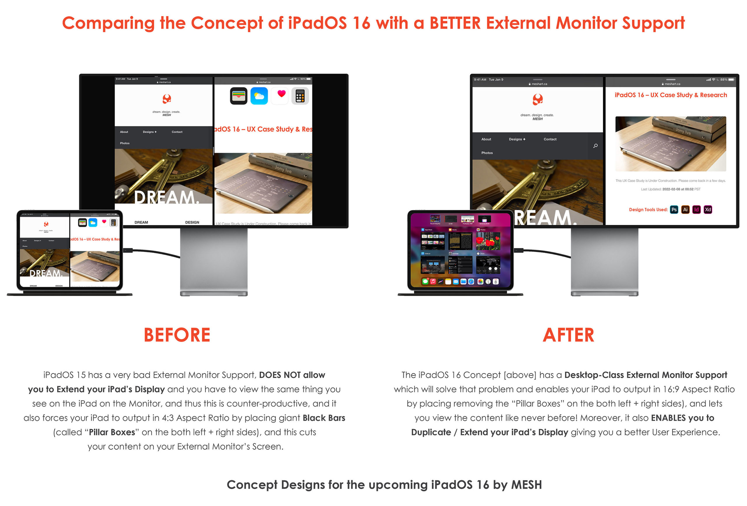
The iPadOS 16 Concept [above on the right] has a Desktop-Class External Monitor Support which will solve that problem and enables your iPad to output in 16:9 Aspect Ratio by placing removing the “Pillar Boxes” on both the left + the right sides), and lets you view the content like never before!
Moreover, it also ENABLES you to Duplicate / Extend your iPad’s Display giving you a better User Experience.
You have no idea how many times I have been super frustrated that I am not able to Extend my iPad’s Screen onto my LG 4K Monitor, or I am not able to connect my M1 iPad “PRO” onto my Samsung QLED and view the beautiful 4K HDR footage taken with my iPhone 12 Pro Max and not be able to see it in it’s full-on Dolby Vision Glory! WHY is that a device that’s labeled as a “PRO” not catering towards “PRO” Users like myself? But, wait, I am not even remotely close to being done just yet! Better buckle up the seatbelt, it’s safer that way. Hold on.
Widgets = Full-on Apps? Yes, Please.
WAIT… Let’s take it one step even further by adding Files to the Home Screen!!
Files on the Home Screen & Full-Sized Widgets for Weather Application.
Full-sized Weather Widget with Data-Rich Information(s) [above]
What about iPad Widget(s) that are ACTUALLY a full-fledged application? WOW! Imagine being able to have a full-sized Widget like the ones we already have for the Apple TV as well as the Apple Photos application? This could actually replace the NEED for the Weather application entirely! That is if Apple actually decided to implement them into their iPadOS Experience at all.
Also, as a bonus, I have also designed individual files being able to be placed on the iPad’s Home-screen. In this case, Photos and Photoshop files are on the Home-screen. Without ever needing to even open the Files app on the iPad. This can be any common files like JPG, PNG, PSD, MOV, MP4, M4A, DOCX, and many, many more!! This will truly make iPad a Desktop-Class Computer, finally!
or…
What about Fly-over iPad Application(s)?
Fly-over UI App Concept(s) for the Calculator application on the iPad [showcased above].
Let us say that Apple isn’t willing to give us a full-screen Calculator application for the iPad Experience, they could at least give us an option to give us a fully-functional Calculator application like that of the iPhone. No just like something like that of the iPhone. but instead, exactly like that of the iPhone. this would not only bring about consistency between various Operating Systems, but it will also bring about uniformity and thus a better User Experience and feeling.
Now, think about this: What about being able to quickly calculate your Stock Earnings with a Calculator Application side-to-side with that of the Stocks Application on the iPad? This shouldn’t Rocket-Science. This should be as simple as 1 + 2 LITERALLY, using the Calculator app on the iPad, oh never mind it is 2022 and we still can’t do that on the M1 Chippped iPad “Pro”…
Tapping on the 3 Dots (Multi-tasking Gesture) will bring about options to put the calculator into the Scientific Calculator UI [showcased above].
More, More, More…
Did someone say: “Multi-tasking”?
I sure did.
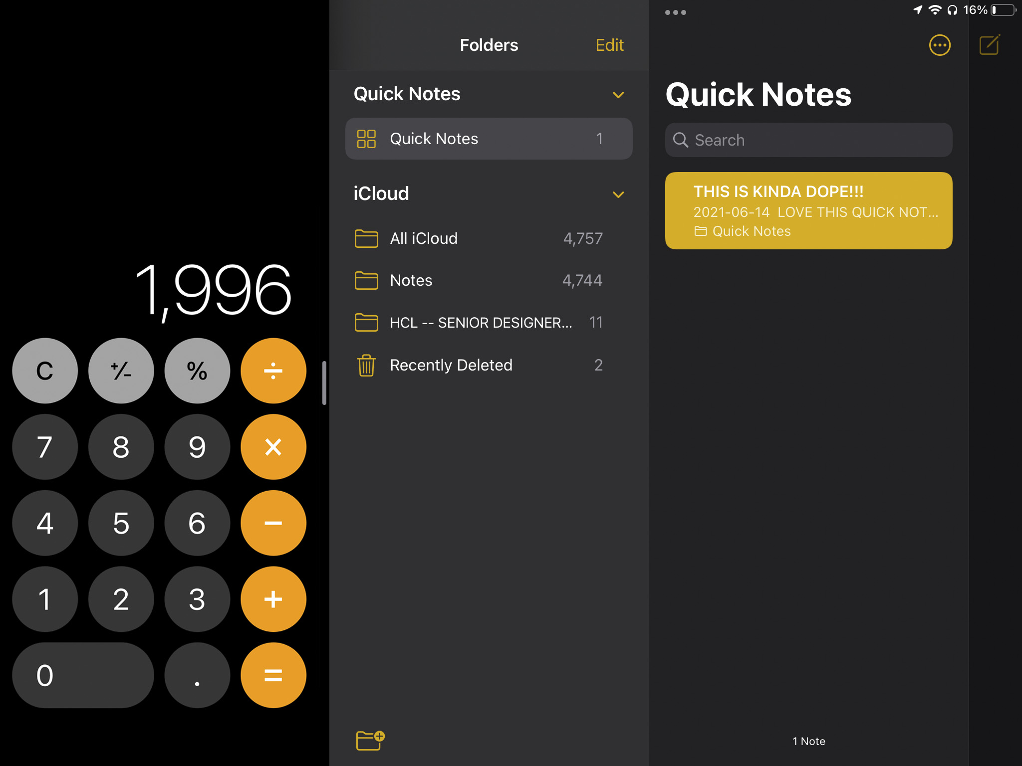
Multitasking with Weather Application in the Slide-Over Window on top of the Clocks application on the iPadOS 16.
Split-view Multitasking Window Concept(s) for the Weather application as a Slide-Over Window on top of the Clocks app [above], showcased for the upcoming iPadOS 16.
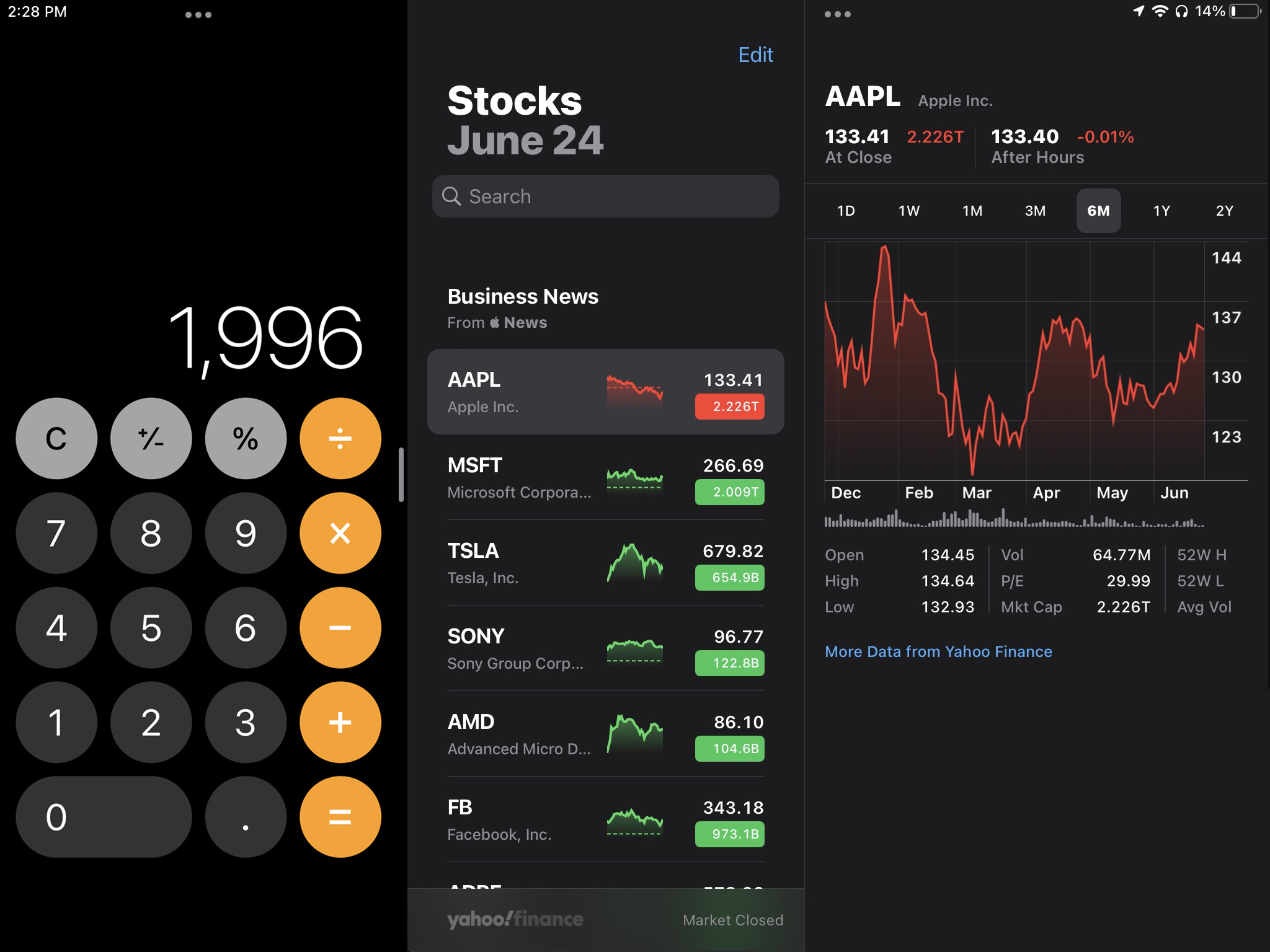
Multitasking with the Calculator Application + the Stocks Application on the iPadOS 16.
Split-view Multitasking Window Concept(s) for the Calculator application side-by-side with that of the Stocks app [above], showcased for the upcoming iPadOS 16.
Multitasking with the Calculator Application + the Notes Application on the iPadOS 16.
Split-view Multitasking Window Concept(s) for the Calculator application side-by-side with that of the Notes app [above], showcased for the upcoming iPadOS 16.
More, More, and Even More…
But, wait… I’m not done.
Just yet.
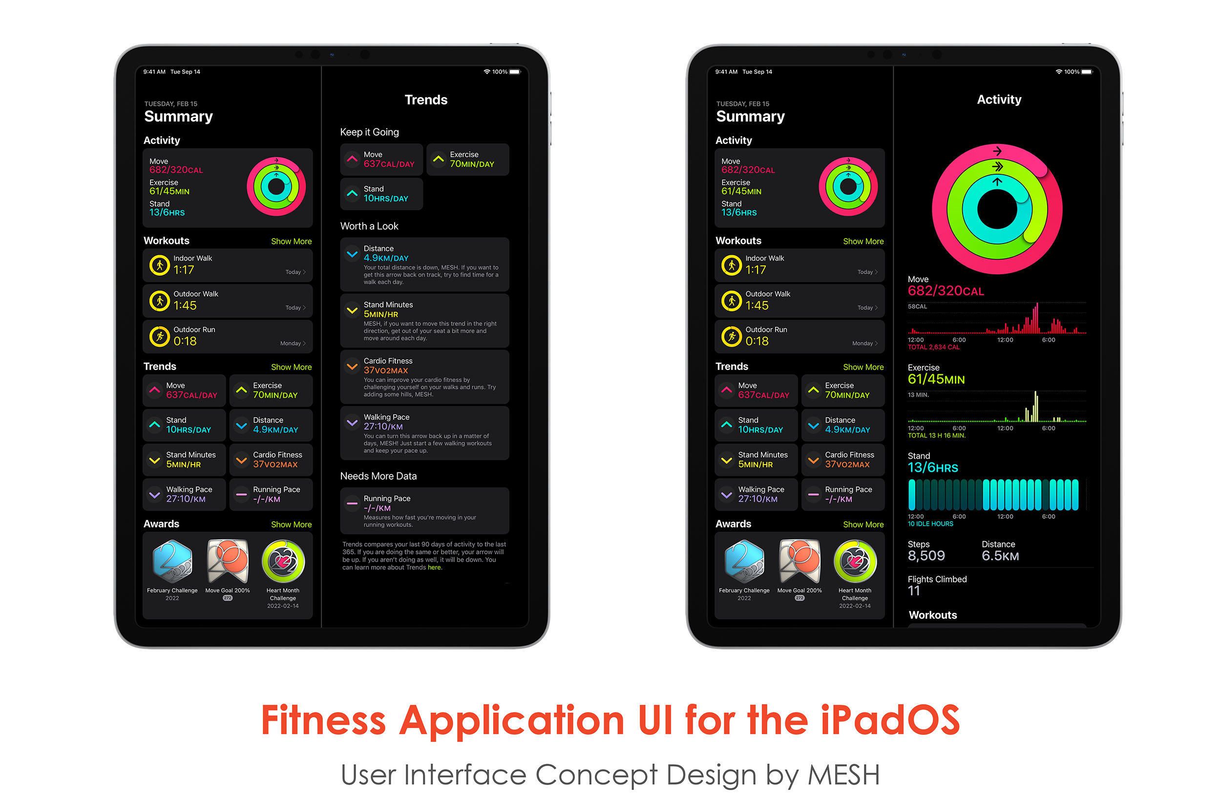
Fitness Application UI Concept [above] with Data-Rich User Interface for the upcoming iPadOS 16
I would like to take this moment towards talking about this gorgeous Fitness application Concept UI I did for the iPadOS 16 that is very data-rich for the Users to sit back during the end of the day and browse all of the workouts that he/she for the day.
Going back to the User Personas, this Fitness Application on the iPad will be EXTREMELY handy for our Elderly Age Demographics. Since this Age Demographics mainly finds the iPhone to be too small and instead finds the iPads to be perfect for their eyes, this will be a very suitable add-on. they are the age group that would most benefit from any Health-Related Wearables like the Apple Watch and therefore, having both the Health application as well as the Fitness application showcasing your “Activity Rings” with Move / Exercise / Stand, your most recent Workouts, your Trends as well as your Awards will be extremely powerful and impactful for the Users.
We already have the Fitness application available on the iPad. When Apple announced the Fitness+ but honestly them not adding the Activity application on the iPad just seems like something they could have accomplished, but they didn’t. There was a real opportunity to have made that into reality… But as always, Apple is baby-stepping their decision(s), which ultimately hurts their customers in the Present.
__________________________

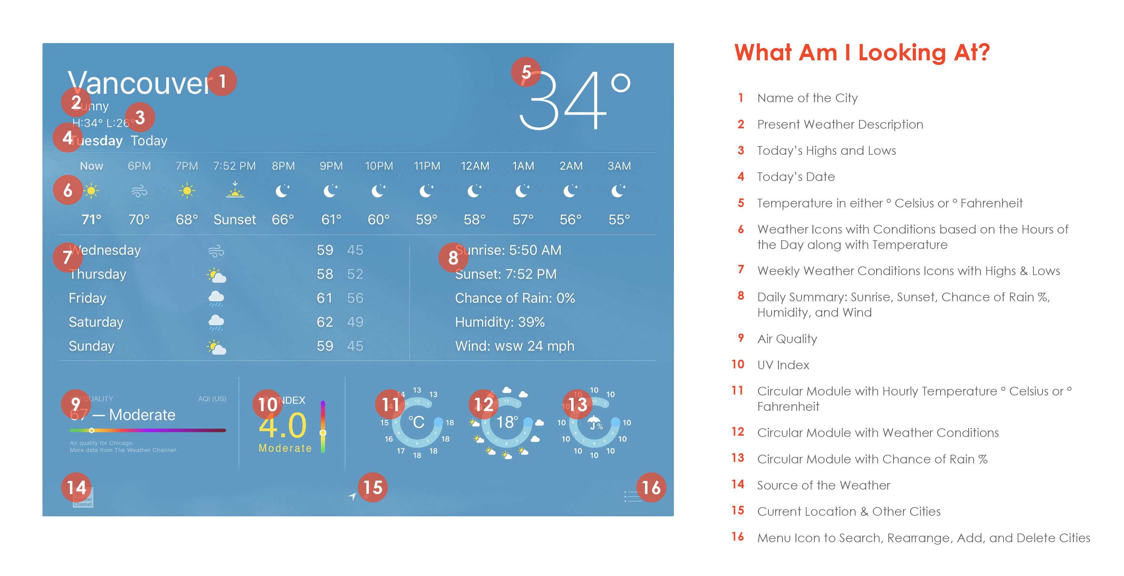
Before looking at the User Interface Designs below, I would like to take this opportunity for you to view the breakdown of each section(s) thru multiple labels. This serves as a guide — towards the development process + end results for the users — for me to showcase its purpose on the screen.
._.
We, designers, build the Component Library to make the dev’s life easier during the initial coding processes.
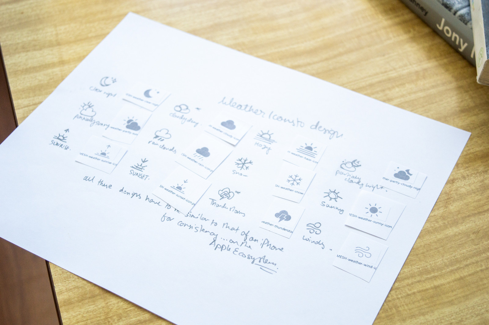
Getting the weather Icons to look similar to that of Apple’s iPhone + Apple Watch + MacOS was VERY important. WHY!? Because I wanted these designs to be fluent within the Apple Ecosystem. Meaning, the visual interface along with the user experience has to be seamless within multiple devices and platforms.
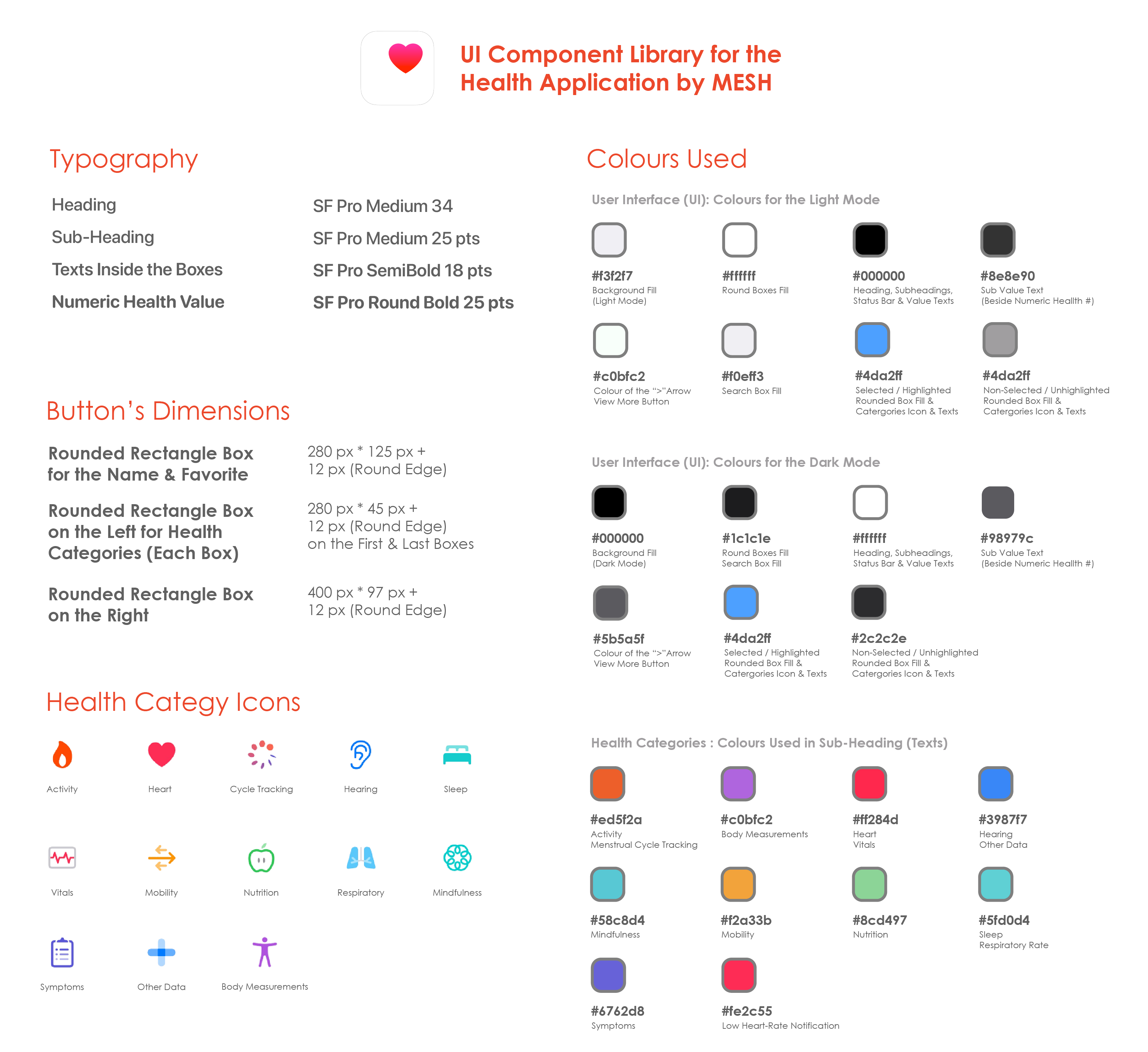
UI Component Library for the Health Application on the iPadOS 16 which showcases Typography (Sizes, Fonts, and Colours), Buttons (Sizes & Dimensions) as well as Hexacode Colors for the Background Foreground, colours of the Texts (Colour fill for the Health Categories such as the Activity, Heart, Nutrition, and much more).
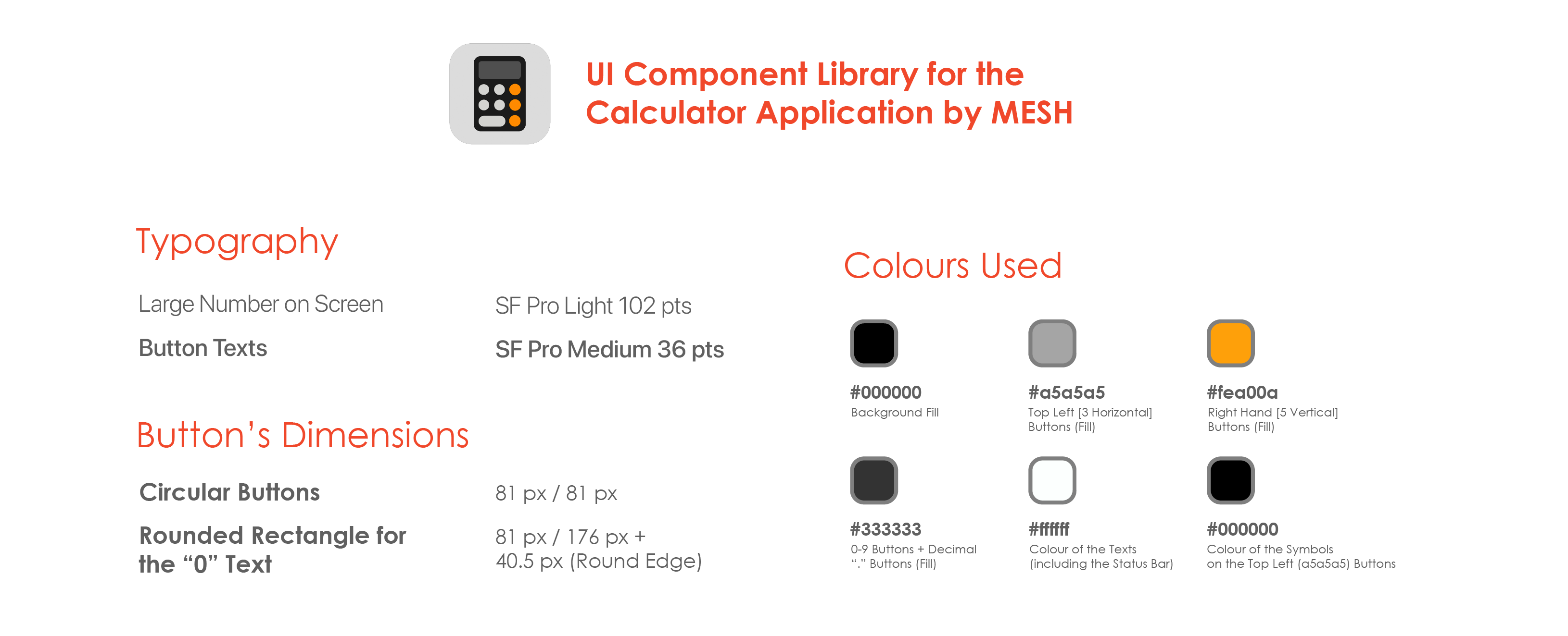
UI Component Library for the Calculator Application on the iPadOS 16 which showcases Typography, Buttons and their Dimensions as well as Hexacode Colors for the Background as well as the Foreground.
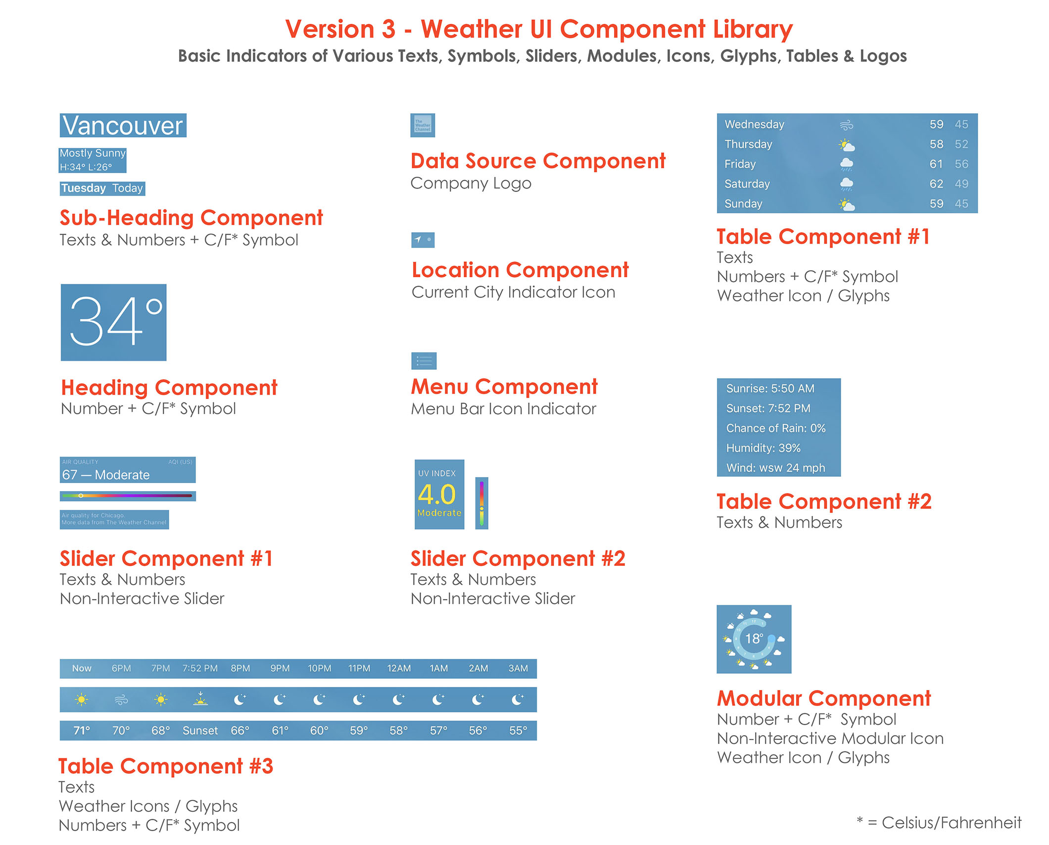
Various Components of the UI Design are broken down into various sections into a Library of User Interface Materials including the Typography, Colour Hexacodes, Tables, Sliders, Modular Components, and more (as shown above) for the development process.
Why did I end up doing this? Because in doing so — as a UX Designer — we make the dev’s life easier (during the initial development process) so that they can start building the UI: one component at a time. For example: starting the development with building the “Heading Component”, or the “Subheading Component”, and ending the final stage of development with the “Table Component #3”, or vice-versa.:
__________________________

I used this technique to better understand my very UI design concepts for the Weather + Calculator + Heath apps. Because — ultimately —my goal has always been to make the designs as friendly, as simple, and as clutter-free as possible. So, this Heat Map has been amazing in guiding me and letting me see things from the User’s POV.
Because, as a designer you get so attached to the product that you are designing, sometimes you forget the smallest details as to how things might look from a third-person point of view: who has never seen this design in their life. You have to ask yourself this question: “How does the design appear to someone seeing these screens for the first time?”. Therefore, these AI-Generated Heat Maps lets us do just that.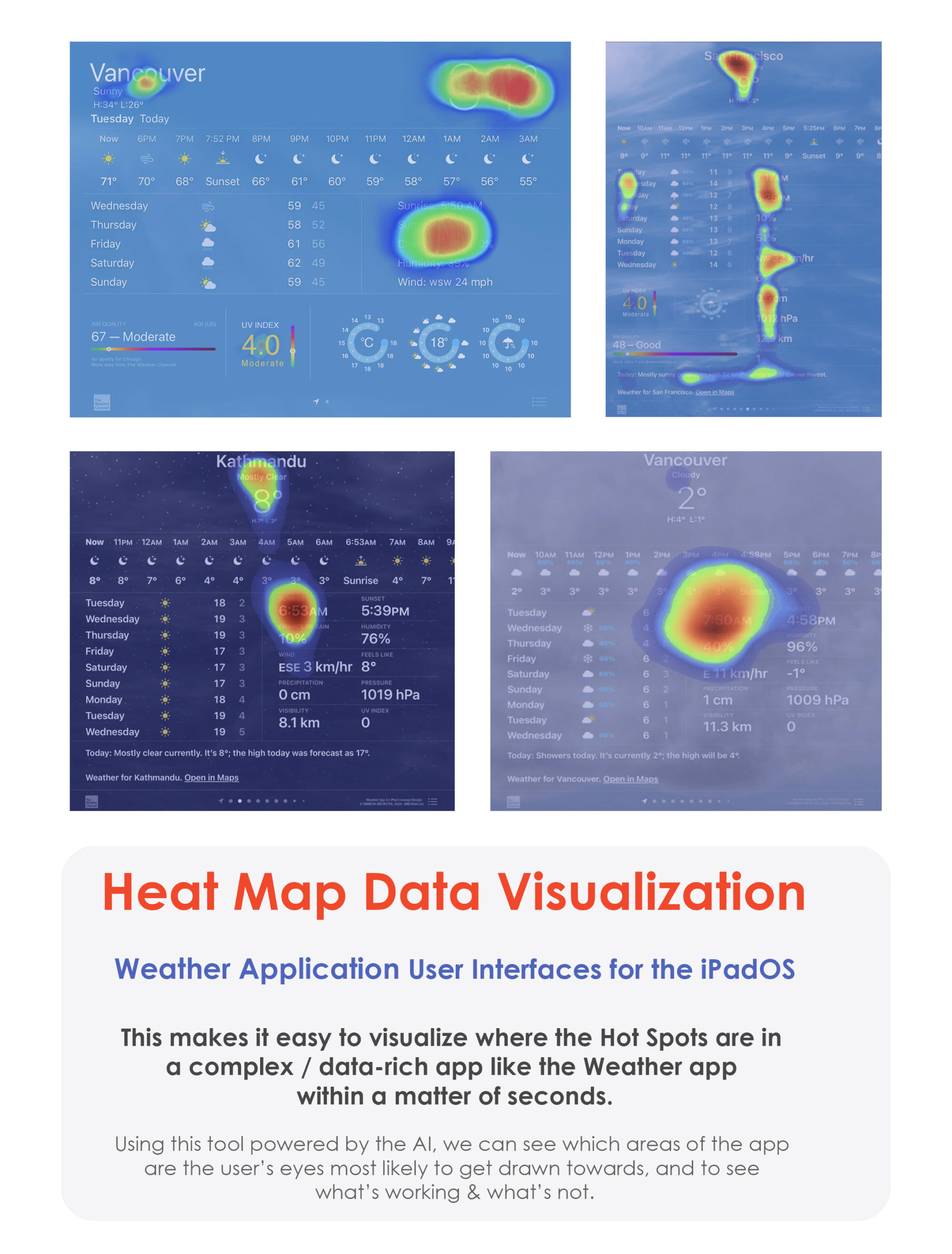
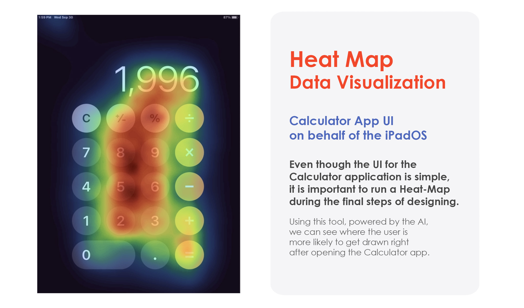
These AI-Generated Heat Maps show variations in colours + hues demonstrating where the user’s eyes will get directed to once they land into the Weather + Calculator + Heath application(s).
You know every nooks and cranny of this UI, because you have spent hours, days, and weeks on a design, but the users are just about to see your designs for the first time and form their opinion about a design within seconds.
So, this technique is good to have, and I have used it to further solidify my design choices. Ultimately, whether we like it or not: the way in which you perceive the designs — as the creator — versus the way in which your users will perceive them be different. We’re all different people. Different experiences will shape the way in which we see the world, differently. That’s why it was important for me to think differently while designing these User Interfaces.
__________________________

Doing all the design is one thing, mocking it up on an iPad is also one thing, but HOW IT LOOKS / FEELS in the REAL-WORLD is a whole another thing that a designer must ALWAYS consider and quite frankly see for themselves by taking lots and lots of photographs of it. This is exactly what I have done below:
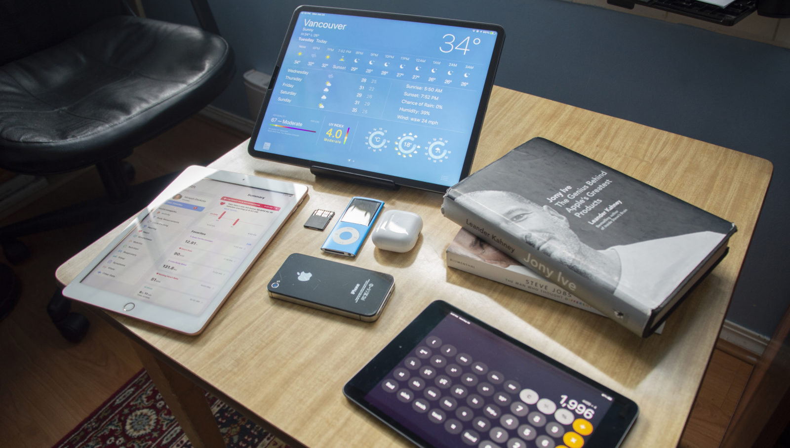
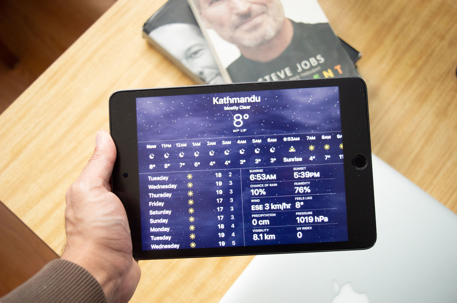
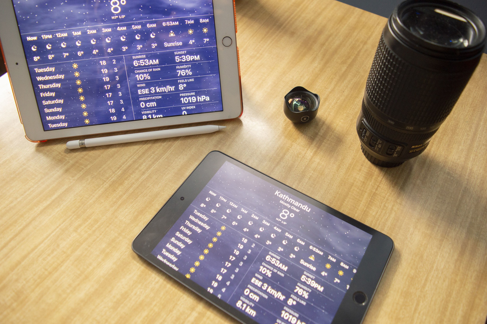
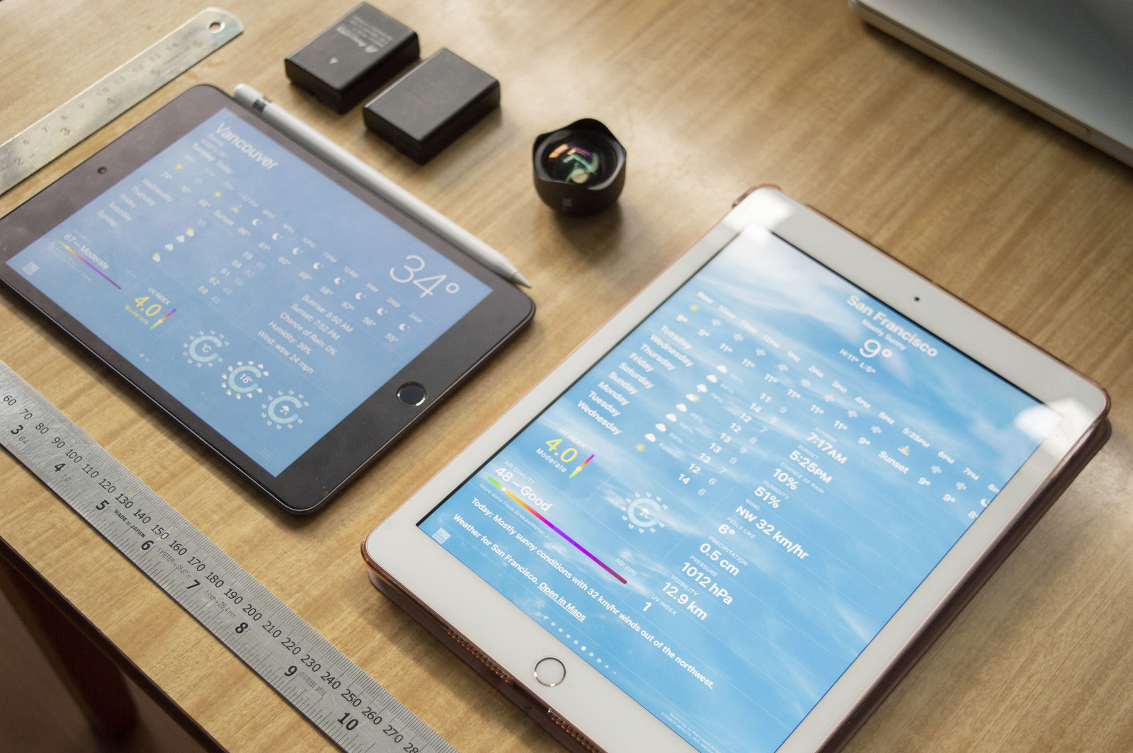
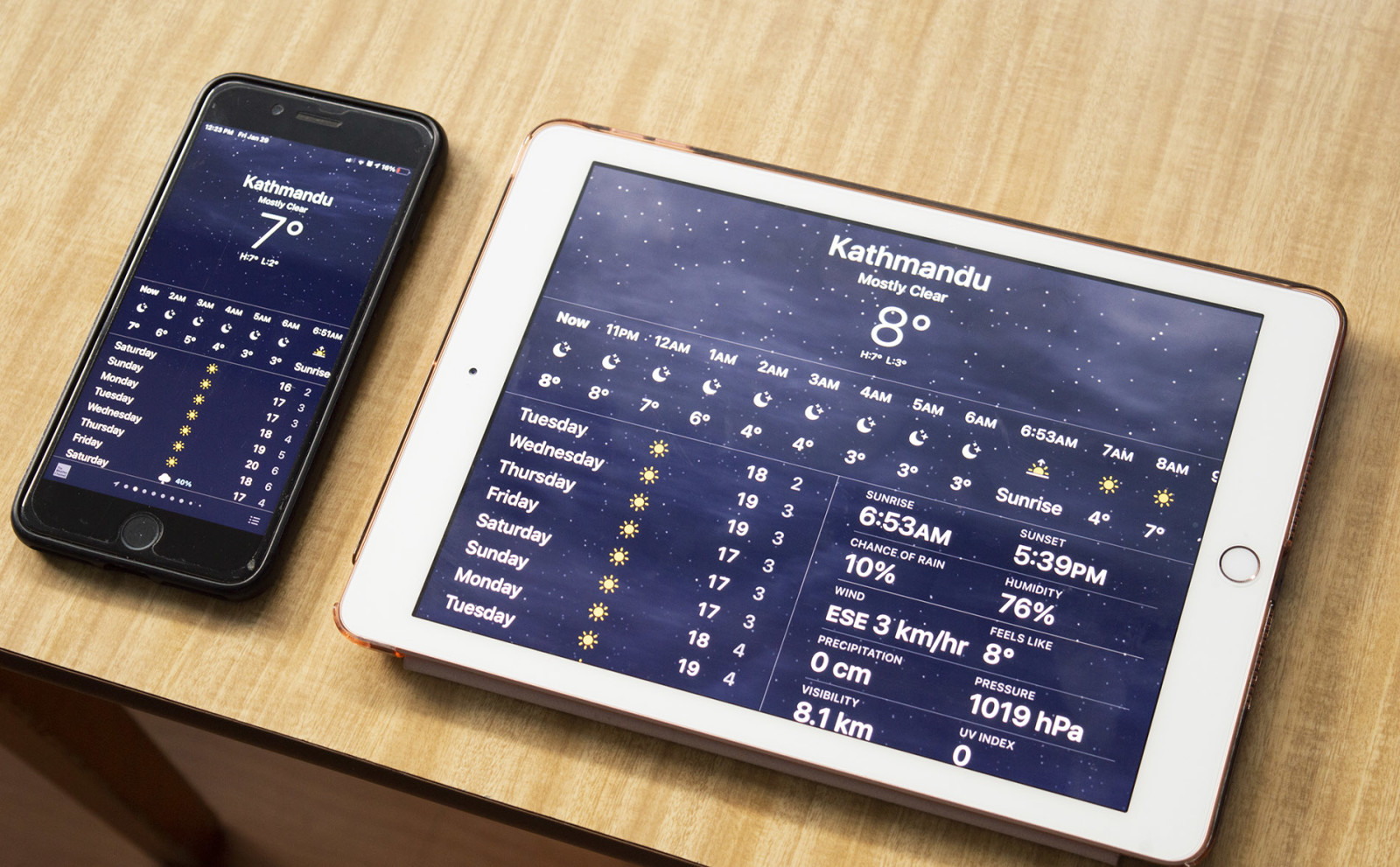
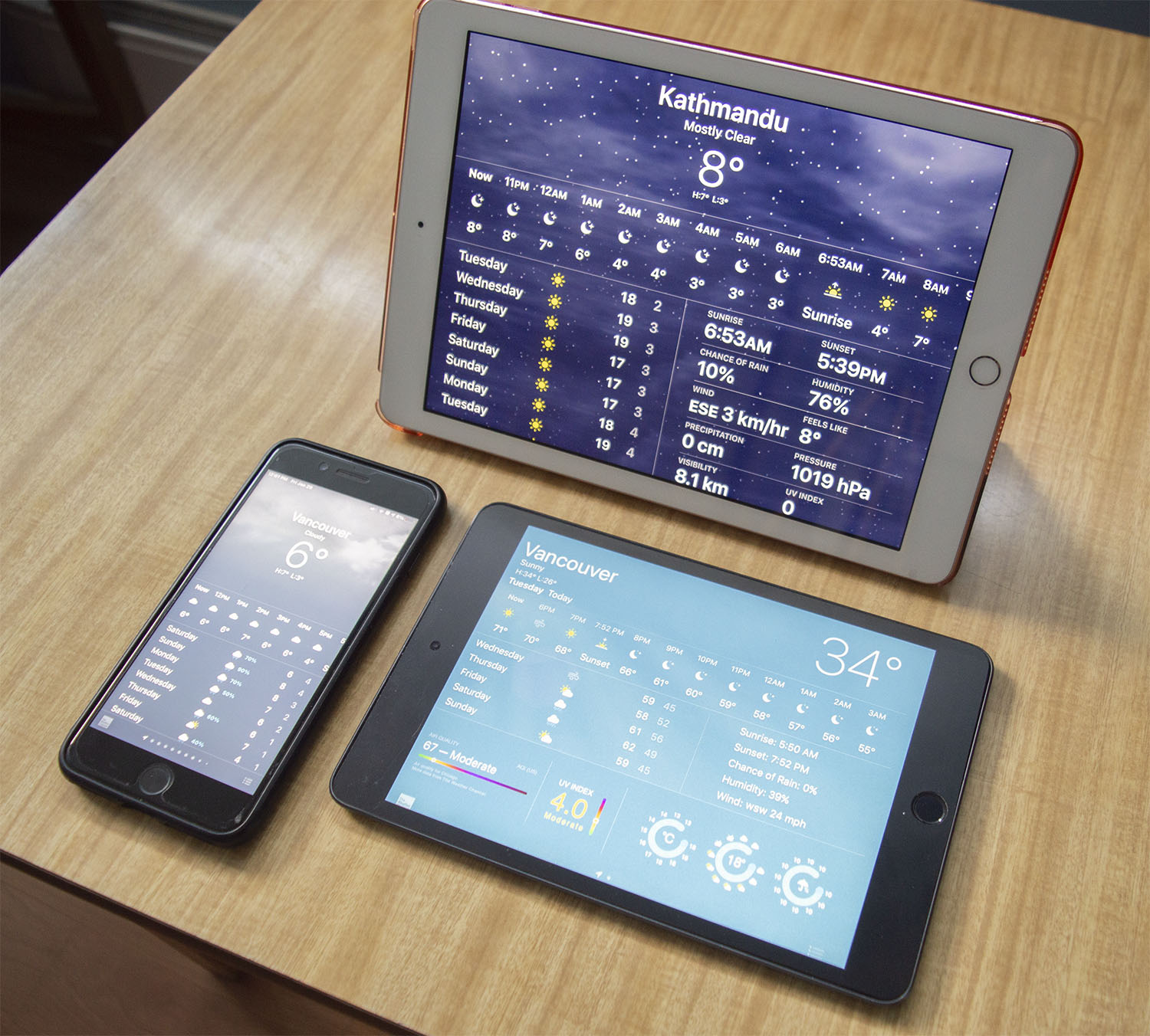
Viewing the Weather app on the iPad Pro 12.9″ [Top], Health app on the iPad 9.7″ [Left], and the Calculator app on my iPad Mini [Right] scattered all over my desk.
“It’s important for me to get the User Interfaces just right on all of the Screen Sizes: from the iPad Mini to the Pro.”
Showcasing the Version 3 of the iPad Weather app’s final design UI with that of the draft of the initial wireframe sketch on both the Regular Sized-iPad as well as the iPad Mini.
Photographing the mock-up UI into the iPads is extremely useful, as it becomes quite handy to visualize the end result(s) in real-life.
I get to see how the icons/texts look while being placed on the actual iPads. I get to see the difference in the icons/texts and their sizes when comparing it with the iPad Mini vs. the Regular Sized-iPads. One of the main issues facing the design is process is the same things might feel different while switching between different sized devices. And, this is a no-no!
I needed to make the UI look JUST RIGHT. Therefore, having consistently between multiple sizes of the iPad family was a MUST. Therefore, I tested the final UI (User Interface) on multiple sizes of the iPad for the looks and the feels. I have to say, I was quite happy with the result.
: )
This is me holding the UI Design of the Weather app on my iPad Mini.
: )
Various angles of the Weather application on the Regular Sized iPad 9.7″ [Left], and the iPad Mini [Right].
: )
 Comparing the iPad Mini’s of UI Design [Left] with the Version 2 of the UI Design on the Regular Sized-iPad [Right].
: )
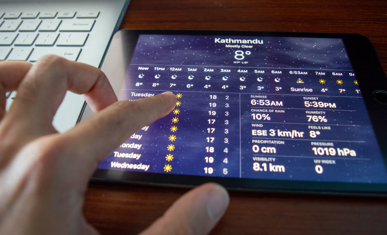
Scrolling thru the Weather application on my iPad Mini.
: )
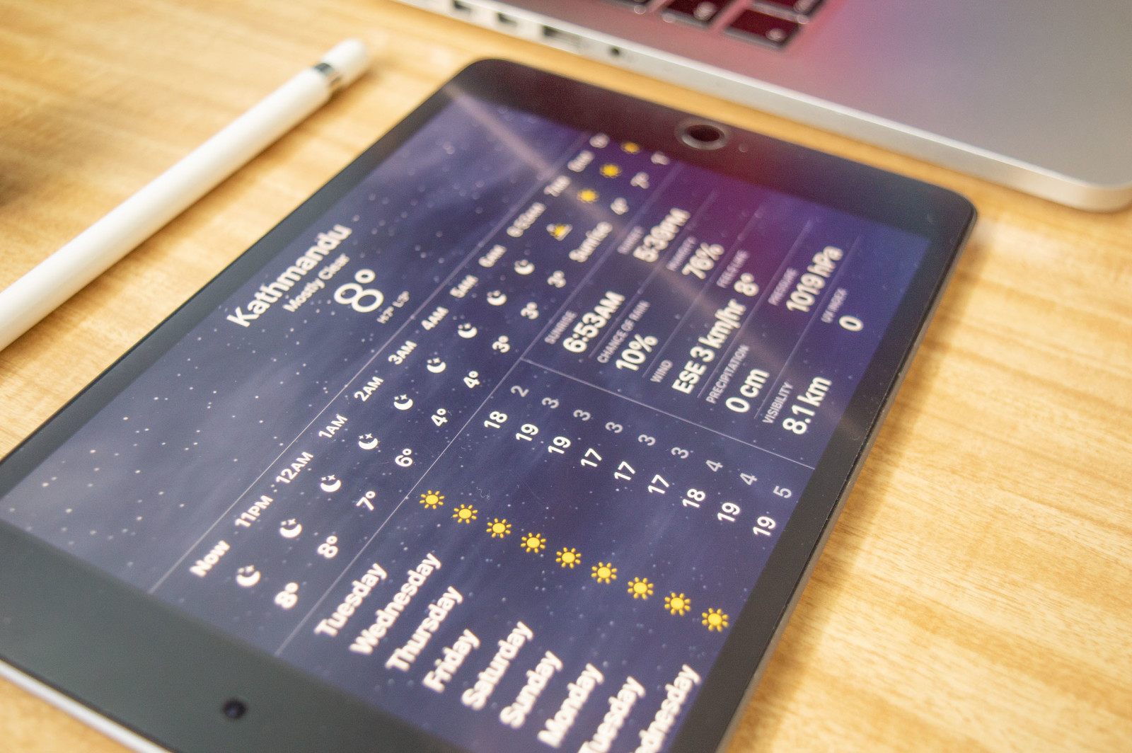 Viewing the Weather app on my iPad Mini that’s on my desk.
Viewing the Weather app on the iPad Pro 12.9″ [Top], Health app on the iPad 9.7″ [Left], and the Calculator app on my iPad Mini [Right] scattered all over my desk.
Showcased above are a few of the real-life mock-ups that I have photographed, showcasing how the Weather App would look like when it is beside you in real-life. The looks and the feel have to be just right, and not only that the functionality of it has to be also on-par with the looks.
__________________________

Showcased above is comparing the iPhone 7 Plus’s Weather App [Left] with that of the Version 1 of the Weather app that I designed, and placed on my iPad Mini [Right].
Showcased above are comparing the iPhone 7 Plus’s Weather App [Bottom-Left] with the Regular Sized-iPad 9.7 [Above], and the iPad Mini [Bottom-Right].
: ): )
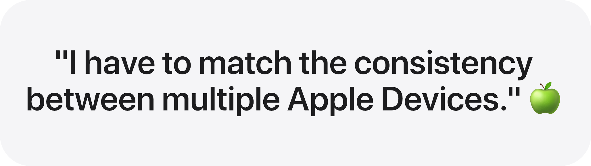
One of the most important things I had to consider while designing was to have similar consistency between multiple Apple Devices. Apple is big on prioritizing the UX Experience to become seamless when a user is moving between various devices. This all ties well into their whole “Apple Ecosystem” feeling that the user expects from multiple Apple Designs.
Read More…
Therefore, everything from the smallest icon of the Sun, to the name of the Font (various SF Pro), to the colour of the background(s): everything has to be similar from the iPhone to the iPad — and that is exactly what I have done — all while keeping the UI guidelines along with accessibility always in the back of my mind while designing.
Another thing to also consider is the various sizes, not all iPad are of the same size. The sizes do vary between different models: as shown above.
Doing all the design is one thing, mocking it up on an iPad is also one thing, but HOW IT LOOKS / FEELS in the real world is a whole another thing that a designer must ALWAYS consider and quite frankly see for themselves by taking lots and lots of photographs of it, and this is exactly what I have done.
I consider myself a “PRO user”. And, I had purchased the new iPad “PRO” with the HOPES that I might have gotten the “PRO” applications to go with my “PRO” device…and I am sure lots of other people have felt the same way as well. People who work with the following software: Professional Video/Photo Editing, Data Management, 2D/3D Animation, Video Game Creations apps, and more!
Right when I got the device, there were no “PRO” apps. But, that is okay. When I purchased the iPad 2021, I expected it to act like a computer especially with the capable M1 Chipset. However, without any Software to go along with it. It is just an expensive Super Car without any roads to drive and utilize its full potential.
I mean, Apple until a few years ago used to ship the iPad with iOS, and now that they have branched into the whole another spectrum of Operating Systems (now called the iPadOS) but it is STILL behaving like an iOS…This is not good. But, then again, this ties very well into their whole “baby-stepping” their Software. Apple has a history of knowingly or unknowingly disappointing their Pro User Bases.
So let’s say that I wait for another 2-3 years until I get an iPad that can fully realize its full potential… And, that is okay, right? But listen to this following dilemma:
Apple has a history of ditching its old hardware in favour of new ones. The timeline for Apple to usually do that is within the 5-7 years cycle of a product.
They advertised M1 chip integration as a standout feature, and if they aren’t going to really utilize it any time soon, then why would they even sell it? It has gone to the point that Apple really needs to distinct Operating Systems on their devices. Regular iPhones, as well as the iPhone Pros, should have two different software, whereas iPads and iPad Pros should have two different software. I mean, when I say this do not full-on abandon all the good stuff on the Pros, but what I am saying is for example iPad/iPhone should have a Pro button switch on their settings — exclusively for “Pro” devices who want to utilize the device’s creative needs, more stats for the users, more freedom and fewer restrictions
This means, let’s say in the next 10 years — in a decade — I was only able to FULLY use my iPad 2-3 YEARS AFTER I HAD INITIALLY PURCHASED IT? This further means that: I wasted my first two years purchasing the super-capable hardware WITHOUT a super capable software to go with it. And that is not good.
Apple baited all of their PRO USERS, and it’s not right. Historically they went out of their way to HIDE the memory specs. It used to be the other way around and now it is clear that it was nothing short of a marketing scheme.
So here is the most annoying thing ever, whether you buy the iPad Pro or the iPad Mini, it is the same Software on it even though they have totally different hardware. Why is that the case?
This is a segue that leads me to one of the most controversial topics when it comes to discussing Apple Inc., which is something that is something that concerns us all, and that is privacy.
“We do not just make the designs pleasing.”
Because designs are so much more than that.
__________________________
Privacy is an important human right, that should NOT be taken lightly: especially by these big corporations and institutions. They have even announced the “Apple Privacy Nutrition Labels” that is applicable on all third-party applications as well as their OWN native applications. All of the Native Apple applications are heavily privacy-driven.
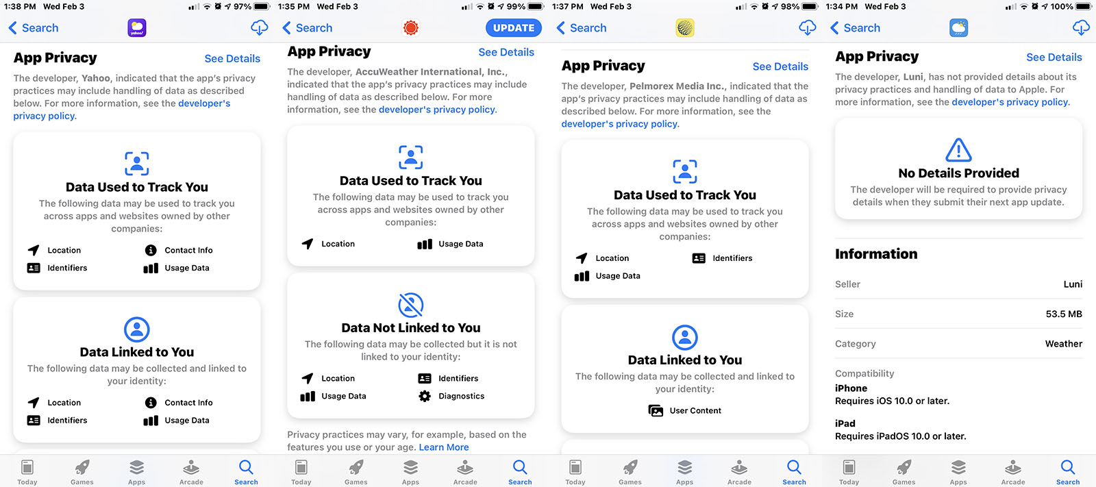
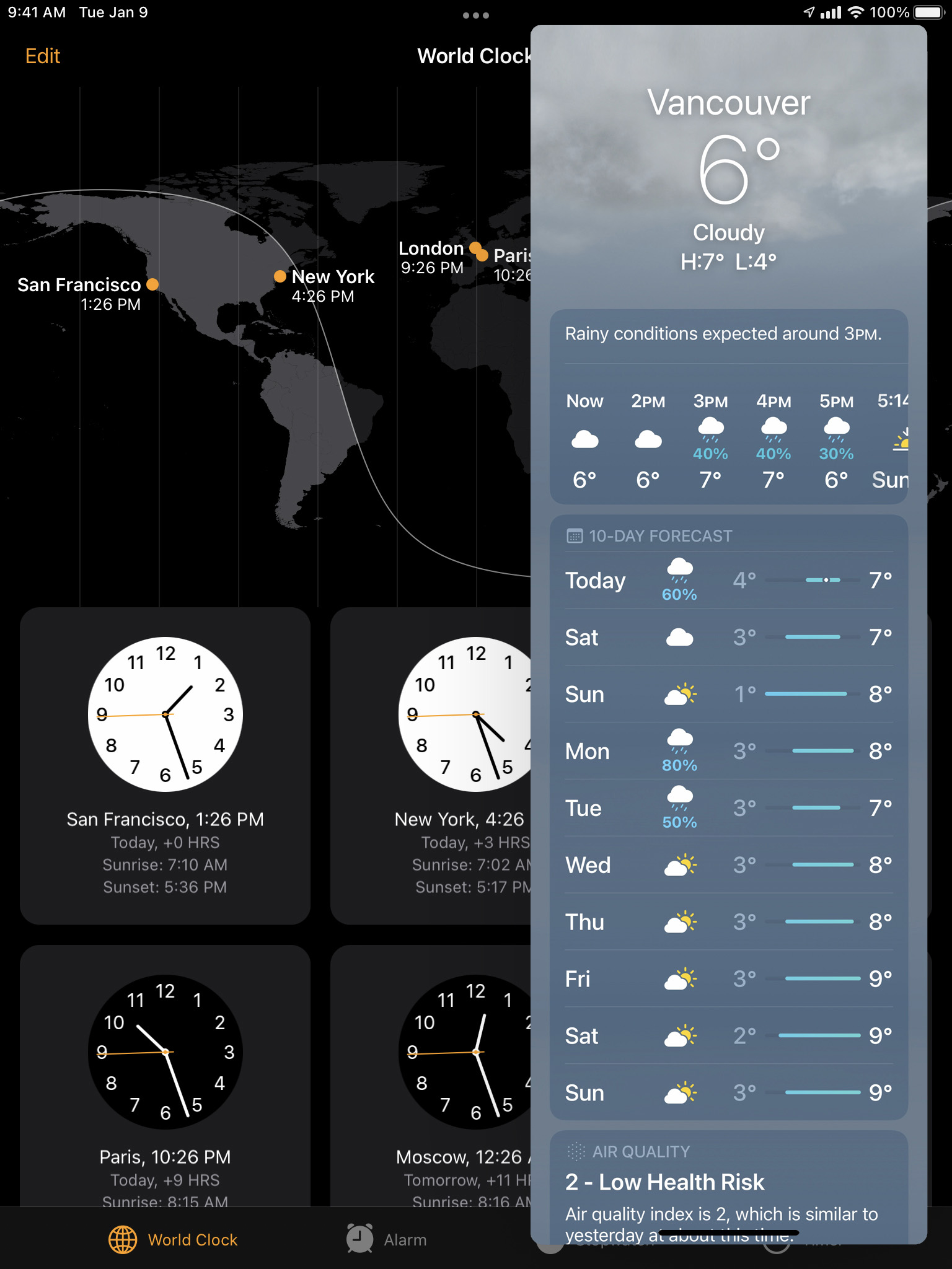
Apple’s Privacy Nutrition Labels showcasing the “Data Used to Track You” on various Third-Party Apps on the App Store including your Location and many more.
Apple has set a new standard for data control and privacy minimization + machine-learning by using on-device calculations for everything from location data, to your contacts, as well as your photos, so that it does not leave the device and go into the cloud. But the same cannot be said for third-party applications. Their stance on privacy may be viewed at https://www.apple.com/privacy.

Apple CEO Tim Cook talks about Privacy on January 28, 2021.
Apple did the RIGHT THING by taking a strong stance on Privacy.
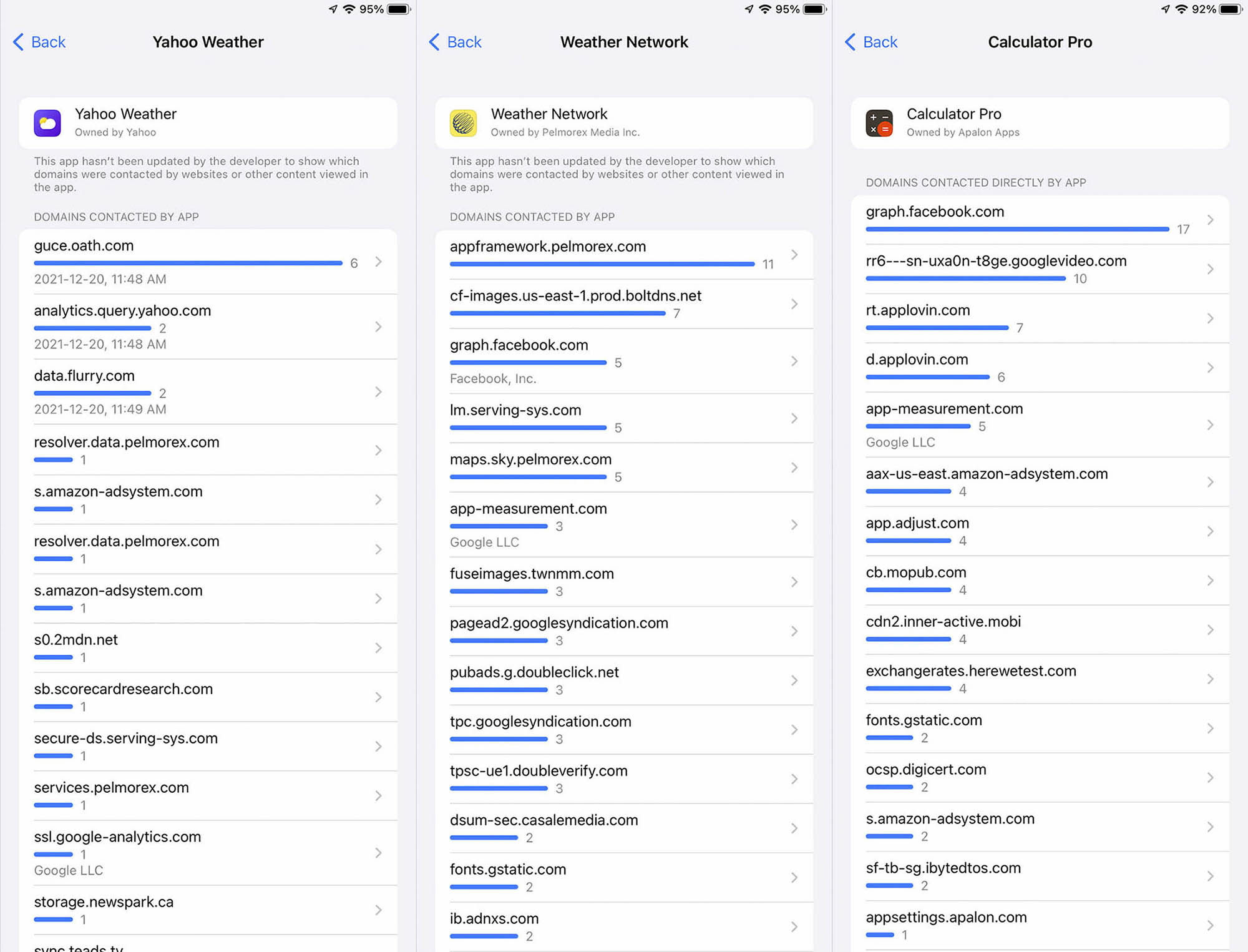
App Privacy Report showcasing how Yahoo Weather [left], The Weather Network [middle], and Calculator Pro [right] all take data from our phones and sell it to companies like Facebook, Yahoo, Google, Amazon, and many more…
“We do not know what they are doing with OUR DATA, or who they might SELL the data to…” 🔐
Now taking that point into consideration, by not having the Apple Weather app on their iPad natively, the App Store is saturated with third-party apps that are littered with ads — which is not what Apple wants.
There is a clear solution towards fixing this: build a Native App that DOES NOT share the user’s location to the highest bidder and is not money-driven.
Read More…
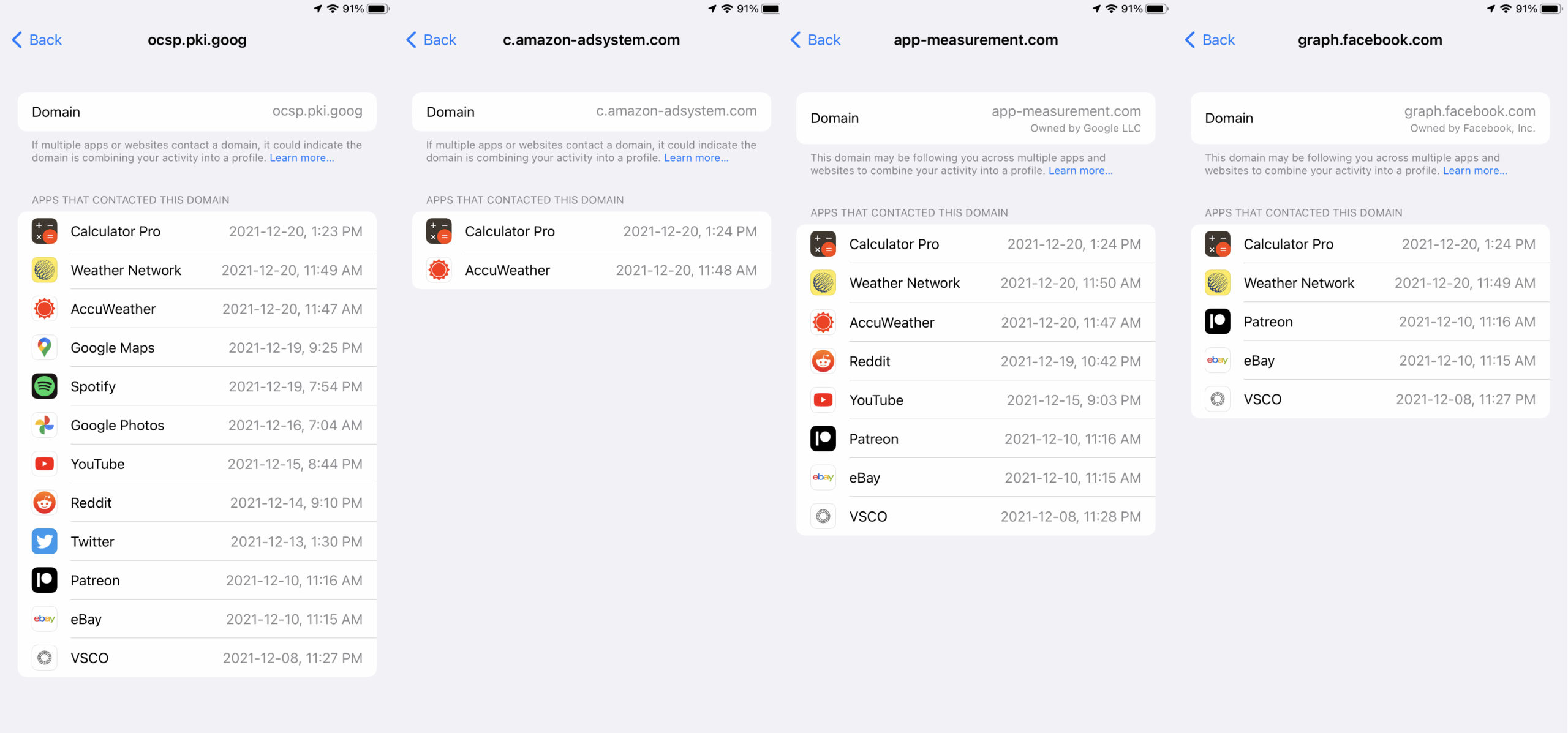
App Privacy Report showcasing how the Third-Party Applications on our Devices are very DATA-HUNGRY and sell our data to companies like Google, Facebook, Amazon, and many more.
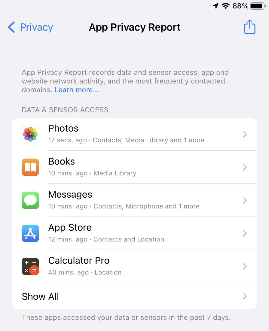
Apple also introduced a very privacy-driven feature in their iOS 15.2 & iPadOS 15.2 and it is called the “App Privacy Report” and this is AN AMAZINGLY POWERFUL TOOL invented by Apple to make the Customer’s in charge of their own Personal Data. This feature is very welcomed and thus this teaches Users (no matter how technologically advanced, or just an average consumer like our fathers and mothers) about how much data does companies like Google, Facebook, Amazon, and much more date does it actually collect from an average user and sell it back to us as advertisements.
Amongst all the other privacy stands, that Apple has taken, they have not thought about this particular issue, and I am using this opportunity to tackle that privacy issue — that a lot of iPad users are facing — when they are forced to use third-party applications that are saturated with bloatware, as well as advertisements.
Why does the Third-Party Calculator app need my Location?
Why on Earth will the Calculator app ever need my Location as to where I am on Earth, when all I am trying to do is some simple calculation? Unless…
The Third-Party-Application takes my Location, combines it with Selling that Data to services like “graph.facebook.com” owned by Facebook, “googleads.g.doubleclick.net” owned by Google, and “amazon-adsystems.com” owned by Amazon and create a Robust Profile on me, and compile it with other people’s location (all around the globe) so that during the Holidays, the Amazon app can sell me whatever I have searched up on Google.
For example, I go on Google and search for PlayStation 5. That is being watched by Google, and now, I will get that same advertisement about “PlayStation 5” on my Calculator App! YES! That is how it works, and there is no privacy!
![]()
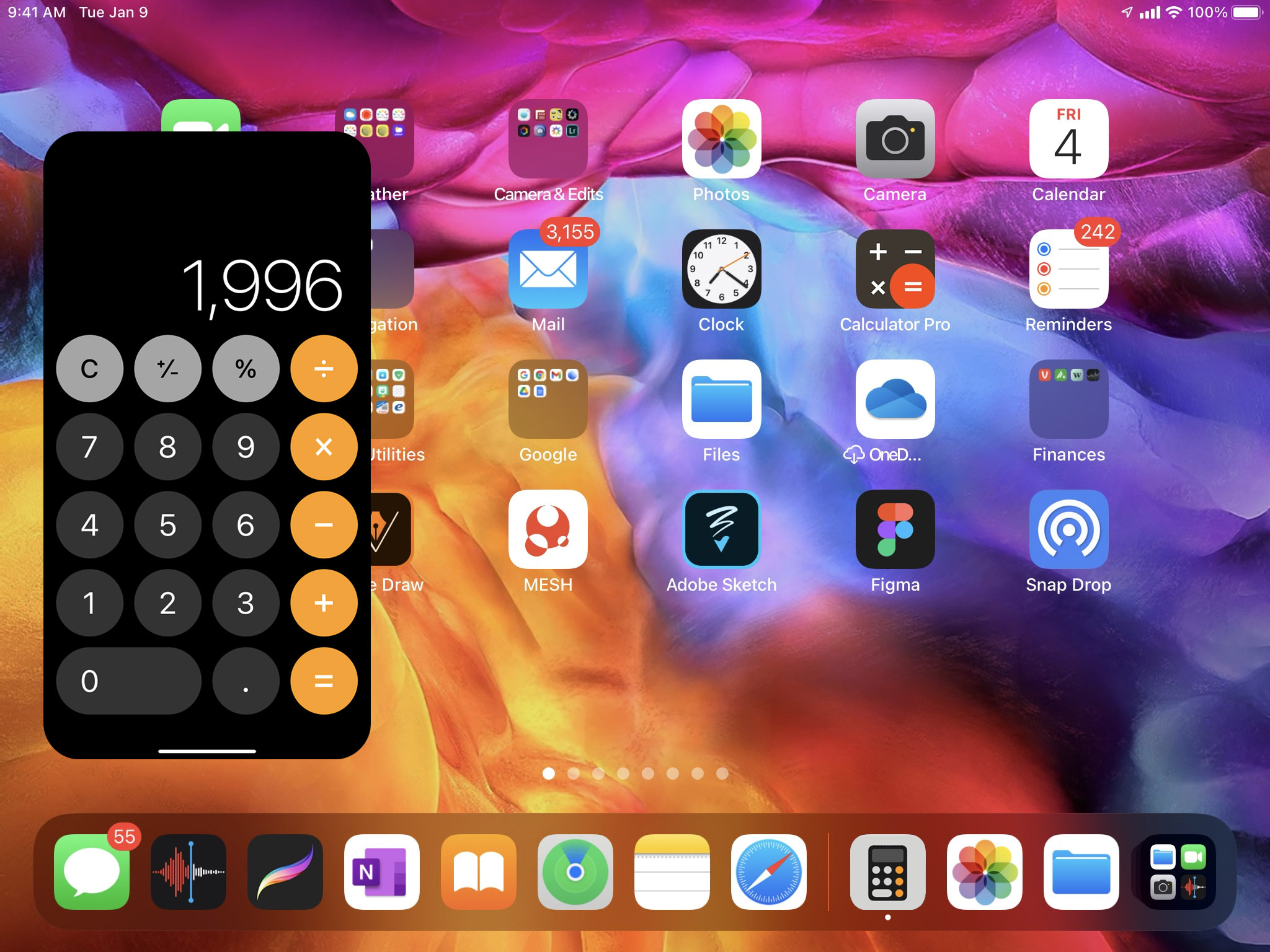
Asking Siri to calculate some Numbers + asking Siri about the Weather Conditions Outside renders a hidden UI with Calculator & Weather app icon(s).
One more thing: when you ask Siri: “How’s the weather outside?“, or if you ask something like: “What’s 95+72+3?” using the iPad then you get the response back, but notice one thing? On the top-left, it’s the Weather & Calculator app icon. So clearly, there is the Weather & Calculator took-kits, icons, resources built into the iPadOS Experience, and yet there is no Weather & Calculator app in itself, and it got me thinking that it has to be some kind of inside-joke at this point as to why there is no Weather + Calculator +Health application(s) on the iPad.
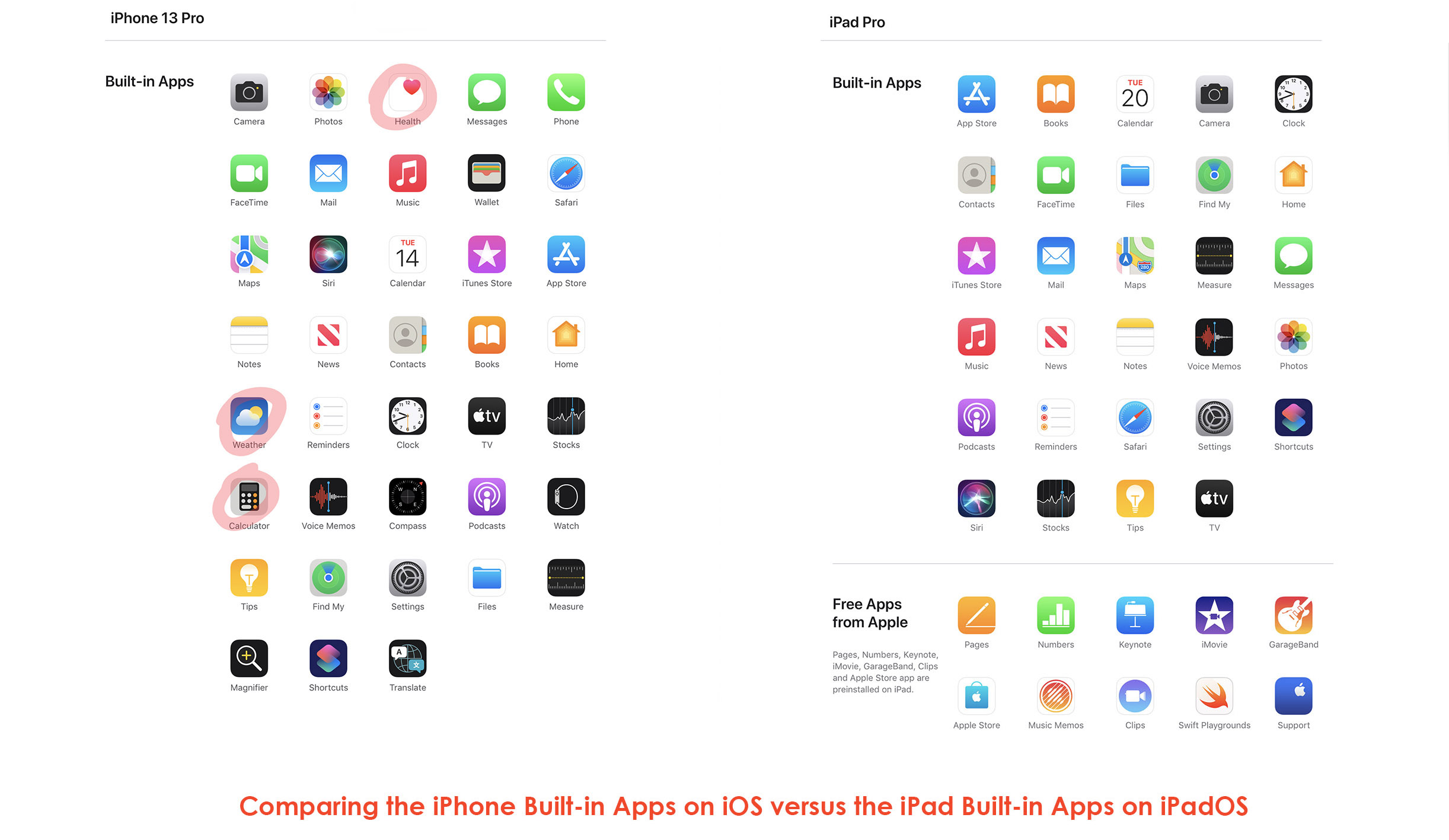
Moreover, take a look at the image below: I am comparing the iPhone 13 Pro / iOS’s Built-in Apps versus the iPad Pro / iPadOS’s Built-in Apps: You see that they everything that the iPhone primarily has but why is that the Weather app and the Health app and the Calculator app are still being omitted?
As I have mentioned above, all of the Native Apple applications are heavily privacy-driven, and Apple would be EVEN MORE PRIVACY DRIVEN if Apple Eliminated the NEED to install Third-Party Weather and Calculators apps on our iPad. This would make Apple solidly the stance on Privacy!
._.
__________________________
Now to sum things up…

Craig Federighi talks about the lack of Weather, Calculator & Health Applications on the iPadOS.
I wanted to leave you with this one video that I have found online (showcased above). In this video, you get to see Craig Federighi — who is the current Senior Vice President of Software Engineering at Apple, and he is in charge of overseeing the development of the iOS, iPadOS, and the Mac OS — answer the question as to why there is no Weather + Calculator + Health apps on the iPad. In the video, he had mentioned the reasons why Apple’s Engineering team has not gotten around to building the Weather Application — amongst — others were they wanted to first build an amazing Weather application, but was unsuccessful in doing so, therefore has not put out the application yet!
Read More…
Craig has been A HUGE INSPIRATION TO ME. I follow a few of his philosophies while doing designs. However — in this particular matter —I would have to disagree with him.
Why? Because, the important in this case would be to just get started on the project — like how did — and not worry about PERFECTION. Perfection will be achieved as you go on. During my initial stages of designing. I had many, many, many errors and mistakes. And, I know that I will make many more. However, when that fear of wanting to get perfection gets in the way of real-work, there is a problem. 😱
This project gave me a great amount of satisfaction in creating.
What started off as a simple creation of the Weather App UI on the iPad turned into me creating the UI for the Calculator app, then the Health app, then an entire Case Study about enhancing the entire iPad User Experience. This is not some random Case Study, this Case Study is something really dear to me. It is a story. It’s my story.
Doing these beautiful mock-ups of the Weather + Health + Calculator app on the iPad and getting the sense of experiencing what these applications could be like. I also had a ton of fun coming up with fun new ways to make the iPad Pro experience to be truly Pro-like with the inclusion of Files on the Home screen, a better HDMI to External Display Support, Multiple Users to be logged into the single device, and many more, laid out in this very page.
Also — as mentioned — I created this project in a mere matter of 2 months (all by myself) so imagine what Apple — a company with a Trillion-Dollar Market Cap — could do given that they have unlimited resources and manpower.
__________________________
I do have a dream…
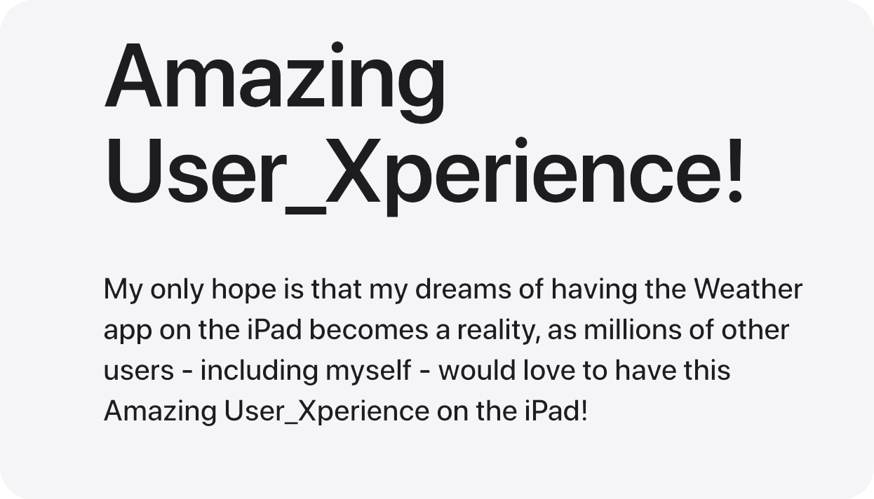
Everything that I have said on this page, along with the designs what I hope will one day become a reality!
Having these essential apps like the Weather, Calculator and Health apps — along with Reminders, Photos, Messages, Clock, and many more that are already there on the iPad — is an absolute must.
Having more powerful Software to go with the iPad Pro’s clearly more Powerful Hardware will elevate the iPadOS Experience for the Creative Users like myself to a whole new level.
What started off as a personal project of mine and a hobby to create a Weather Application on the iPad turned into this 6K word UX Project with a ton of Research + lots and lots of User Interfaces/Designs, and I couldn’t be more happier with the results!
🙂
__________________________
Thank you for visiting.
If you have any questions/suggestions — or if you just want to say hi — please do contact me by sending me an e-mail.
– MESH
Last updated: 2022-03-15 at 19:04 PST
© MESHart.ca 2022.
__________________________